erena
Reshaping erena’s Navigation and Dashboard
Players opened erena wanting to compete and spent their time looking for something to enter. I ran the research and rebuilt the information architecture so the distance between showing up and playing was short enough that people actually covered it.
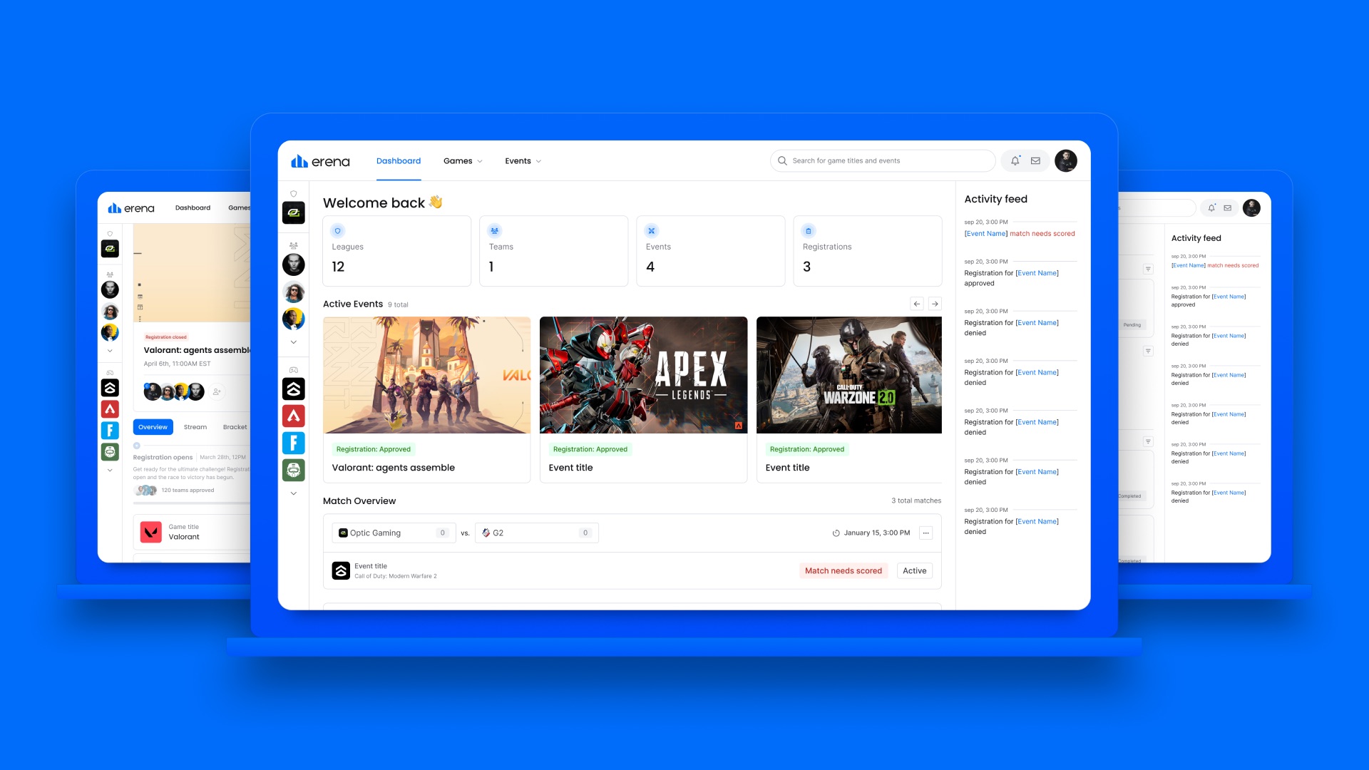
Overview
Finding the fun
A tournament platform gets handed the easiest user intent in software. Nobody lands on erena by accident. They are already there to play, and all the product has to do is not get in the way.
It got in the way (Fig 1.0). Somewhere between the front page and an event a player could actually join, we were losing people who had walked in ready. That distance was the project.
The hurdles
Events were buried:
Discovery was the point of the product, and it took real effort. Players showed up motivated and left before they ever entered anything.
The navigation had accumulated rather than been designed:
Features arrived over several years and nobody went back to ask how they fit together. What players moved through reflected how the company was built, not how a competitor thinks.
We could not point to where it broke:
Frustration was easy to confirm and useless on its own. Without knowing which moments failed and why, any redesign would have been a guess with a mood board attached.
Goal:
The shortest possible path from arriving to competing.
Deep dive
Screens were fine, the shape of the product was not
“Hard to navigate” is what users say when something is wrong, and it points nowhere. Acting on it directly means redesigning whatever you already suspected was ugly.
So the first weeks were not design. Interviews gave us specific moments where people stalled, and a heuristic evaluation ran those complaints against the interface to sort genuine breakage from things players simply disliked. Both fed an empathy map, and once the picture assembled, the answer was not on any individual page. Nothing needed restyling. The product was organized wrong (Fig 2.0).
That changed what we were building. The dashboard was going to be where the work showed, but the work itself was underneath it, in how the entire platform was arranged.
The decision
Build the structure around what the business needed to grow
An information architecture can be organized entirely around what users say they want. It will test beautifully and change nothing about the company’s position.
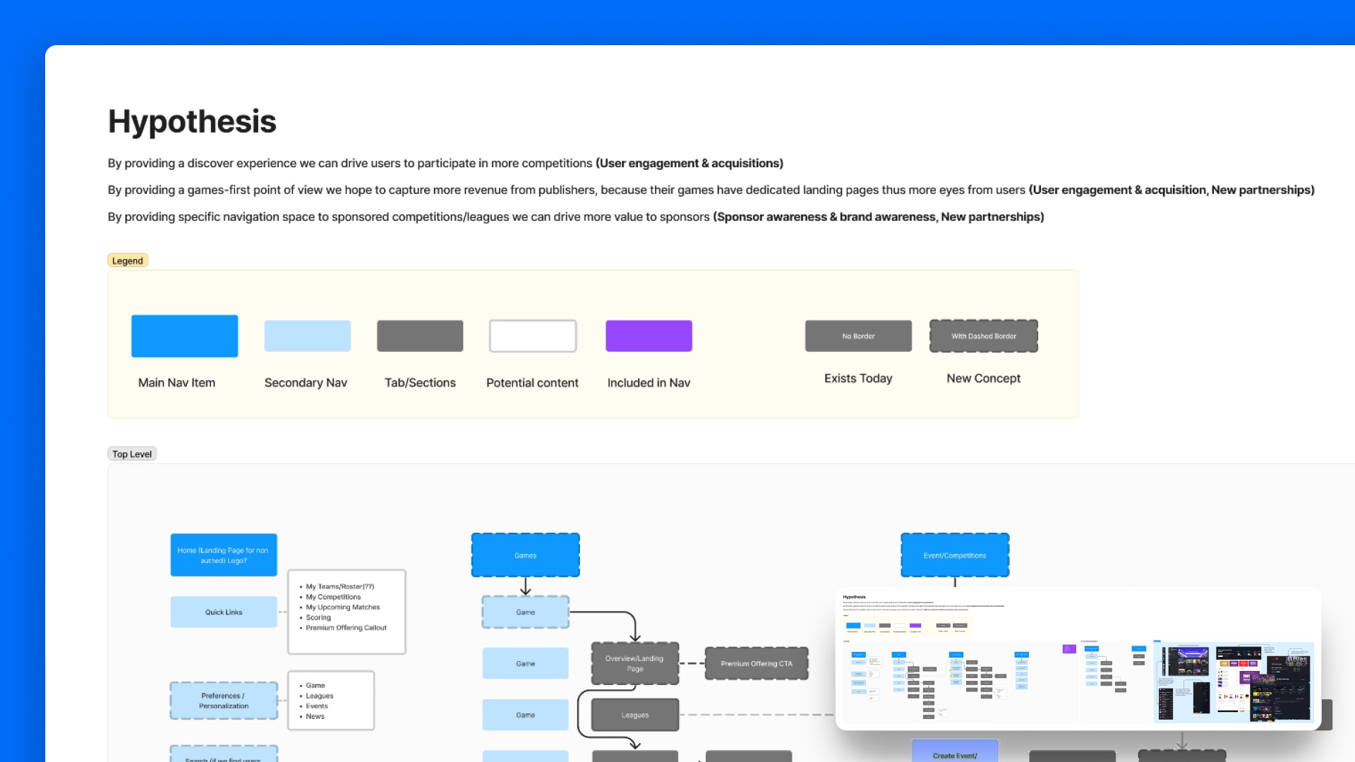
I started from three hypotheses instead (Fig 3.0), each attached to an outcome. A games-first structure, where every title has its own landing page, gives publishers a reason to partner and gives players somewhere obvious to go. A genuine discovery layer converts browsing into entering, which is the only conversion erena runs on. And giving sponsored leagues real estate in the navigation puts sponsor value inside the product rather than inside a pitch deck.
That gave every structural decision something to be checked against. Does this serve engagement, acquisition, or partner revenue? A far better question than whether a menu feels tidy, and a much easier one to defend in a room.
The structure
Deciding what belongs in the nav, and what does not
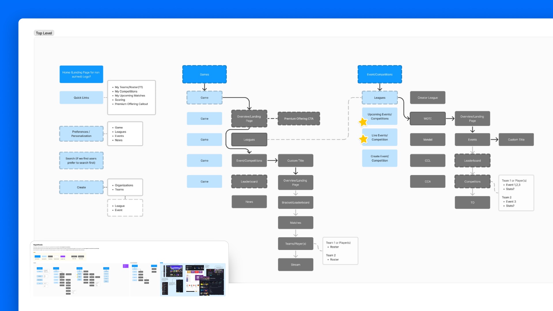
The FigJam board held the entire proposal (Fig 4.0). Four top-level destinations, Home, Games, Events and Competitions, and a premium tier, with the full depth beneath each one mapped out to brackets, matches, rosters, streams, and leaderboards.
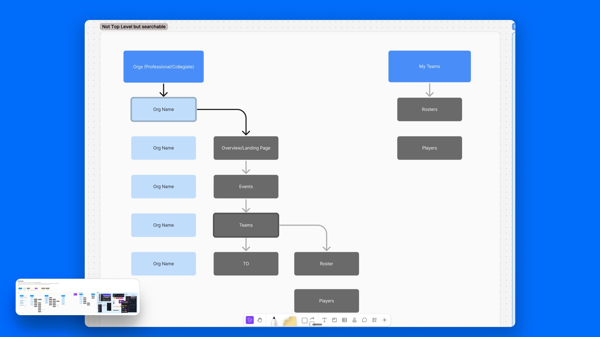
The section I would point to first is the one for everything kept out. Organizations, teams, and rosters are content people genuinely look for, and none of it earned a top-level position. It went to search. Choosing what to exclude is the half of this work that determines whether a navigation stays clear or grows back into the thing you just took apart.
I also built a legend into the board marking every node twice: by role, so main nav read differently from secondary nav and from tabs, and by status, so anything new was visibly distinct from anything that already shipped. Leadership could look at a proposal and the current product in a single view without mistaking one for the other.
Process
From idea to reality
Hands-on Validation
The board carried the structure, the hypotheses behind it, and the visual language separating what existed from what I was proposing. Tree testing then checked that structure against where players expected to find things, which is a cheap question to ask of a diagram and an expensive one to ask of a shipped build.
Engineering the Gap
Nothing here was handed over. Kickoffs, sprints, releases, and testing ran in a loop with player feedback going into the following cycle, which is the only sane way to change how an entire product is organized. The mockups were a starting position, not a finish line.
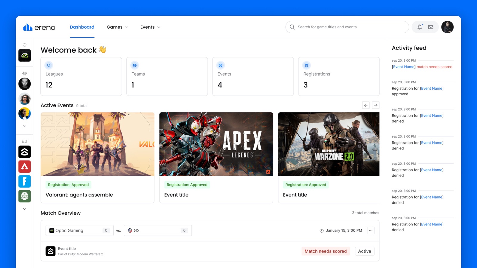
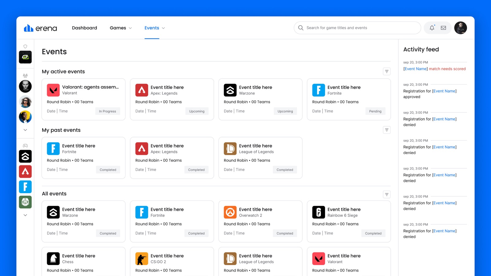
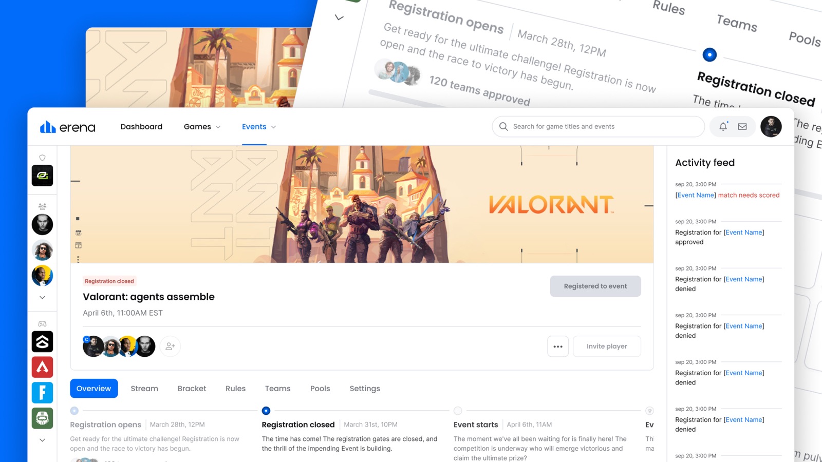
Stress testing paradigms
Wire-framing, Prototyping, and Validation
The question worth testing was whether people could find what they came for (Fig 6.0). Everything else was secondary.
Usability sessions and player feedback agreed. The platform was faster and more pleasant than what it replaced, features sat where people reached for them, and locating an event stopped feeling like a chore you completed before the fun started.
Findability
Improved
Tree testing confirmed players looked for features where the new structure placed them.
Player sentiment
Positive Signal
Players and viewers both described a clearer, quicker experience.
By the numbers
Takeaways and business impact
These figures describe erena before the redesign fully rolled out. They are the scale the new structure was designed to carry, not an outcome of it.
34m+
Live Views
800k
Registered Users
260+
Hosted Events
$1m+
Prizing Awarded
The IA carried a business argument
Three hypotheses tied the structure to publisher partnerships, competition entries, and sponsor value. That is the difference between a proposal leadership can act on and a preference they have to be talked into.
Research replaced opinion in the room
Interviews, heuristic evaluation, and tree testing meant the recommendation arrived with evidence attached. Buy-in was quick because there was very little left to argue about.
Exclusion did as much work as inclusion
Routing orgs, teams, and rosters to search rather than the nav is what keeps the structure from refilling. The visible redesign was downstream of decisions about what to leave out.