# Zach Blevins Design System: guide for AI agents

> The design system behind zachblevins.com, written for coding agents. Read it before you write markup or CSS for the site, or for anything that should look like it. It is generated from the stylesheet and the component catalog on every build, so it describes exactly what ships.

- Live reference: https://zachblevins.com/design-system (every component rendered from the real stylesheet, with a playground)
- Tokens as data: https://zachblevins.com/design-tokens.json
- Stylesheet: https://zachblevins.com/css/styles.css
- Figma library: `u7Woeg2PGHsjKAyaGKuKf2` (node ids below)

Code is the source of truth. Figma owns anatomy and states; the stylesheet owns what ships. When this file and the stylesheet disagree, the stylesheet wins, and the next build rewrites this file.

## Rules

1. **Reuse before you write.** Every component in the system ships on the site. Copy its markup and classes as they are. If what you need is not here, say so rather than inventing a variant the Figma library does not have.
2. **Color comes from semantic tokens.** Use the `--c-*` tokens, and `--op-*` when you want a share of the foreground. Never type a hex value, and never reach for a `--ds-*` primitive inside a component: primitives do not flip with the theme, semantic tokens do.
3. **Every screen has two themes.** Dark mode is `<html data-theme="dark">`. Anything you add has to read in both, and a dark value goes in the `:root[data-theme="dark"]` block, not beside the rule that uses it.
4. **Type and spacing are tokens too.** Font families come from `--f-display`, `--f-sans` and `--f-mono`. Sizes and line heights come from `--fs-*` and `--lh-*`, spacing from `--pad`, `--band-y`, `--band-gap` and the gap tokens. They already step at 768 and 1200.
5. **Two breakpoints, mobile first.** The base styles are the 390 frame. `@media (min-width: 768px)` and `(min-width: 1200px)` are the only queries. Do not add one; retune a token in the `:root` block for that width instead.
6. **Icons are Lucide symbols.** Reference the sprite with `<svg><use href="#i-name"></use></svg>` inside `.icon`. Strokes are 2px on a 24px grid and the color follows the text.
7. **Motion uses the motion tokens.** `--dur` and `--ease` for state changes, `--press-dur` and `--press-ease` for presses, `--arrow-*` for arrows. Every other duration is a step of the scale (`--dur-fast`, `--dur-short`, `--dur-slow`, `--dur-long`), or for entrances `--dur-light`, `--dur-enter`, `--dur-reveal` and `--dur-settle`, never typed by hand. Anything the reader opens or closes moves on `--arrow-ease`; `--ease-out-expo` is for scroll reveals and icons settling. Everything stops under `prefers-reduced-motion`.
8. **Accessible in both themes.** Text clears WCAG AA on its real background in Light and in Dark. Keep visible focus, real heading order, `aria-current` on the current page and alt text on every image.
9. **Safe areas go through tokens.** Anything pinned to an edge pads with `--safe-t`, `--safe-r`, `--safe-b` or `--safe-l`, never `env()` directly.
10. **Write like Zach.** First person, plain words, varied sentence length. No em dashes anywhere in copy.

## Theming

Light is the default. Dark is `data-theme="dark"` on `<html>`, set before first paint from `localStorage.theme` and flipped by the button with `data-theme-toggle`. The semantic tokens carry both themes, so a component written against them needs no dark rules of its own.

## Breakpoints

| Frame | Query | Notes |
| --- | --- | --- |
| 390 | base styles | mobile first, every token's starting value |
| 768 | `@media (min-width: 768px)` | tablet |
| 1200 | `@media (min-width: 1200px)` | desktop; content caps at `--page-max` |

## Color: semantic tokens

Use these. Each names the Figma variable it binds to. Values are what the token resolves to in each theme.

| Token | Figma variable | Light | Dark |
| --- | --- | --- | --- |
| `--c-ink` | Brand/Primary/1000 | #0e0f10 (`--ds-brand-1000`) | #0e0f10 (`--ds-brand-1000`) |
| `--c-white` |  | #ffffff (`--ds-white-1000`) | #ffffff (`--ds-white-1000`) |
| `--c-accent` | Brand/Secondary/50 | #d7ff38 (`--ds-accent-50`) | #d7ff38 (`--ds-accent-50`) |
| `--c-bg` | Background/Default/Primary | #ffffff (`--ds-white-1000`) | #0e0f10 (`--ds-brand-1000`) |
| `--c-bg-hover` | Background/Default/Primary Hover: Ink/050, Chalk/050 in Dark | #0e0f100d (`--ds-black-050`) | #ffffff0d (`--ds-white-050`) |
| `--c-text` | Typography/Default/Primary | #0e0f10 (`--ds-black-1000`) | #ffffff (`--ds-white-1000`) |
| `--c-text-2` | Typography/Default/Secondary | #0e0f10bf (`--ds-black-750`) | #ffffffb2 (`--ds-white-700`) |
| `--c-text-3` | Typography/Default/Tertiary | #0e0f1099 (`--ds-black-600`) | #ffffff80 (`--ds-white-500`) |
| `--c-link` | Opacity/900, both modes | #0e0f10e5 (`--ds-black-900`) | #ffffffe5 (`--ds-white-900`) |
| `--c-line` | Border/Default/Primary | #e7e7e7 (`--ds-brand-100`) | #ffffff1a (`--ds-white-100`) |
| `--c-overlay` | Opacity/050, Button/Background/Tertiary | #0e0f100d (`--ds-black-050`) | #ffffff0d (`--ds-white-050`) |
| `--c-nav` | Background/Default/Nav: Ink/100 here, Chalk/100 in Dark | #0e0f101a (`--ds-black-100`) | #ffffff1a (`--ds-white-100`) |
| `--c-overlay-hover` | Opacity/150, Button/Background/Tertiary Hover | #0e0f1026 (`--ds-black-150`) | #ffffff26 (`--ds-white-150`) |
| `--c-overlay-press` | Opacity/100, Button/Background/Tertiary Pressed | #0e0f101a (`--ds-black-100`) | #ffffff1a (`--ds-white-100`) |
| `--c-blanket` | Background/Utilities/Blanket, under the nav and menu tints | #ffffffb2 (`--ds-white-700`) | #0e0f10b2 (`--ds-black-700`) |
| `--c-menu-flat` |  | #e7e7e7 (`--ds-brand-100`) | #262728 (`--ds-brand-900`) |
| `--c-menu-glass` |  | rgb(222 222 222 / 0.73) | rgb(47 48 49 / 0.73) |
| `--c-btn-icon` | Icon/Button/Tertiary + Ghost | #0e0f10 (`--ds-brand-1000`) | #d7ff38 (`--ds-accent-50`) |
| `--c-btn-primary` | Button/Background/Primary | #0e0f10 (`--ds-brand-1000`) | #ffffff (`--ds-white-1000`) |
| `--c-btn-primary-hover` | Button/Background/Primary Hover | #0e0f10 (`--ds-brand-1000`) | #e7e7e7 (`--ds-brand-100`) |
| `--c-btn-primary-fg` | Button/Typography/Primary | #ffffffcc (`--ds-white-800`) | #0e0f10 (`--ds-brand-1000`) |
| `--c-btn-primary-fg-hover` | Button/Typography/Primary Hover | #ffffff (`--ds-white-1000`) | #0e0f10 (`--ds-brand-1000`) |
| `--c-btn-primary-fg-pressed` | Button/Typography/Primary Pressed | #d7ff38 (`--ds-accent-50`) | #0e0f10 (`--ds-brand-1000`) |
| `--c-btn-primary-icon` | Icon/Button/Primary | #d7ff38 (`--ds-accent-50`) | #0e0f10 (`--ds-brand-1000`) |
| `--c-selector` | nav underline, Icon/Button/Ghost | #0e0f10 (`--ds-brand-1000`) | #d7ff38 (`--ds-accent-50`) |
| `--c-caret` | nav chevron, Icon/Button/Tertiary | #0e0f10 (`--ds-brand-1000`) | #d7ff38 (`--ds-accent-50`) |
| `--c-danger-text` | Typography/Danger/Primary | #c22826 (`--ds-red-700`) | #fdc1ba (`--ds-red-200`) |
| `--c-danger-border` | Border/Danger/Primary | #c22826 (`--ds-red-700`) | #fc655a (`--ds-red-500`) |
| `--c-on-dark` | Button/Typography/Primary | #ffffffcc (`--ds-white-800`) | #ffffffcc (`--ds-white-800`) |
| `--c-on-dark-3` | Chalk/200, footer legal line | #ffffff33 (`--ds-white-200`) | #ffffff33 (`--ds-white-200`) |
| `--c-dim` |  | #0e0f10cc (`--ds-black-800`) | #0e0f10cc (`--ds-black-800`) |

### Opacity scale

`--op-000` to `--op-1000` in steps of 50 are the foreground at that opacity: ink in Light, white in Dark. Reach for them when you want "n% of the text color" and the result should flip with the theme.

### Primitives

The raw ramps behind the semantic layer. They do not change with the theme, so components should not use them directly. Listed so you can read a resolved value, not so you can pick one.

| Ramp | Steps |
| --- | --- |
| `--ds-black-*` | 000 #0e0f1000, 050 #0e0f100d, 100 #0e0f101a, 150 #0e0f1026, 200 #0e0f1033, 250 #0e0f1040, 300 #0e0f104d, 350 #0e0f1059, 400 #0e0f1066, 450 #0e0f1073, 500 #0e0f1080, 550 #0e0f108c, 600 #0e0f1099, 650 #0e0f10a6, 700 #0e0f10b2, 750 #0e0f10bf, 800 #0e0f10cc, 850 #0e0f10d9, 900 #0e0f10e5, 950 #0e0f10f2, 1000 #0e0f10 |
| `--ds-white-*` | 000 #ffffff00, 050 #ffffff0d, 100 #ffffff1a, 150 #ffffff26, 200 #ffffff33, 250 #ffffff40, 300 #ffffff4d, 350 #ffffff59, 400 #ffffff66, 450 #ffffff73, 500 #ffffff80, 550 #ffffff8c, 600 #ffffff99, 650 #ffffffa6, 700 #ffffffb2, 750 #ffffffbf, 800 #ffffffcc, 850 #ffffffd9, 900 #ffffffe5, 950 #fffffff2, 1000 #ffffff |
| `--ds-brand-*` | 50 #f3f3f3, 100 #e7e7e7, 200 #cfcfcf, 300 #b7b7b7, 400 #9f9f9f, 500 #868787, 600 #6e6f70, 700 #565758, 800 #3e3f40, 900 #262728, 1000 #0e0f10 |
| `--ds-accent-*` | 50 #d7ff38 |
| `--ds-red-*` | 200 #fdc1ba, 500 #fc655a, 700 #c22826 |

## Type

Three families, all self-hosted: Clash Display for display, Inter for text, Geist Mono for labels and code.

### Type classes

| Class | Declarations |
| --- | --- |
| `.t-eyebrow` | font-family: var(--f-mono); font-weight: 400; font-size: 0.75rem; line-height: 1.375rem; color: var(--c-text-3) |
| `.t-eyebrow--accent` | color: var(--c-accent) |
| `.t-hero` | font-family: var(--f-display); font-weight: 600; font-size: var(--fs-page-title); line-height: var(--lh-page-title); color: var(--c-text) |
| `.t-display` | font-family: var(--f-display); font-weight: 600; font-size: min(var(--step), calc(var(--fs-page-title) * 0.9)); line-height: var(--lh-hero); color: var(--c-text) |
| `.t-h3` | font-family: var(--f-display); font-weight: 500; font-size: var(--fs-h3); line-height: var(--lh-h3); color: var(--c-text) |
| `.t-lead` | font-family: var(--f-sans); font-size: var(--fs-lead); line-height: var(--lh-lead); color: var(--c-text-2); max-width: var(--lead-max) |
| `.t-mono` | font-family: var(--f-mono); font-size: 0.625rem; line-height: 1rem; color: var(--c-text-3) |
| `.t-link` | color: inherit |
| `.t-body` | font-family: var(--f-sans); font-size: var(--fs-body); line-height: var(--lh-body); color: var(--c-text-2) |

Hold the last two words of a title together with `<span class="nb">` so it never ends on a single word.

### Type tokens

Values at each frame. A component reads the token; the token steps for it.

| Token | 390 | 768 | 1200 | Note |
| --- | --- | --- | --- | --- |
| `--f-display` | "Clash Display", "Inter", -apple-system, BlinkMacSystemFont, sans-serif | = | = |  |
| `--f-sans` | "Inter", -apple-system, BlinkMacSystemFont, "Segoe UI", sans-serif | = | = |  |
| `--f-mono` | "Geist Mono", ui-monospace, SFMono-Regular, Menlo, monospace | = | = |  |
| `--fs-hero` | 2.5rem | 4.5rem | = |  |
| `--lh-hero` | 3rem | 5rem | = |  |
| `--title-min` | 2.5rem | = | 6.1875rem | the ramp's floor at this width |
| `--title-ramp` | min(11.28vw, 7.8125rem) | min(calc(80px + (100vw - 768px) * 0.037), 7.8125rem) | 6.1875rem |  |
| `--title-scale` | 1 | = | = | the height rules' only lever |
| `--fs-page-title` | max(var(--title-min), calc(var(--title-ramp) * var(--title-scale))) | = | = |  |
| `--lh-page-title` | 1.18 | 1.1 | 1.0808 |  |
| `--lead-max` | 768px | = | 1064px |  |
| `--fs-lead` | 1rem | 1.375rem | 1.5rem |  |
| `--lh-lead` | 1.875rem | 2.375rem | 2.5rem |  |
| `--fs-card-lg` | 1.5rem | 2rem | = |  |
| `--lh-card-lg` | 2.25rem | 2.5rem | = |  |
| `--fs-card` | 1.5rem | = | = |  |
| `--lh-card` | 2.25rem | = | = |  |
| `--fs-body` | 0.875rem | 1rem | = |  |
| `--lh-body` | 1.5rem | 1.875rem | = |  |
| `--ps-lead` | 0.75rem | 0.875rem | 1rem | Title Body paragraph spacing |
| `--fs-intro` | 2rem | = | 3rem |  |
| `--lh-intro` | 2.5rem | = | 3.5rem |  |
| `--fs-skill-title` | 1.5rem | = | 2rem |  |
| `--lh-skill-title` | 2.25rem | = | 2.5rem |  |
| `--fs-cta` | 1.5rem | 2rem | 2.5rem |  |
| `--lh-cta` | 2.25rem | 2.5rem | 3rem |  |
| `--fw-cta` | 500 | 600 | = |  |
| `--fs-quote2` | 2rem | = | 2.5rem |  |
| `--lh-quote2` | 2.5rem | = | 3rem |  |
| `--fs-stat2` | 2rem | 2.5rem | 3rem |  |
| `--lh-stat2` | 2.5rem | 3rem | 3.5rem |  |
| `--fs-stat-label` | 1.25rem | 1.5rem | = |  |
| `--lh-stat-label` | 1.875rem | 2.125rem | = |  |
| `--fs-strip-value` | 2rem | 2.5rem | 3rem |  |
| `--lh-strip-value` | 2.5rem | 3rem | 3.5rem |  |
| `--fs-strip-label` | 1.25rem | 1.5rem | = |  |
| `--lh-strip-label` | 1.875rem | 2.125rem | = |  |
| `--ps-quote` | 1.25rem | = | 1.5rem | Title Header/SM paragraph spacing |
| `--fs-h3` | 1.5rem | 2rem | 2.5rem |  |
| `--lh-h3` | 2.25rem | 2.5rem | 3rem |  |
| `--fs-skill` | 1.125rem | 1.25rem | 2rem |  |
| `--lh-skill` | 1.5rem | 1.875rem | 2.5rem |  |
| `--fs-stat` | 3rem | 4rem | 4.5rem |  |
| `--lh-stat` | 3.5rem | 4.5rem | 5rem |  |

## Layout and spacing tokens

Values at each frame. A component reads the token; the token steps for it.

| Token | 390 | 768 | 1200 | Note |
| --- | --- | --- | --- | --- |
| `--page-max` | 1440px | = | = | widest a page's content (and a bleed figure) gets |
| `--pad` | 1.125rem | 2rem | 4rem |  |
| `--scroll-edge` | 3rem | = | = |  |
| `--nav-pad-y` | 1.125rem | 1.5rem | = |  |
| `--nav-h` | calc(40px + 2 * var(--nav-pad-y) + var(--safe-t)) | = | = |  |
| `--radius` | 4px | = | = |  |
| `--band-y` | 2.5rem | 3.5rem | 5rem | block padding of a page band |
| `--band-gap` | 2.5rem | 3.5rem | 5rem | rhythm between items inside a band |
| `--rule-space` | 2rem | 3.5rem | 5rem | divider line → its label |
| `--hero-foot-gap` | calc(var(--band-gap) * 1.5) | = | = |  |
| `--arcade-end` | 4rem | = | 6.5rem | 404 hero → footer, Figma 390 and 768 |
| `--grid-gap` | 2rem | = | 3rem |  |
| `--grid-row-gap` | 3.5rem | = | 5rem |  |
| `--card-text-pr` | 1.125rem | 2rem | 0.125rem | Figma project details: 18 on phones, 32 at 768, 2 from 1200 |
| `--footer-pad-y` | 2rem | 3.5rem | = |  |
| `--footer-pad-b` | 2rem | 3.5rem | = | Space/1400 |
| `--footer-gap` | 2rem | 3.5rem | 5rem |  |
| `--footer-cta-gap` | 1.5rem | 3rem | = |  |
| `--cta-h` | 48px | = | 56px | medium button on phones and tablets |
| `--cta-pad-x` | 1.25rem | = | = | every button, Space/500 |
| `--cta-icon` | 22px | = | 24px |  |
| `--label-gap` | 2.5rem | 3.5rem | 3rem | section label → its content (Figma: 40 / 56 / 48) |
| `--step-gap` | 1.5rem | 2rem | 3rem | step number → step text |
| `--contact-btn-px` | 1.125rem | 2rem | 1.5rem |  |
| `--split-gap` | 1.5rem | 2rem | 3rem |  |
| `--aside-gap` | 2.5rem | 3.5rem | 4rem |  |
| `--meta-gap` | 0.5rem | 1.5rem | 3rem | phones: space-between does the spacing, so the three facts Figma sets on one row still fit |
| `--panel-gap` | 1rem | 1.75rem | 2rem |  |
| `--panel-row-gap` | 0.25rem | 1rem | 1.5rem | icon sits above the text at 390 |
| `--panel-icon-pad` | 0.5rem | = | 1rem |  |
| `--panel-icon` | 16px | 24px | = |  |
| `--process-gap` | 2.5rem | 3.5rem | 3rem | heading over a card row (DSW "Process") |
| `--cards-gap` | 2.5rem | 3.5rem | 1.5rem | the same, where the 1200 frame tightens to 24 |
| `--skill-gap` | 1.5rem | 2rem | 2.5rem |  |
| `--card-pad` | 1.5rem | 2rem | 3rem |  |
| `--marquee-tile` | 95px | 152px | 200px |  |
| `--sb-thumb` | var(--ds-brand-300) | = | = |  |
| `--sb-thumb-hover` | var(--ds-brand-400) | = | = |  |
| `--sb-track` | transparent | = | = |  |

## Motion tokens

| Token | 390 | 768 | 1200 | Note |
| --- | --- | --- | --- | --- |
| `--marquee-duration` | 32s | 52s | 68s |  |
| `--ease` | cubic-bezier(0.22, 0.61, 0.36, 1) | = | = |  |
| `--dur` | 220ms | = | = |  |
| `--dur-fast` | 150ms | = | = | glyph swaps and the quickest fades |
| `--dur-short` | 200ms | = | = | exits, and small things arriving |
| `--dur-slow` | 300ms | = | = | what the reader opens: scrim, notice, picture |
| `--dur-long` | 400ms | = | = | explanatory motion: the process map, the edge blur |
| `--dur-light` | 500ms | = | = | statement words sharpening, the process map's nodes |
| `--dur-enter` | 550ms | = | = | the load-in, block by block and word by word |
| `--dur-reveal` | 600ms | = | = | blocks rising in as they scroll into view |
| `--dur-settle` | 900ms | = | = | the slowest arrivals: the About photo, the hatch |
| `--dur-menu-in` | 240ms | = | = |  |
| `--dur-menu-out` | 180ms | = | = |  |
| `--press-dur` | 160ms | = | = |  |
| `--press-ease` | ease-out | = | = |  |
| `--arrow-rotate` | 45deg | = | = |  |
| `--arrow-dur` | 260ms | = | = |  |
| `--arrow-ease` | cubic-bezier(0.22, 1, 0.36, 1) | = | = |  |
| `--ease-out-expo` | cubic-bezier(0.16, 1, 0.3, 1) | = | = |  |
| `--ease-enter` | cubic-bezier(0.33, 1, 0.68, 1) | = | = |  |
| `--ease-overshoot` | cubic-bezier(0.34, 1.56, 0.64, 1) | = | = | the sun's rays and the menu X |

## Device tokens

| Token | 390 | 768 | 1200 | Note |
| --- | --- | --- | --- | --- |
| `--safe-t` | env(safe-area-inset-top, 0px) | = | = |  |
| `--safe-r` | env(safe-area-inset-right, 0px) | = | = |  |
| `--safe-b` | env(safe-area-inset-bottom, 0px) | = | = |  |
| `--safe-l` | env(safe-area-inset-left, 0px) | = | = |  |

`=` means the value carries over from the frame to its left.

## Icons

Lucide (ISC), inlined as `<symbol>`s in every page's sprite. Use them by id:

```html
<span class="icon" aria-hidden="true"><svg width="24" height="24" viewBox="0 0 24 24"><use href="#i-arrow-ur"></use></svg></span>
```

Available: `i-arrow-ur`, `i-chevron-down`, `i-chevron-right`, `i-menu`, `i-x`, `i-arrow-left`, `i-arrow-right`, `i-eye`, `i-eye-off`, `i-check`, `i-copy`, `i-mail-pen`, `i-repeat-2`, `i-link`, `i-ticket`, `i-play`, `i-pause`, `i-volume-2`, `i-volume-x`, `i-maximize`, `i-minimize`.

## Components (31)

Every component in the Figma library, the classes that ship it, and markup cut from a real page of the site. Each one has a live playground at https://zachblevins.com/design-system.

### Actions

Every way to act: buttons, icon buttons, links, and the previous / next pair that closes a case study.

#### Button

- Figma: `button`, node `2006:9915`
- Variants: primary, secondary, tertiary, ghost × large, medium × static, hover, active
- Classes: `.btn .btn--accent / --primary / --tertiary / --secondary`
- Playground: https://zachblevins.com/design-system#actions

Accent for the main action, primary beside it, tertiary for quiet choices. Secondary is in the library but on no page right now. Hover lifts with Elevation / Hover; press settles to Elevation / Pressed and the arrow steps away.

```html
<a class="btn btn--accent btn--cta" href="/contact">
  <span>Get in touch</span>
  <span class="icon" aria-hidden="true"><svg width="24" height="24" viewBox="0 0 24 24"><use href="#i-arrow-ur"></use></svg></span>
</a>
<button class="btn btn--primary" type="button" data-copy="zachblevins.design@gmail.com">
  <span data-copy-label>Copy email</span>
  <span class="icon icon--copy" aria-hidden="true"><svg width="24" height="24" viewBox="0 0 24 24"><use href="#i-copy"></use></svg></span>
  <span class="visually-hidden" aria-live="polite" data-copy-status></span>
</button>
<a class="btn btn--tertiary btn--cta" href="/work">
  <span>View all work</span>
  <span class="icon" aria-hidden="true"><svg width="24" height="24" viewBox="0 0 24 24"><use href="#i-arrow-ur"></use></svg></span>
</a>
<button class="btn btn--tertiary cookie-notice__btn" type="button" data-cookie-choice="declined">Decline</button>
```

#### Icon Button

- Figma: `button-icon`, node `2006:10024`
- Variants: primary, secondary, tertiary, ghost × large, medium, small, x-small, xx-small × static, hover, active
- Classes: `.tool-btn .tool-btn--tint`
- Playground: https://zachblevins.com/design-system#actions

Icon-only, 40px square, 4px corner. The theme toggle takes the tinted ground; the menu and close buttons sit bare.

```html
<button class="tool-btn tool-btn--tint" type="button" data-theme-toggle aria-pressed="false" aria-label="Switch to dark theme">
  <span class="icon icon--20 icon--ink theme-icon" aria-hidden="true"><svg width="24" height="24" viewBox="0 0 24 24"><mask id="theme-bite"><rect width="24" height="24" fill="#fff"/><circle class="theme-icon__bite" cx="17" cy="7" r="6" fill="#000"/></mask><clipPath id="theme-inside"><circle class="theme-icon__core" cx="12" cy="12" r="9"/></clipPath><g class="theme-icon__body"><g mask="url(#theme-bite)"><circle class="theme-icon__core theme-icon__rim" cx="12" cy="12" r="9"/></g><g clip-path="url(#theme-inside)"><circle class="theme-icon__bite" cx="17" cy="7" r="6"/></g></g><path class="theme-icon__moon" d="M20.985 12.486a9 9 0 1 1-9.473-9.472c.405-.022.617.46.402.803a6 6 0 0 0 8.268 8.268c.344-.215.825-.004.803.401"/><g class="theme-icon__star"><path d="M20 3v4"/><path d="M22 5h-4"/></g><g class="theme-icon__rays"><path d="M12 2v2"/><path d="M12 20v2"/><path d="m4.93 4.93 1.41 1.41"/><path d="m17.66 17.66 1.41 1.41"/><path d="M2 12h2"/><path d="M20 12h2"/><path d="m6.34 17.66-1.41 1.41"/><path d="m19.07 4.93-1.41 1.41"/></g></svg></span>
</button>
<button class="tool-btn nav__menu-btn" type="button" aria-expanded="false" aria-controls="mobile-menu" aria-label="Open menu">
  <span class="icon icon--20 icon--ink menu-icon" aria-hidden="true"><svg width="24" height="24" viewBox="0 0 24 24"><path class="menu-icon__bar menu-icon__bar--a" d="M4 9h16"/><path class="menu-icon__bar menu-icon__bar--b" d="M4 15h16"/></svg></span>
</button>
<button class="tool-btn" type="button" data-menu-close aria-label="Close menu">
  <span class="icon icon--20 icon--ink menu-icon" aria-hidden="true"><svg width="24" height="24" viewBox="0 0 24 24"><path class="menu-icon__bar menu-icon__bar--a" d="M4 9h16"/><path class="menu-icon__bar menu-icon__bar--b" d="M4 15h16"/></svg></span>
</button>
```

#### Link

- Figma: `link`, node `2132:489`
- Variants: primary, secondary × static, hover, pressed
- Classes: `.btn-text .social-link`
- Playground: https://zachblevins.com/design-system#actions

A text link with a trailing arrow. The hero uses it for the next page; the menu and footer use it for socials.

```html
<a class="btn-text" href="/approach">
  <span>Find out how</span>
  <span class="icon" aria-hidden="true"><svg width="24" height="24" viewBox="0 0 24 24"><use href="#i-arrow-ur"></use></svg></span>
</a>
<a class="social-link" href="https://www.linkedin.com/in/zachblevins" target="_blank" rel="noopener noreferrer"><span>LinkedIn</span><span class="icon" aria-hidden="true"><svg width="24" height="24" viewBox="0 0 24 24"><use href="#i-arrow-ur"></use></svg></span></a>
```

#### Nav Button

- Figma: `nav-button`, node `2598:306`
- Variants: Show label, Left icon, Right icon × static, hover, active
- Classes: `.nav-btn`
- Playground: https://zachblevins.com/design-system#actions

A labelled link on the nav pill's frosted ground, with a glyph on either side or both. A trailing arrow turns on hover; a leading one steps back. Contact me in the phone nav, and the way back to zachblevins.com in this page's top bar, arrow alone at 768.

```html
<a class="nav-btn nav__cta" href="/contact"><span>Contact me</span><span class="icon icon--20" aria-hidden="true"><svg width="24" height="24" viewBox="0 0 24 24"><use href="#i-arrow-ur"></use></svg></span></a>
```

#### Project Actions

- Figma: `actions`, node `2194:2125`
- Variants: 1440, 768, 390
- Classes: `.cs-actions`
- Playground: https://zachblevins.com/design-system#actions

Previous and next at the end of a case study. Stacked full width below 768.

```html
<nav class="cs-actions" aria-label="Case studies">
  <a class="btn btn--tertiary btn--cta" href="/work-prizepicks"><span class="icon icon--flip" aria-hidden="true"><svg width="24" height="24" viewBox="0 0 24 24"><use href="#i-arrow-ur"></use></svg></span><span>Previous project</span></a>
  <a class="btn btn--primary btn--cta" href="/work-efuse"><span>Next project</span><span class="icon" aria-hidden="true"><svg width="24" height="24" viewBox="0 0 24 24"><use href="#i-arrow-ur"></use></svg></span></a>
</nav>
```

### Navigation

The bar, its links and dropdown, and the full-screen menu below 768.

#### Top Nav

- Figma: `main-nav · nav · nav-link · logo`, node `2095:1620 · 2203:583 · 2159:1740 · 2203:1443`
- Variants: 1200, 768, mobile · 768 above, 767 below · primary, secondary, tertiary × static, hover, active · static, hover, pressed
- Classes: `.nav .nav__pill .nav__link .nav__logo`
- Playground: https://zachblevins.com/design-system#navigation

A frosted pill with the logo and links, the theme toggle on its own. The current page carries the selector bar; hover grows it in.

```html
<header class="nav">
  <div class="shell nav__bar">
    <nav class="nav__pill" aria-label="Main">
      <a class="nav__logo" href="/" aria-label="Zach Blevins, home"><svg viewBox="0 0 40 40" width="40" height="40" aria-hidden="true" focusable="false"><path d="M31.25 8.75V10.8926L13.5713 28.5713H28.5713V19.4648H26.4287L29.1064 16.7861L31.25 14.6426V31.25H8.75V29.6426L18.9277 19.4648H11.4287V22.6787L8.75 25.3574V8.75H31.25ZM11.4287 11.4287V16.7861H21.6064L26.9639 11.4287H11.4287Z"/></svg></a>
      <button class="tool-btn nav__menu-btn" type="button" aria-expanded="false" aria-controls="mobile-menu" aria-label="Open menu">
        <span class="icon icon--20 icon--ink menu-icon" aria-hidden="true"><svg width="24" height="24" viewBox="0 0 24 24"><path class="menu-icon__bar menu-icon__bar--a" d="M4 9h16"/><path class="menu-icon__bar menu-icon__bar--b" d="M4 15h16"/></svg></span>
      </button>
      <ul class="nav__links">
        <li class="nav__item" data-dropdown>
          <a class="nav__link" href="/work">Work</a>
          <button class="nav__caret" type="button" aria-expanded="false" aria-controls="projects-menu" aria-label="Show projects">
            <span class="icon icon--16 icon--ink" aria-hidden="true"><svg width="24" height="24" viewBox="0 0 24 24"><use href="#i-chevron-right"></use></svg></span>
          </button>
          
        </li>
          <li><a class="nav__link" href="/about" aria-current="page">About me</a></li>
          <li><a class="nav__link" href="/approach">My approach</a></li>
          <li><a class="nav__link" href="/contact">Contact me</a></li>
      </ul>
    </nav>
    <div class="nav__end">
      <a class="nav-btn nav__cta" href="/contact"><span>Contact me</span><span class="icon icon--20" aria-hidden="true"><svg width="24" height="24" viewBox="0 0 24 24"><use href="#i-arrow-ur"></use></svg></span></a>
      <button class="tool-btn tool-btn--tint" type="button" data-theme-toggle aria-pressed="false" aria-label="Switch to dark theme">
        <span class="icon icon--20 icon--ink theme-icon" aria-hidden="true"><svg width="24" height="24" viewBox="0 0 24 24"><mask id="theme-bite"><rect width="24" height="24" fill="#fff"/><circle class="theme-icon__bite" cx="17" cy="7" r="6" fill="#000"/></mask><clipPath id="theme-inside"><circle class="theme-icon__core" cx="12" cy="12" r="9"/></clipPath><g class="theme-icon__body"><g mask="url(#theme-bite)"><circle class="theme-icon__core theme-icon__rim" cx="12" cy="12" r="9"/></g><g clip-path="url(#theme-inside)"><circle class="theme-icon__bite" cx="17" cy="7" r="6"/></g></g><path class="theme-icon__moon" d="M20.985 12.486a9 9 0 1 1-9.473-9.472c.405-.022.617.46.402.803a6 6 0 0 0 8.268 8.268c.344-.215.825-.004.803.401"/><g class="theme-icon__star"><path d="M20 3v4"/><path d="M22 5h-4"/></g><g class="theme-icon__rays"><path d="M12 2v2"/><path d="M12 20v2"/><path d="m4.93 4.93 1.41 1.41"/><path d="m17.66 17.66 1.41 1.41"/><path d="M2 12h2"/><path d="M20 12h2"/><path d="m6.34 17.66-1.41 1.41"/><path d="m19.07 4.93-1.41 1.41"/></g></svg></span>
      </button>
    </div>
  </div>

  
</header>
```

#### Dropdown Menu

- Figma: `menu`, node `2165:1836`
- Variants: default, open, dropdown, dropdown-wide × 767 below, 768+
- Classes: `.menu .dropdown`
- Playground: https://zachblevins.com/design-system#navigation

The Work dropdown: projects, socials and the legal line on a frosted panel.

```html
<div class="menu dropdown" id="projects-menu" hidden>
  <ul class="menu__links" aria-label="Projects">
    <li><a class="menu__link" href="/work-prizepicks"><span>PrizePicks</span></a></li>
    <li><a class="menu__link" href="/work-dsw"><span>DSW Inc.</span></a></li>
    <li><a class="menu__link" href="/work-efuse"><span>efuse</span></a></li>
    <li><a class="menu__link" href="/work-erena"><span>erena</span></a></li>
    <li><a class="menu__link" href="/work-esportsgg"><span>esports.gg</span></a></li>
    <li><a class="menu__link" href="/work-sidekick"><span>sidekick</span></a></li>
  </ul>
  <div class="menu__foot">
    <div class="menu__social">
      <a class="social-link" href="https://www.linkedin.com/in/zachblevins" target="_blank" rel="noopener noreferrer"><span>LinkedIn</span><span class="icon" aria-hidden="true"><svg width="24" height="24" viewBox="0 0 24 24"><use href="#i-arrow-ur"></use></svg></span></a>
      <a class="social-link" href="https://dribbble.com/zachblevins" target="_blank" rel="noopener noreferrer"><span>Dribbble</span><span class="icon" aria-hidden="true"><svg width="24" height="24" viewBox="0 0 24 24"><use href="#i-arrow-ur"></use></svg></span></a>
      <a class="social-link" href="https://twitter.com/zblevins_" target="_blank" rel="noopener noreferrer"><span>X (Twitter)</span><span class="icon" aria-hidden="true"><svg width="24" height="24" viewBox="0 0 24 24"><use href="#i-arrow-ur"></use></svg></span></a>
      <a class="social-link" href="https://github.com/blev-commits" target="_blank" rel="noopener noreferrer"><span>GitHub</span><span class="icon" aria-hidden="true"><svg width="24" height="24" viewBox="0 0 24 24"><use href="#i-arrow-ur"></use></svg></span></a>
    </div>
    <p class="t-mono">&copy; Zach Blevins. All Rights Reserved 2026</p>
  </div>
</div>
```

#### Mobile Menu

- Figma: `menu`, node `2165:1836`
- Variants: open, 767 below
- Classes: `.menu .mobile-menu`
- Playground: https://zachblevins.com/design-system#navigation

Below 768 the same links fill the screen, Work folding open like a group.

```html
<div class="menu mobile-menu" id="mobile-menu" role="dialog" aria-modal="true" aria-label="Menu" hidden>
  <div class="mobile-menu__head">
    <a class="nav__logo" href="/" aria-label="Zach Blevins, home"><svg viewBox="0 0 40 40" width="40" height="40" aria-hidden="true" focusable="false"><path d="M31.25 8.75V10.8926L13.5713 28.5713H28.5713V19.4648H26.4287L29.1064 16.7861L31.25 14.6426V31.25H8.75V29.6426L18.9277 19.4648H11.4287V22.6787L8.75 25.3574V8.75H31.25ZM11.4287 11.4287V16.7861H21.6064L26.9639 11.4287H11.4287Z"/></svg></a>
    <button class="tool-btn" type="button" data-menu-close aria-label="Close menu">
      <span class="icon icon--20 icon--ink menu-icon" aria-hidden="true"><svg width="24" height="24" viewBox="0 0 24 24"><path class="menu-icon__bar menu-icon__bar--a" d="M4 9h16"/><path class="menu-icon__bar menu-icon__bar--b" d="M4 15h16"/></svg></span>
    </button>
  </div>
  <nav class="mobile-menu__body" aria-label="Mobile">
    <button class="mobile-menu__link" type="button" data-work-toggle aria-expanded="false" aria-controls="mobile-projects">
      Work <span class="icon icon--20" aria-hidden="true"><svg width="24" height="24" viewBox="0 0 24 24"><use href="#i-chevron-right"></use></svg></span>
    </button>
    <ul class="menu__links" id="mobile-projects" hidden>
          <li><a class="menu__link" href="/work-prizepicks"><span>PrizePicks</span></a></li>
          <li><a class="menu__link" href="/work-dsw"><span>DSW Inc.</span></a></li>
          <li><a class="menu__link" href="/work-efuse"><span>efuse</span></a></li>
          <li><a class="menu__link" href="/work-erena"><span>erena</span></a></li>
          <li><a class="menu__link" href="/work-esportsgg"><span>esports.gg</span></a></li>
          <li><a class="menu__link" href="/work-sidekick"><span>sidekick</span></a></li>
    </ul>
    <div class="mobile-menu__primary">
        <a class="mobile-menu__link" href="/about" aria-current="page">About me</a>
        <a class="mobile-menu__link" href="/approach">Approach</a>
        <a class="mobile-menu__link" href="/contact">Contact me</a>
    </div>
  </nav>
  <div class="menu__foot">
    <div class="menu__social">
          <a class="social-link" href="https://www.linkedin.com/in/zachblevins" target="_blank" rel="noopener noreferrer"><span>LinkedIn</span><span class="icon" aria-hidden="true"><svg width="24" height="24" viewBox="0 0 24 24"><use href="#i-arrow-ur"></use></svg></span></a>
          <a class="social-link" href="https://dribbble.com/zachblevins" target="_blank" rel="noopener noreferrer"><span>Dribbble</span><span class="icon" aria-hidden="true"><svg width="24" height="24" viewBox="0 0 24 24"><use href="#i-arrow-ur"></use></svg></span></a>
          <a class="social-link" href="https://twitter.com/zblevins_" target="_blank" rel="noopener noreferrer"><span>X (Twitter)</span><span class="icon" aria-hidden="true"><svg width="24" height="24" viewBox="0 0 24 24"><use href="#i-arrow-ur"></use></svg></span></a>
          <a class="social-link" href="https://github.com/blev-commits" target="_blank" rel="noopener noreferrer"><span>GitHub</span><span class="icon" aria-hidden="true"><svg width="24" height="24" viewBox="0 0 24 24"><use href="#i-arrow-ur"></use></svg></span></a>
    </div>
    <p class="t-mono">&copy; Zach Blevins. All Rights Reserved 2026</p>
  </div>
</div>
```

### Headers + Dividers

How a section starts: the title header, the section header, and the rules and labels between them.

#### Title Header

- Figma: `headers / type=title`, node `2065:1718`
- Variants: title, section × 1440, 768, 390
- Classes: `.intro .intro__title`
- Playground: https://zachblevins.com/design-system#headers

An eyebrow, a section title and a lead. Opens every band on the main pages.

```html
<div class="intro">
  <p class="t-eyebrow">The Short Version</p>
  <h2 class="intro__title">I Figure Out What to Build, Then I Help <span class="nb">Ship It.</span></h2>
  <p class="t-lead">Seed-stage startups and a $2.8 billion retailer. Different rooms, same job. Find what&rsquo;s actually broken, talk to the people living with it, and leave the team something they can keep building on. Here&rsquo;s what that looked like.</p>
</div>
```

#### Section Header

- Figma: `headers / type=section`, node `2065:1718`
- Variants: title, section × 1440, 768, 390
- Classes: `.cs-sub .skill__title`
- Playground: https://zachblevins.com/design-system#headers

The case study version: smaller title, body copy in place of a lead.

```html
<div class="cs-sub">
  <p class="t-eyebrow">The Hurdles</p>
</div>
```

#### Divider Row

- Figma: `divider-row`, node `2182:276`
- Variants: divider, break, header × all, 1440, 768, 390
- Classes: `.section-label`
- Playground: https://zachblevins.com/design-system#headers

A rule with a numbered eyebrow on the left and a value on the right.

```html
<div class="section-label">
  <h2 class="t-eyebrow" id="more-work-label">02 / More Work</h2>
  <p class="t-eyebrow">2015 / 2023</p>
</div>
```

#### Project Notes

- Figma: `divider-items / type=project-notes`, node `2182:277`
- Variants: divider, text labels, project-notes
- Classes: `.cs-meta`
- Playground: https://zachblevins.com/design-system#headers

The hero meta row: Company, Role, Duration, Industry, Website. It wraps, so a fifth item never squeezes the rest.

```html
<dl class="cs-meta">
  <div class="cs-meta__item"><dt class="t-eyebrow">Company</dt><dd class="cs-meta__value">DSW Inc.</dd></div>
  <div class="cs-meta__item"><dt class="t-eyebrow">Role</dt><dd class="cs-meta__value">UX Designer</dd></div>
  <div class="cs-meta__item"><dt class="t-eyebrow">Duration</dt><dd class="cs-meta__value">2015–2017</dd></div>
  <div class="cs-meta__item"><dt class="t-eyebrow">Industry</dt><dd class="cs-meta__value">Retail &amp; Ecommerce</dd></div>
  <div class="cs-meta__item"><dt class="t-eyebrow">Website</dt><dd><a class="btn-text cs-meta__value" href="https://www.dsw.com/" target="_blank" rel="noopener noreferrer"><span>DSW.com</span><span class="icon" aria-hidden="true"><svg width="24" height="24" viewBox="0 0 24 24"><use href="#i-arrow-ur"></use></svg></span></a></dd></div>
</dl>
```

### Cards

Everything that repeats. Each collection wraps on a minimum width, so the column count comes from the space, not a breakpoint.

#### Work Card

- Figma: `card-work`, node `2077:692`
- Variants: 767 below, 768 above × default, hover, active
- Classes: `.work-card in .work-grid`
- Playground: https://zachblevins.com/design-system#cards

Image, title and company. The whole card is the link.

```html
<a class="work-card" href="/work-prizepicks">
  <div class="work-card__media">
    <img src="assets/img/prizepicks-feature.jpg" srcset="assets/img/prizepicks-feature-640.webp 640w, assets/img/prizepicks-feature-768.webp 768w, assets/img/prizepicks-feature-960.webp 960w, assets/img/prizepicks-feature-1280.webp 1280w, assets/img/prizepicks-feature-1920.webp 1920w" sizes="(min-width: 1568px) 704px, (min-width: 768px) 50vw, 100vw" alt="PrizePicks wordmark on a deep purple wave pattern" width="1920" height="1080">
  </div>
  <div class="work-card__foot">
    <div class="work-card__text">
      <h3 class="work-card__title">Designing the Feed, Profiles, and Tail Flow</h3>
      <p class="work-card__result">+56% tailed lineups, +15% WoW retention</p>
      <p class="work-card__company">PrizePicks</p>
    </div>
    <span class="icon" aria-hidden="true"><svg width="24" height="24" viewBox="0 0 24 24"><use href="#i-arrow-ur"></use></svg></span>
  </div>
</a>
```

#### Info Card

- Figma: `card-info`, node `2076:680`
- Variants: info, goal × 1440, 768, 390
- Classes: `.cs-cards .cs-card .cs-card--dark`
- Playground: https://zachblevins.com/design-system#cards

Bordered text cards. The goal card turns to ink with an accent title.

```html
<div class="cs-cards">
  <div class="cs-card">
    <h3 class="skill__title">A Fractured Web Presence:</h3>
    <p class="skill__detail">Desktop and m-dot ran as separate properties, splitting SEO equity and letting the two experiences drift. Every feature had to be built and maintained twice.</p>
  </div>
  <div class="cs-card">
    <h3 class="skill__title">An App That Could Not Sell:</h3>
    <p class="skill__detail">Shopping was not possible in it, and most reviewers never got past the launch screen. Anyone who did hit friction the moment they moved between the app and the site.</p>
  </div>
  <div class="cs-card">
    <h3 class="skill__title">A Five-Month Scope Shift:</h3>
    <p class="skill__detail">A native iOS app was requested five months from launch. Two products now had to ship on a timeline built for one, forcing tight MLP scoping alongside the Angular rebuild.</p>
  </div>
  <div class="cs-card cs-card--dark">
    <h3 class="skill__title">Goal:</h3>
    <p class="skill__detail">One unified platform, replacing a split that cost twice to maintain.</p>
  </div>
</div>
```

#### Stat Card

- Figma: `card-stat`, node `2060:908`
- Variants: 1440, 768, 390
- Classes: `.cs-stats .cs-stat`
- Playground: https://zachblevins.com/design-system#cards

A value, a label and a line of context, in bordered cards.

```html
<div class="cs-stats">
  <div class="cs-stat"><p class="cs-stat__value">$2.8B</p><div class="cs-stat__text"><p class="cs-stat__label">Total Company Revenue</p><p class="skill__detail">A new company high, closing the year on record digital performance.</p></div></div>
  <div class="cs-stat"><p class="cs-stat__value">1.5m</p><div class="cs-stat__text"><p class="cs-stat__label">App Downloads in Year One</p><p class="skill__detail">A product with nothing to inherit, reaching scale from a standing start.</p></div></div>
  <div class="cs-stat"><p class="cs-stat__value">+26%</p><div class="cs-stat__text"><p class="cs-stat__label">Digital Demand Growth</p><p class="skill__detail">The strongest growth in digital demand DSW had seen in nine years.</p></div></div>
  <div class="cs-stat"><p class="cs-stat__value">4.8</p><div class="cs-stat__text"><p class="cs-stat__label">iOS App Rating</p><p class="skill__detail">Ranked #88 in Shopping, across 63.4K reviews.</p></div></div>
</div>
```

#### At a Glance

- Figma: `stat-strip`, node `2379:12`
- Variants: row, stacked · text properties Value 1 to 3, Label 1 to 3
- Classes: `.cs-glance .cs-statline .cs-rows`
- Playground: https://zachblevins.com/design-system#cards

At a Glance: a ruled stat strip over ruled title and detail rows, no boxes. On a locked case study it hides once the full story is open.

```html
<div class="cs-glance">
  <div class="cs-statline">
    <div class="cs-statline__item"><p class="cs-stat__value">2</p><p class="cs-stat__label">Person Design Team</p></div>
    <div class="cs-statline__item"><p class="cs-stat__value">70%</p><p class="cs-stat__label">Site Pages I Designed</p></div>
    <div class="cs-statline__item"><p class="cs-stat__value">100%</p><p class="cs-stat__label">App Designed In-House</p></div>
  </div>
  <ul class="skills cs-rows">
    <li class="skill-row">
      <h3 class="skill-row__title">The Website</h3>
      <p class="skill-row__detail">IBM iX joined for the early concept work and designed about 30% of the pages. I carried that system through the rest.</p>
    </li>
    <li class="skill-row">
      <h3 class="skill-row__title">The Testing</h3>
      <p class="skill-row__detail">Lextant ran most of the website&rsquo;s usability testing, and I was in the room for it. The app&rsquo;s testing I ran myself.</p>
    </li>
    <li class="skill-row">
      <h3 class="skill-row__title">The App</h3>
      <p class="skill-row__detail">Ours. I designed it in-house and led its user research, from the first studies to the sessions that shaped what shipped.</p>
    </li>
  </ul>
</div>
```

#### Panel

- Figma: `card-panel · panel-row`, node `2060:937 · 2066:1849`
- Variants: 1440, 768, 390 · 1200, 768, 390
- Classes: `.cs-panel .cs-panel__row`
- Playground: https://zachblevins.com/design-system#cards

A bordered panel of ruled rows for testing results and mechanics.

```html
<div class="cs-panel">
  <div class="cs-panel__cell">
    <p class="t-eyebrow">Cognitive Load</p>
    <div class="cs-panel__row">
      <div class="cs-panel__text">
        <h4 class="skill__title">Neutral / Unchanged</h4>
        <p class="skill__detail">Rewards and store features sat alongside the shopping flow without slowing it down.</p>
      </div>
    </div>
  </div>
  <hr class="cs-rule" aria-hidden="true">
  <div class="cs-panel__cell">
    <p class="t-eyebrow">Loyalty Visibility</p>
    <div class="cs-panel__row">
      <div class="cs-panel__text">
        <h4 class="skill__title">Positive Signal</h4>
        <p class="skill__detail">Testers expected points and offers surfaced during browsing, not after checkout.</p>
      </div>
    </div>
  </div>
</div>
```

#### Result Cards

- Figma: `stat-cards · stat-card`, node `2323:906 · 2323:758`
- Variants: 1440, 768, 390 · 1440, 768, 390 × default, hover
- Classes: `.stat-cards .stat-card`
- Playground: https://zachblevins.com/design-system#cards

The joined result cards on About. A card that links somewhere is clickable all over and hatches on hover.

```html
<div class="stat-cards stat-cards--joined">
  <div class="stat-card hatch">
    <p class="t-eyebrow">PrizePicks</p>
    <p class="stat-card__value">+56%</p>
    <p class="stat-card__label">Tailed Lineups</p>
    <p class="stat-card__text">The first social feed, for 20 million accounts. I led the design. Gross handle up 1.9%.</p>
    <a class="btn btn--primary stat-card__link" href="/work-prizepicks">
      <span>Read the case study</span>
      <span class="icon" aria-hidden="true"><svg width="24" height="24" viewBox="0 0 24 24"><use href="#i-arrow-ur"></use></svg></span>
    </a>
  </div>
  <div class="stat-card hatch">
    <p class="t-eyebrow">HubiFi &middot; 2025 to Now</p>
    <p class="stat-card__value">3x</p>
    <p class="stat-card__label">ARR, $1M to $3M</p>
    <p class="stat-card__text">I was the only designer, from the first screen to the sales deck.</p>
  </div>
  <div class="stat-card hatch">
    <p class="t-eyebrow">HubiFi</p>
    <p class="stat-card__value">$9.5M</p>
    <p class="stat-card__label">Series A</p>
    <p class="stat-card__text">Then I built the decks and demos for the raise.</p>
  </div>
  <div class="stat-card hatch">
    <p class="t-eyebrow">READY Robotics</p>
    <p class="stat-card__value">$24M</p>
    <p class="stat-card__label">Series B</p>
    <p class="stat-card__text">At READY Robotics, the interface work I led was critical to closing it.</p>
  </div>
</div>
```

### Image + Quote

Pictures and the words around them.

#### Image

- Figma: `image`, node `2057:76`
- Classes: `.cs-figure`
- Playground: https://zachblevins.com/design-system#media

A 16:9 image with a right-aligned mono caption. Click to open it full screen.

```html
<figure class="cs-figure">
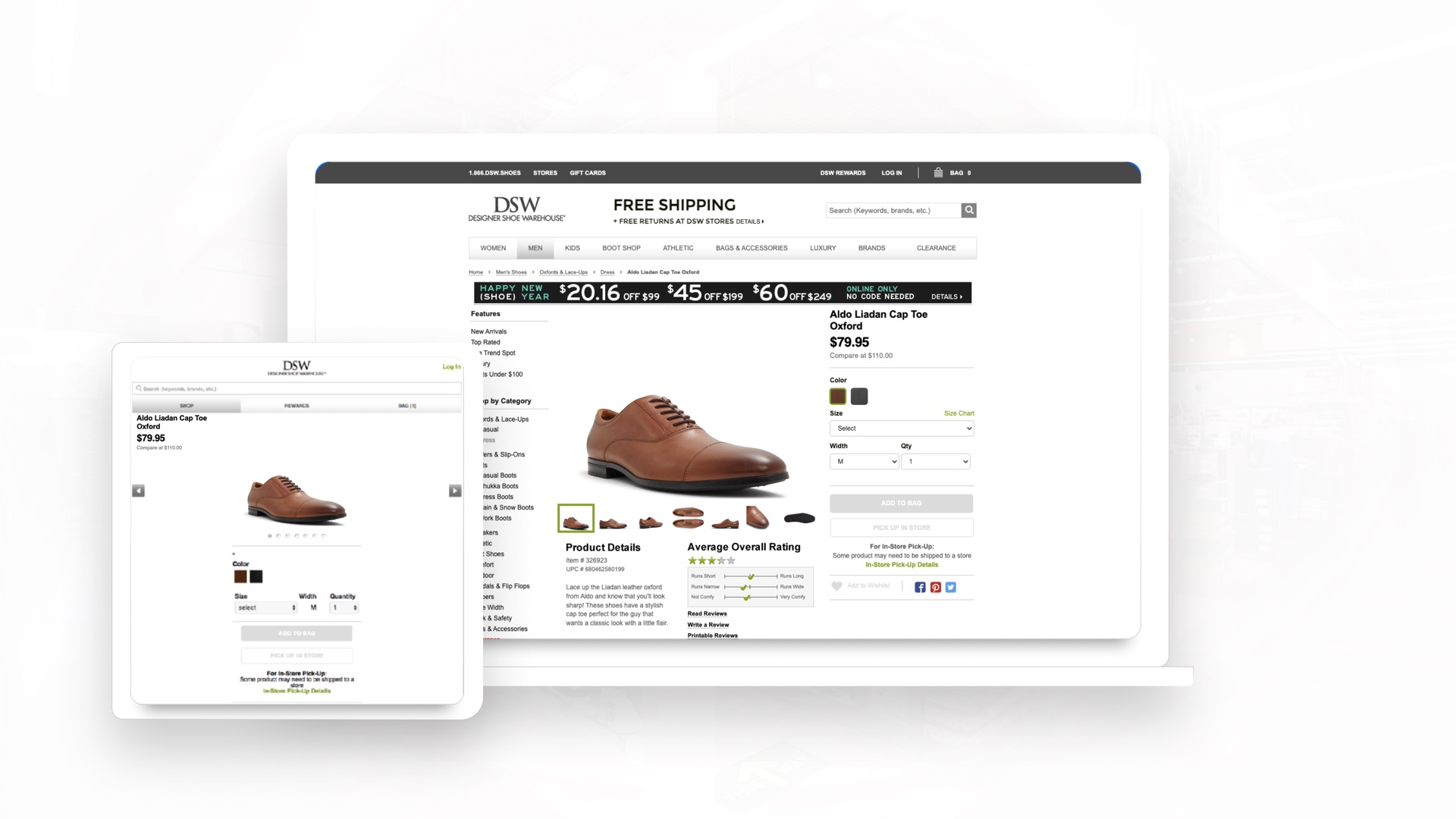
  <img src="assets/img/work/dsw/fig1-0.jpg" srcset="assets/img/work/dsw/fig1-0-640.webp 640w, assets/img/work/dsw/fig1-0-768.webp 768w, assets/img/work/dsw/fig1-0-1024.webp 1024w, assets/img/work/dsw/fig1-0-1440.webp 1440w, assets/img/work/dsw/fig1-0-1920.webp 1920w" sizes="(min-width: 1568px) 1440px, 100vw" alt="The same DSW product page on desktop and on the m-dot site" width="1920" height="1080" loading="lazy" decoding="async">
  <figcaption>Fig 1.0. The same product page on desktop and m-dot. Two codebases, two content updates, and SEO equity split between them.</figcaption>
</figure>
```

#### Image Split

- Figma: `image-split`, node `2213:655`
- Variants: right, left, bottom × 1440, 768, 390
- Classes: `.cs-split .cs-split--image-first`
- Playground: https://zachblevins.com/design-system#media

Text and image side by side from 1200, stacked below. The image side can lead.

```html
<div class="cs-split">
  <div class="cs-sub">
    <p class="t-eyebrow">My Part</p>
    <h3 class="skill__title">A Team of Two, Plus Partners</h3>
    <div class="cs-sub__body">
      <p class="skill__detail">Design was my manager and me. I did the visual lifting on both products, with partners where the website needed scale.</p>
    </div>
  </div>
  <figure class="cs-figure">
    <img src="assets/img/work/dsw/fig1-0.jpg" srcset="assets/img/work/dsw/fig1-0-640.webp 640w, assets/img/work/dsw/fig1-0-768.webp 768w, assets/img/work/dsw/fig1-0-1024.webp 1024w, assets/img/work/dsw/fig1-0-1440.webp 1440w, assets/img/work/dsw/fig1-0-1920.webp 1920w" sizes="(min-width: 1568px) 704px, (min-width: 1200px) 50vw, 100vw" alt="The same DSW product page on desktop and on the m-dot site" width="1920" height="1080" loading="lazy" decoding="async">
    <figcaption>Fig 1.0. The same product page on desktop and m-dot. Two codebases, two content updates, and SEO equity split between them.</figcaption>
  </figure>
</div>
```

#### Quote

- Figma: `quote`, node `2066:2098`
- Variants: 1440, 768, 390
- Classes: `.cs-quote`
- Playground: https://zachblevins.com/design-system#media

A pull quote with an optional attribution.

```html
<figure class="cs-quote">
  <blockquote class="cs-quote__body">
    <p>&ldquo;Our total company revenues set a new high of $2.8 billion. We had positive footwear comp at Designer Shoe Warehouse for the third quarter in a row. We delivered our strongest growth in digital demand in the last 9 years.&rdquo;</p>
  </blockquote>
  <figcaption class="cs-quote__attr">Roger Rawlins, CEO</figcaption>
</figure>
```

### Skill + Step

Rows that read top to bottom.

#### Skill

- Figma: `skill`, node `2182:291`
- Variants: 1440, 768, 390 × lit, unlit
- Classes: `.skills .skill-row`
- Playground: https://zachblevins.com/design-system#lists

Title and detail side by side from 768, ruled between. On Home and About the titles light up word by word as they scroll in.

```html
<ul class="skills skills--lit" aria-labelledby="what-i-do-label">
  <li class="skill-row">
    <h3 class="skill-row__title">Finding the Real Problem</h3>
    <p class="skill-row__detail">Usability testing / Research that never stops / Journey mapping / Information architecture / Knowing what to fix first</p>
  </li>
  <li class="skill-row">
    <h3 class="skill-row__title">Designing the System</h3>
    <p class="skill-row__detail">Wireframes / Figma component libraries / Design tokens / Interaction and visual design / Prototyping fast</p>
  </li>
  <li class="skill-row">
    <h3 class="skill-row__title">Building It Live</h3>
    <p class="skill-row__detail">Design engineer by default / Directing coding agents / Pixel-accurate live prototypes / Figma to front end / Web, iOS, whatever ships</p>
  </li>
  <li class="skill-row">
    <h3 class="skill-row__title">Deciding What Gets Built</h3>
    <p class="skill-row__detail">Working with founders / Roadmaps / Tying design to the business / Cutting the backlog down</p>
  </li>
  <li class="skill-row">
    <h3 class="skill-row__title">Leading the Work</h3>
    <p class="skill-row__detail">Creative direction / Managing contractors / Fixing the process / Getting teams pointed the same way</p>
  </li>
  <li class="skill-row">
    <h3 class="skill-row__title">Building the Brand</h3>
    <p class="skill-row__detail">Identity / Marketing sites / Collateral / Brand guidelines</p>
  </li>
  <li class="skill-row">
    <h3 class="skill-row__title">Keeping Things Moving</h3>
    <p class="skill-row__detail">Mentoring / Helping dev ship faster / The parts of agile that actually help / Working across teams</p>
  </li>
</ul>
```

#### Step

- Figma: `step`, node `2081:800`
- Variants: 1440, 768, 390
- Classes: `.skill-list .skill--step`
- Playground: https://zachblevins.com/design-system#lists

Numbered process rows on My Approach, ruled between. The number column sizes to its digits.

The markup runs long; copy it from `approach.html`, or from the playground's code view.

### Input

The one form on the site: the access code for a locked case study.

#### Input

- Figma: `input`, node `2146:903`
- Variants: default, hover, active, input, error-default, error-hover
- Classes: `.field .field__input .field__toggle`
- Playground: https://zachblevins.com/design-system#forms

A label, the input and a show / hide toggle, inside the access card. An error swaps the hint for a message in Danger red.

```html
<form class="gate-card" data-gate-form="prizepicks" novalidate>
  <button class="tool-btn gate-card__close" type="button" aria-label="Close" data-gate-close><span class="icon icon--20 icon--ink" aria-hidden="true"><svg width="24" height="24" viewBox="0 0 24 24"><use href="#i-x"></use></svg></span></button>
  <div class="gate-card__header">
    <h2 class="gate-card__title" id="gate-title">Enter Password</h2>
    <p class="gate-card__desc" id="gate-desc">This project is password-protected. Please enter the access code provided to view the case study.</p>
  </div>
  <div class="field">
    <label class="field__label" for="gate-code">Access code</label>
    <div class="field__control">
      <input class="field__input" id="gate-code" name="code" type="password" autocomplete="current-password" autocapitalize="off" autocorrect="off" spellcheck="false" enterkeyhint="go" required aria-describedby="gate-error">
      <button class="tool-btn tool-btn--xs field__toggle" type="button" aria-label="Show access code" aria-pressed="false" data-gate-reveal><span class="icon icon--16 icon--ink" aria-hidden="true"><svg width="24" height="24" viewBox="0 0 24 24"><use href="#i-eye-off"></use></svg></span></button>
    </div>
    <p class="field__error" id="gate-error" role="alert"></p>
  </div>
  <button class="btn btn--primary btn--cta gate-card__submit" type="submit"><span>Submit</span><span class="icon" aria-hidden="true"><svg width="24" height="24" viewBox="0 0 24 24"><use href="#i-arrow-ur"></use></svg></span></button>
  <p class="gate-card__request"><span>Don&rsquo;t have the access?</span><a class="gate-card__link" href="/contact">Request access</a></p>
</form>
```

### Marquee

The only component that moves on its own.

#### Marquee

- Figma: `marquee · marquee__item`, node `2066:2090 · 2179:517`
- Variants: 1440, 768, 390 × default, hover × gray, full
- Classes: `.marquee .marquee__item`
- Playground: https://zachblevins.com/design-system#motion

Two identical sets slide in a loop with no JavaScript, edges fading out. Hover or tap a logo to light it: full color, lifted, name underneath. Stops for reduced motion.

The markup runs long; copy it from `approach.html`, or from the playground's code view.

### Media Player

Custom controls over a native video.

#### Media Player

- Figma: `player`, node `2066:2270`
- Variants: idle, playing
- Classes: `.player`
- Playground: https://zachblevins.com/design-system#player

Lime controls and scrubber over a dark frame. Without JavaScript the browser's controls stay, so it always plays. This demo shows the poster only; the footage is behind the PrizePicks access code.

Its markup lives in the locked PrizePicks case study. Use the playground's code view.

### Footer

The same footer closes every page.

#### Footer, Desktop

- Figma: `footer`, node `2182:162`
- Variants: 1200
- Classes: `.footer`
- Playground: https://zachblevins.com/design-system#footer

Desktop, 1200 and up. The call to action on the left, page and social links in two columns on the right, and the legal line, credit and llms.txt along the bottom. Dark in both themes.

```html
<footer class="footer">
  <div class="shell footer__inner">
    <div class="footer__top">
      <div class="footer__cta">
        <div class="footer__cta-head">
          <p class="t-eyebrow t-eyebrow--accent">Contact</p>
          <p class="footer__title">Looking for a Designer Who Can Do All of It?</p>
        </div>
        <a class="btn btn--accent btn--cta" href="/contact">
          <span>Get in touch</span>
          <span class="icon" aria-hidden="true"><svg width="24" height="24" viewBox="0 0 24 24"><use href="#i-arrow-ur"></use></svg></span>
        </a>
      </div>
      <nav class="footer__links" aria-label="Footer">
        <ul class="footer__col">
        <li><a class="footer__link" href="/work">Work</a></li>
        <li><a class="footer__link" href="/about">About me</a></li>
        <li><a class="footer__link" href="/approach">My approach</a></li>
        <li><a class="footer__link" href="/contact">Contact me</a></li>
        </ul>
        <ul class="footer__col">
        <li><a class="footer__link" href="https://www.linkedin.com/in/zachblevins" target="_blank" rel="noopener noreferrer"><span>LinkedIn</span><span class="icon" aria-hidden="true"><svg width="24" height="24" viewBox="0 0 24 24"><use href="#i-arrow-ur"></use></svg></span></a></li>
        <li><a class="footer__link" href="https://twitter.com/zblevins_" target="_blank" rel="noopener noreferrer"><span>X (Twitter)</span><span class="icon" aria-hidden="true"><svg width="24" height="24" viewBox="0 0 24 24"><use href="#i-arrow-ur"></use></svg></span></a></li>
        <li><a class="footer__link" href="https://dribbble.com/zachblevins" target="_blank" rel="noopener noreferrer"><span>Dribbble</span><span class="icon" aria-hidden="true"><svg width="24" height="24" viewBox="0 0 24 24"><use href="#i-arrow-ur"></use></svg></span></a></li>
        <li><a class="footer__link" href="https://github.com/blev-commits" target="_blank" rel="noopener noreferrer"><span>GitHub</span><span class="icon" aria-hidden="true"><svg width="24" height="24" viewBox="0 0 24 24"><use href="#i-arrow-ur"></use></svg></span></a></li>
        </ul>
      </nav>
    </div>
    <div class="footer__bottom">
      <div class="footer__meta">
        <p class="footer__legal">&copy; Zach Blevins. All Rights Reserved 2026</p>
        <p class="footer__legal">Made with <svg class="footer__heart" role="img" aria-label="love" viewBox="0 0 24 24"><path d="M2 9.5a5.5 5.5 0 0 1 9.591-3.676.56.56 0 0 0 .818 0A5.49 5.49 0 0 1 22 9.5c0 2.29-1.5 4-3 5.5l-5.492 5.313a2 2 0 0 1-3 .019L5 15c-1.5-1.5-3-3.2-3-5.5"/></svg> in Figma built with Claude</p>
      </div>
      <a class="footer__agents" href="llms.txt" type="text/plain">llms.txt</a>
    </div>
  </div>
</footer>
```

#### Footer, Tablet

- Figma: `footer`, node `2182:162`
- Variants: 768
- Classes: `.footer`
- Playground: https://zachblevins.com/design-system#footer

Tablet, 768 to 1199. The same parts with tighter gaps; the links keep their two columns beside the call to action.

Same markup as Footer, Desktop; the stylesheet lays it out for the width.

#### Footer, Phone

- Figma: `footer`, node `2182:162`
- Variants: 390
- Classes: `.footer`
- Playground: https://zachblevins.com/design-system#footer

Phone, up to 767. Everything stacks: the call to action and its full-width button, then the two link columns, then the legal lines.

Same markup as Footer, Desktop; the stylesheet lays it out for the width.

### Icons + Texture

Lucide icons inlined as symbols, 24px grid, 2px strokes, round caps and joins. Color follows the text.

#### Icon

- Figma: `icon`, node `2116:644`
- Variants: 50 glyphs
- Classes: `.icon`
- Playground: https://zachblevins.com/design-system#icons

Lucide symbols in each page's sprite, referenced by id. Color follows the text.

```html
<span class="icon" aria-hidden="true"><svg width="24" height="24" viewBox="0 0 24 24"><use href="#i-arrow-ur"></use></svg></span>
```

#### Texture

- Figma: `hatch`, node `2402:2`
- Classes: `.hatch`
- Playground: https://zachblevins.com/design-system#icons

The diagonal hatch behind page titles and the marquee, and on a linked result card when you hover it.

```html
<div class="hatch" style="height:160px"></div>
```

## Before you hand work back

- Every color, size, gap and duration you wrote is a token, and no new hex values appear.
- It reads at 390, 768 and 1200, in Light and in Dark.
- Text clears WCAG AA in both themes, and focus is visible.
- Components match their markup above; nothing was restyled locally to look like one.
- The copy has no em dashes.