Esports.gg
Leveling Up Engagement: Redesigning esports.gg for Growth and Revenue
esports.gg made money when people stayed. They were not staying. I led the redesign of the homepage, article experience, and navigation, which doubled time on site and dropped bounce rate from 72% to 54.65%.
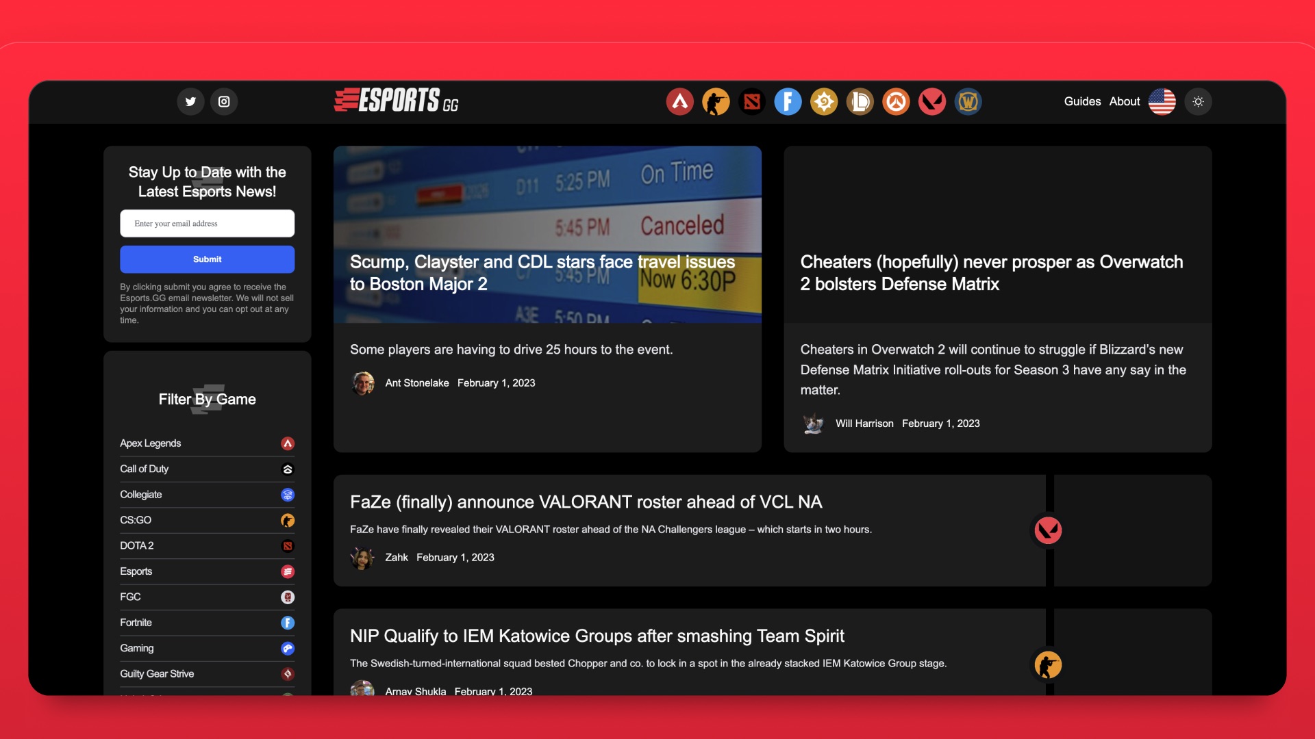
Overview
A content site that people left
Editorial businesses live or die on a single question: does the next click happen? esports.gg had the audience, the coverage, and the traffic. What it did not have was a reason to stay past the article someone landed on.
That distinction matters because it defines the target. This was never about a site being ugly (Fig 1.0). Bounce rate, session length, and monthly visitors were the business, and every one of them was pointing the wrong direction.
The hurdles
No clear point of view:
User surveys said the site struggled to communicate what it was. Visitors landed, read one thing, and had no sense of what else was there for them.
Navigation that did not lead anywhere:
Getting from one piece of content to the next relied on the reader already knowing what to look for. On a site with this much coverage, that is a lot of value sitting unreachable.
Revenue tied directly to the problem:
Ad revenue scales with engagement. A 72% bounce rate was not a UX complaint, it was the P&L, which meant a slow fix was not really a fix.
Goal:
Turn a single landing into a session.
Deep dive
Reading is not the metric, staying is
Nearly all traffic arrives on an article. Somebody searches a patch note or a tournament result, gets what they came for, and closes the tab. At 72% bounce, that was happening on roughly three of every four visits. The article did its job perfectly and the business gained almost nothing.
Surveys confirmed the shape of it. Readers were not confused by any individual page, they simply had no map of the site and no reason to believe a second thing worth reading existed. That reframed the work away from polishing article layouts and toward the surfaces that decide what happens after someone finishes reading.
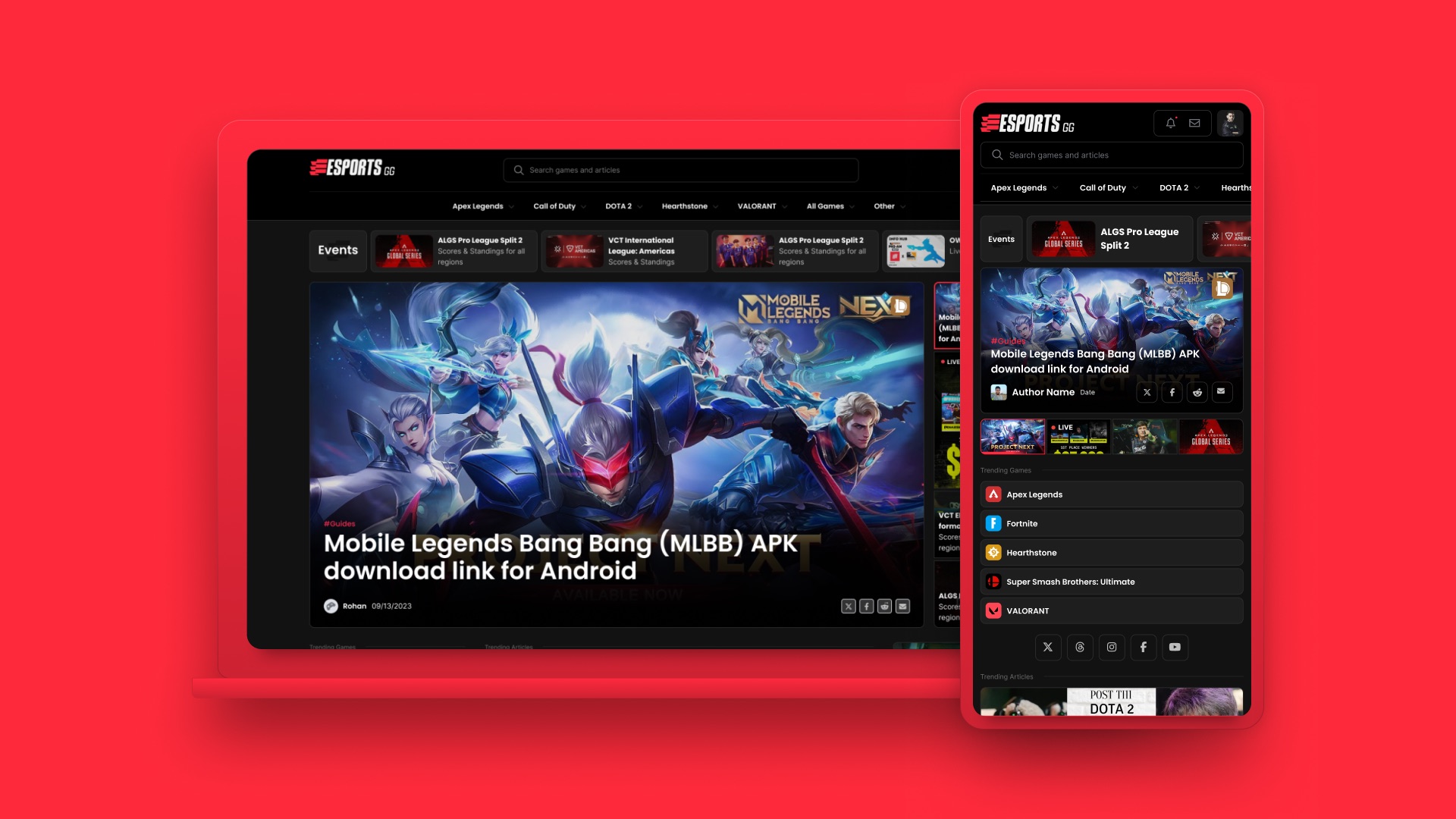
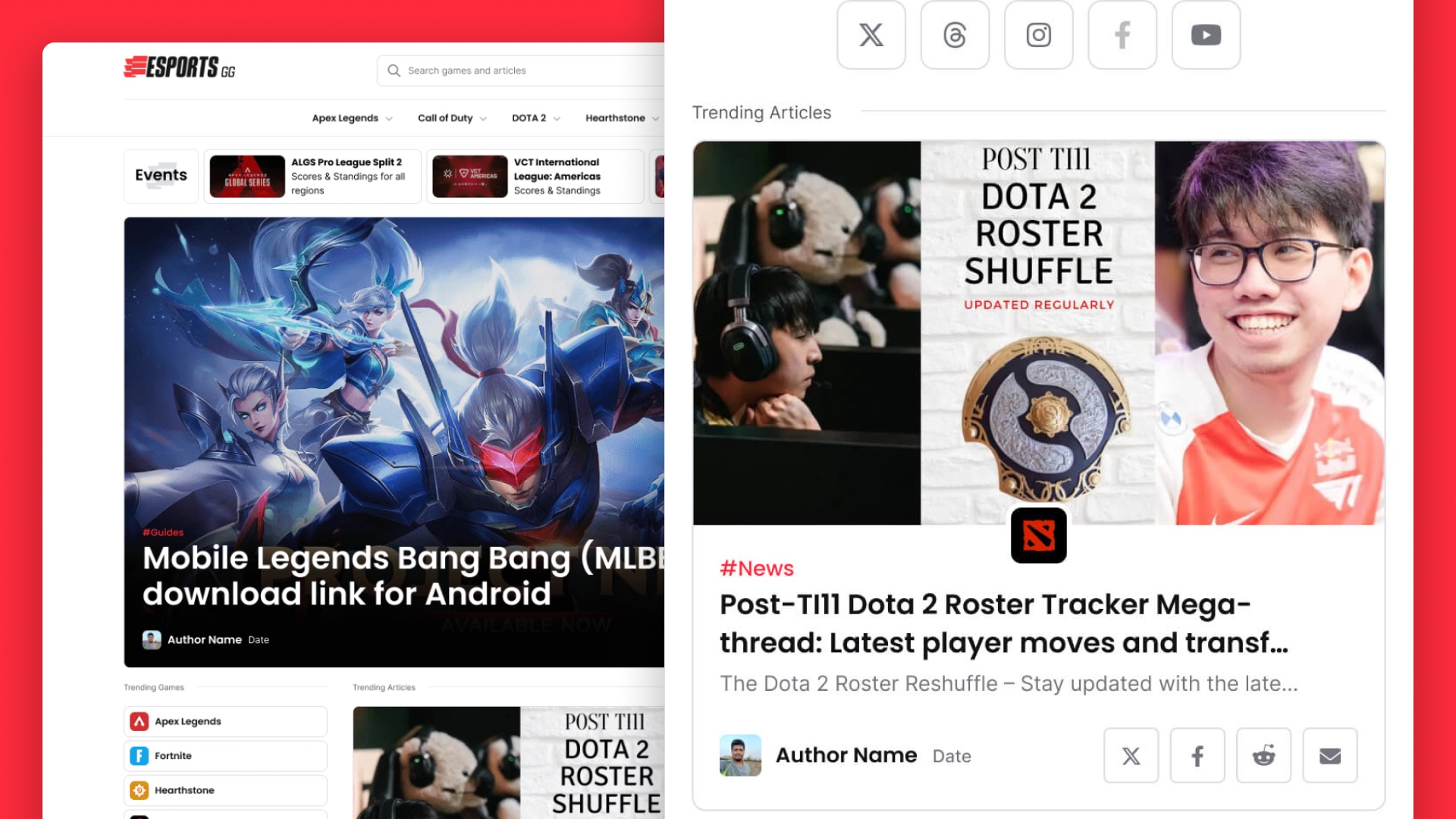
So the redesign concentrated on three: search, so anyone could actually find coverage on demand; a trending games section, so the site could put something in front of a reader before they went looking; and navigation that let people explore by interest instead of by memory. All of it responsive (Fig 2.0), since a large share of this audience reads on a phone.
The decision
Skip low fidelity and go straight to the real thing
The timeline was not generous, and the metrics were moving in the wrong direction while we worked. That ruled out a long ramp.
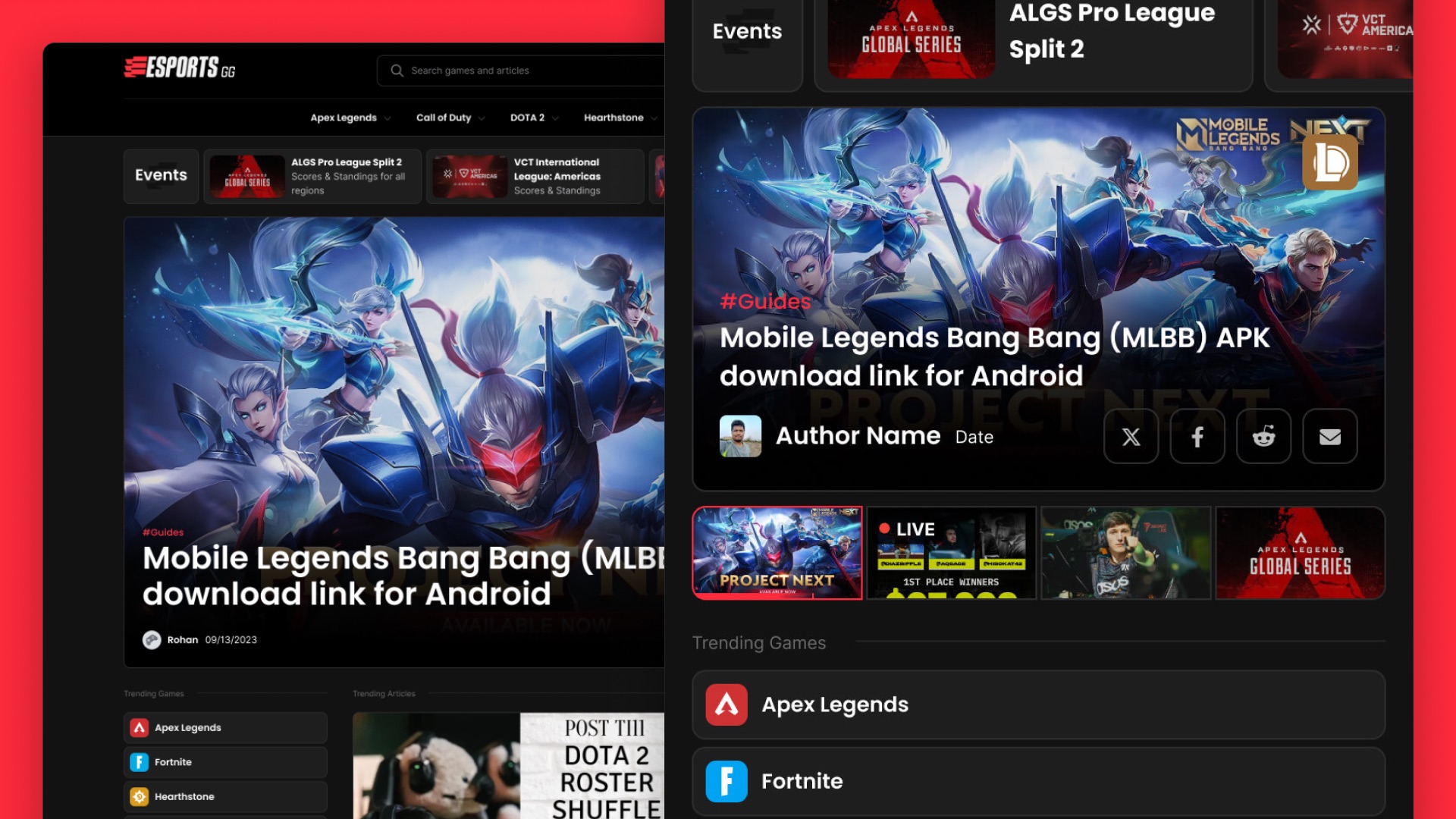
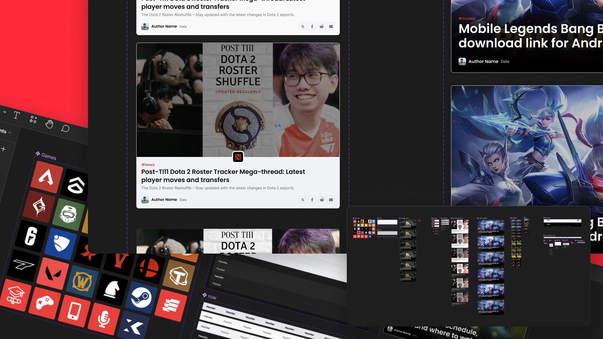
I went from surveys directly into high-fidelity mockups, no low-fidelity wireframes in between. The reason it worked is that we already had a company design system, so component decisions were largely made before I opened the file. Adapting it to esports.gg’s brand meant most of my attention could go to structure and hierarchy rather than to reinventing buttons and type scales.
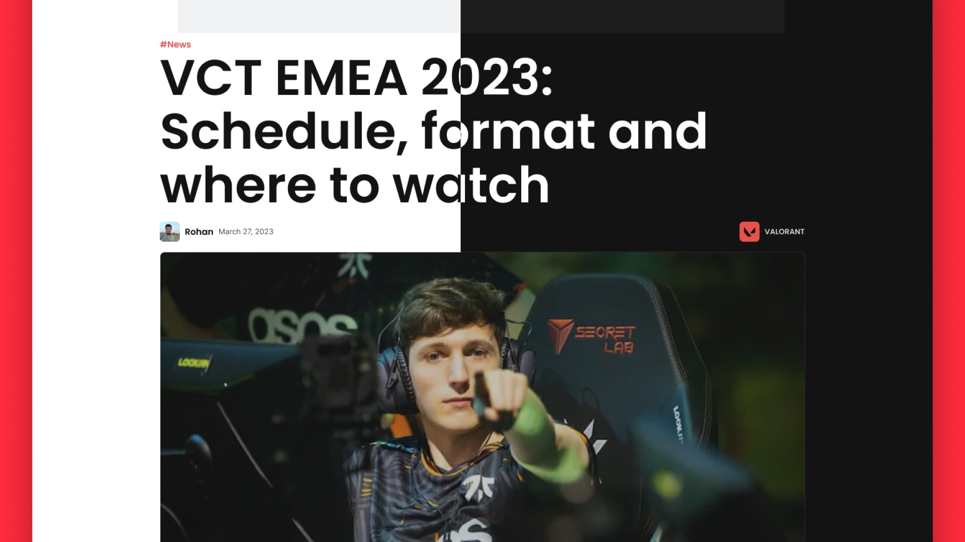
The payoff was feedback quality. High-fidelity homepage and article screens (Fig 3.0) gave people something honest to respond to, which surfaced real reactions weeks before a wireframe process would have produced anything testable.
The tradeoff is worth stating plainly. Skipping low fidelity narrows how many structural directions you seriously explore, because the first credible thing you build starts to feel settled. With an existing design system and a well-defined problem, that risk was small. Without either, it would not have been.
Collaboration
Three people, one decision-making unit
The product trio ran this: me, the Product Owner, and the Engineering Lead. Design brief, feature kickoffs, sprints, releases, reviews, the same three people through all of it.
The practical effect is that scope, feasibility, and design intent got resolved in conversation rather than in a handoff document. Nothing reached engineering as a surprise, and nothing got built that we had not agreed served the metrics we were chasing.
Process
From idea to reality
Hands-on Validation
Homepage and article experience went in front of users first, since those were the two surfaces carrying the entire engagement problem. Getting reactions on them early meant the rest of the redesign was built on something that had already been tested rather than assumed.
Engineering the Gap
Iteration continued after launch instead of stopping at it. Real engagement data replaced survey responses as the input, which is a better signal than anything you can get in a session, and the design kept adjusting to it.
Stress testing paradigms
Surveys, prototyping, and validation
The measure was behavioral, not stated. People will tell you a site feels better and still leave after ninety seconds, so the thing worth watching was whether sessions actually got longer.
They did. Time on site doubled, and bounce fell from 72% to 54.65%, moving the site out of the range where nearly every visit ended after one article and into the band a healthy content hub operates in. Monthly visitors grew alongside it. Deeper engagement per visitor is exactly the outcome those surfaces were designed to produce, and it showed up behaviorally rather than only in survey responses.
Bounce rate
72% → 54.65%
A 17-point drop, landing in the range typical for content hubs.
Time on site
Doubled
One minute to two, measured after the redesign shipped.
Discovery
Improved
Search and trending games gave readers a next step from any page.
By the numbers
Takeaways and business impact
54.65%
Bounce Rate
Down from 72% before the redesign.
2 min
Time On Site
Up from one minute.
1.8m
Monthly Visitors
Engagement was the revenue model
Ad income scales with session depth, so doubling time on site and cutting bounce by 17 points was not a UX win that happened to please the business. It was the point of the project.
The design system bought the timeline
Working from established components is what made a fast redesign possible without the quality falling apart. It is also why skipping low fidelity was a defensible call rather than a shortcut.
A trio moved faster than a process
Design, product, and engineering deciding together removed the handoff cycle entirely. On a project measured in weeks, that structure was worth more than any individual method.