Digital transformation
DSW’s Digital Transformation Drives Record-Breaking Revenue of $2.8 Billion
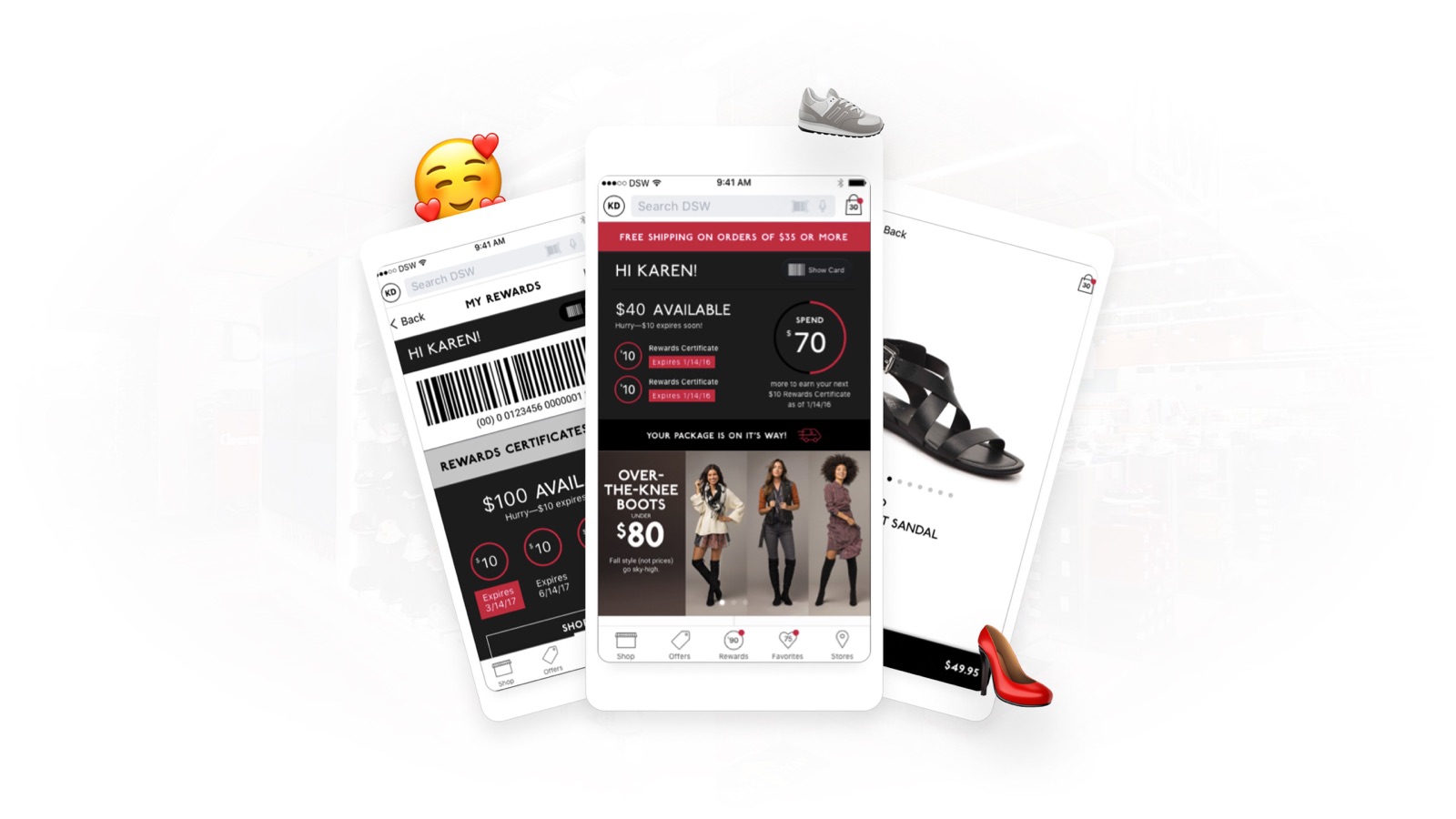
DSW ran desktop and mobile as two separate properties with an app that could not sell shoes. I worked on the rebuild that consolidated them into one responsive platform and shipped a native iOS app alongside it, five months after leadership asked for one.
Overview
Two properties, three problems
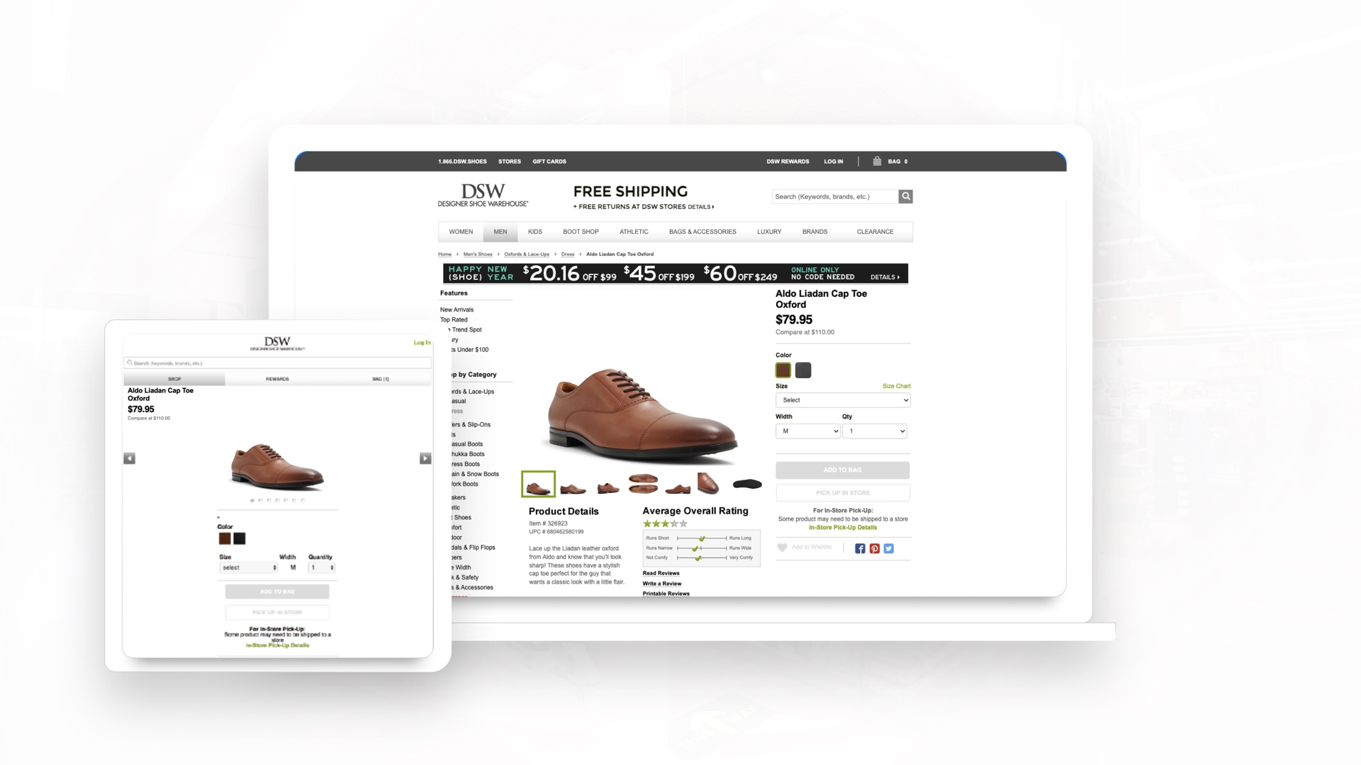
An m-dot setup means everything gets built twice. Two codebases, two content updates, two sets of bugs, and SEO equity split between them. Over time the desktop and mobile experiences drift apart until they stop feeling like the same retailer.
That was the inherited situation (Fig 1.0). The app was worse, and the fix had to cover both.
The hurdles
A Fractured Web Presence:
Desktop and m-dot ran as separate properties, splitting SEO equity and letting the two experiences drift. Every feature had to be built and maintained twice.
An App That Could Not Sell:
Shopping was not possible in it, and most reviewers never got past the launch screen. Anyone who did hit friction the moment they moved between the app and the site.
A Five-Month Scope Shift:
A native iOS app was requested five months from launch. Two products now had to ship on a timeline built for one, forcing tight MLP scoping alongside the Angular rebuild.
Goal:
One unified platform, replacing a split that cost twice to maintain.
Deep dive
The old app could not sell shoes
That is not a turn of phrase. Shopping simply was not possible in it.
The reviews told the rest of the story. Most people never made it past the launch screen, and the ones who did hit friction every time they moved between the app and the site. The two surfaces felt like separate brands rather than one company.
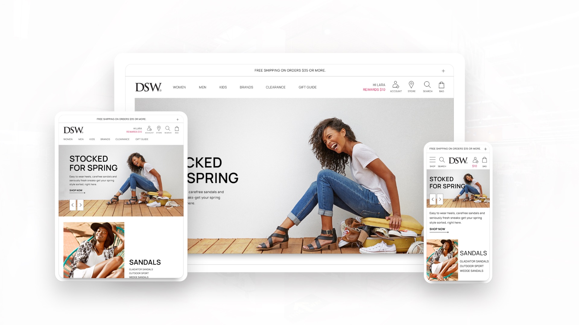
That was also the opening. With nothing worth preserving and no legacy behavior to protect, we could build what DSW actually needed instead of patching what existed (Fig 1.1).
We had a tremendous chance to build something great.
The scope shift
Five months from launch, leadership asked for an app
The responsive site was already in flight, which meant defining an entire second product on a timeline built for one.
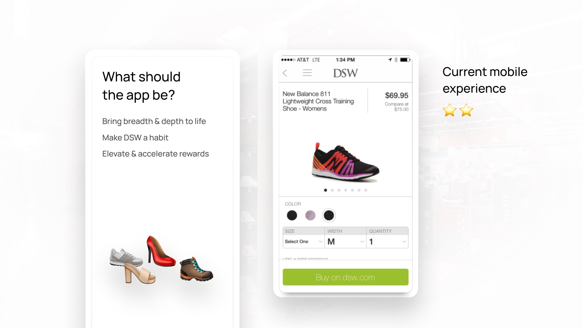
We moved fast on a content strategy anchored to a single idea (Fig 2.0): the app should be a constant companion, connecting the store and the screen rather than duplicating the website. That pointed us to the essentials, namely rewards, gift cards, shopping, and inspiration, along with a streamlined path from browsing to buying, scoped for DSW’s most loyal shoppers.
The intent behind it followed naturally. Bring the breadth and depth of the assortment to life, make DSW a habit instead of an occasional stop, and elevate the rewards program so loyalty compounds with every visit.
The decision
Scope for lovable, not minimal
Five months for a native app forces a hard question about what gets cut. The usual answer is a minimum viable product, ship the smallest thing that technically works, and iterate after launch.
We scoped for a Minimal Lovable Product instead. The distinction matters given the history here. DSW had already shipped an app people abandoned at the launch screen, and a second thin release would have confirmed what those reviewers already believed. The bar was not whether the app functioned. It was whether someone would keep it installed.
So fewer features, finished properly (Fig 2.1). Rewards, gift cards, shopping, and inspiration, each one complete rather than five things half-built. What got cut was breadth, and breadth is recoverable in a later release. Trust is not.
Process
From idea to reality
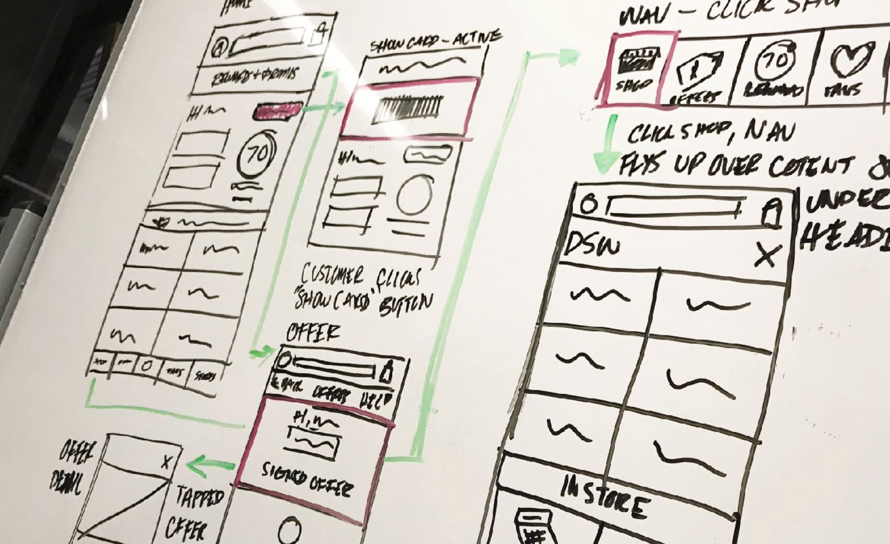
Ambitious goals fueled the work. Whiteboards filled with ideas that became interactive prototypes, and those prototypes faced the only test that mattered: real customers.
Hands-on Validation
Prototypes went in front of shoppers early and often, and the four features that survived scoping are what shipped (Fig 3.0). We watched where people hesitated, where they tapped without thinking, and where the path to a purchase broke down. Each round sent us back with something specific to fix rather than a guess to argue about.
Engineering the Gap
Design and engineering worked the problem together instead of in sequence. With five months on the clock, every interaction had to be evaluated for what it would cost to build, and scope decisions got made in the room rather than discovered late.
Stress testing paradigms
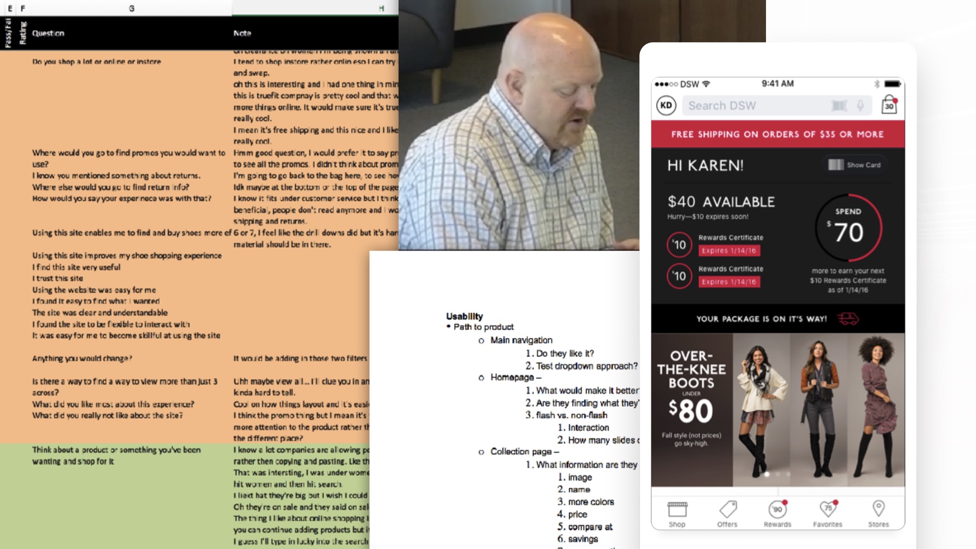
Wire-framing, prototyping, and validation
We put the design in front of shoppers before a line of production code was written. The open question was whether adding rewards, gift cards, and store utility to the app would clutter the one thing people came to do, which was find a pair of shoes and buy them.
It did not. Loyalty members responded fastest to seeing their points while they browsed rather than tucked away in an account screen, and the shopping path held up under testing without anyone losing the thread. What came back was refinement, not rework: label changes, a few adjustments to the product detail layout, and ideas we parked for later releases.
Cognitive load
Neutral / Unchanged
Rewards and store features sat alongside the shopping flow without slowing it down.
Loyalty visibility
Positive Signal
Testers expected points and offers surfaced during browsing, not after checkout.
“Our total company revenues set a new high of $2.8 billion. We had positive footwear comp at Designer Shoe Warehouse for the third quarter in a row. We delivered our strongest growth in digital demand in the last 9 years.”
By the numbers
Takeaways and business impact
$2.8B
Total Company Revenue
A new company high, closing the year on record digital performance.
1.5m
App Downloads in Year One
A product with nothing to inherit, reaching scale from a standing start.
+26%
Digital Demand Growth
The strongest growth in digital demand DSW had seen in nine years.
4.8
iOS App Rating
Ranked #88 in Shopping, across 63.4K reviews.
A Full Reversal in App Sentiment
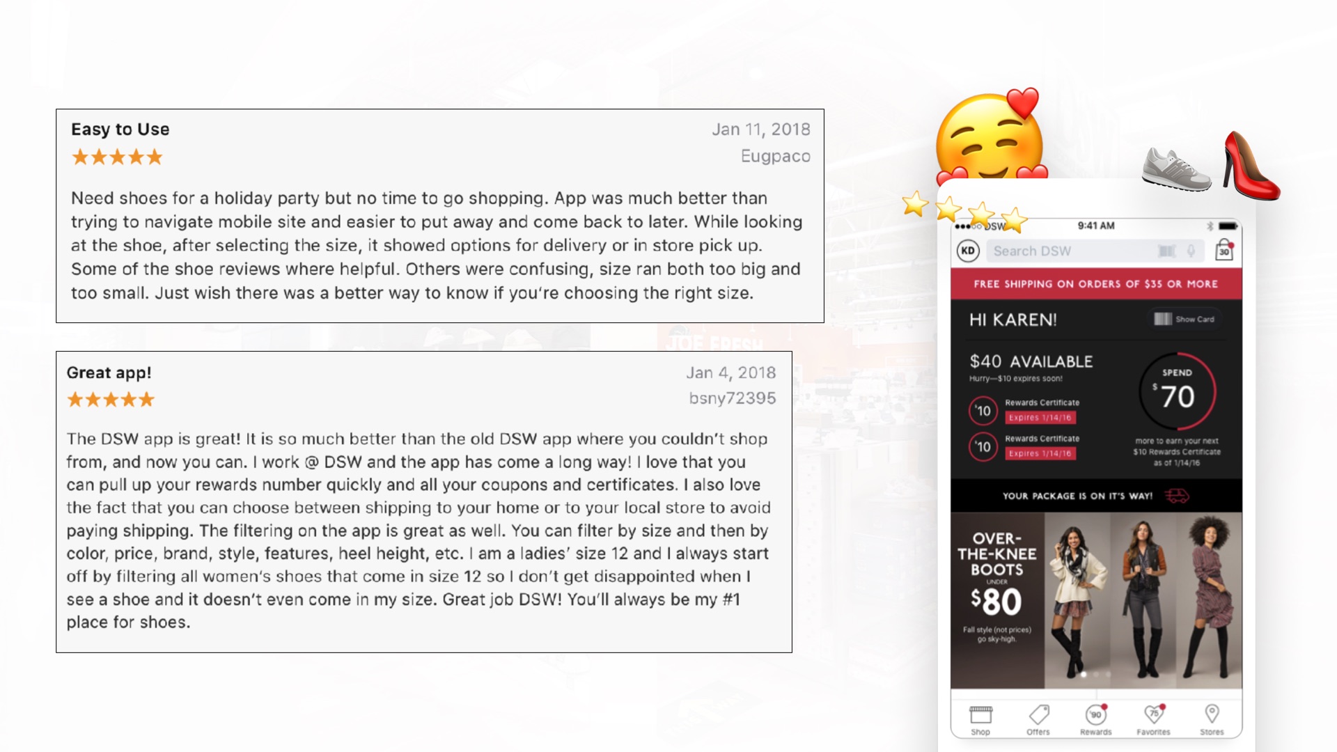
The previous app could not sell shoes, and most reviews came from people who never got past the launch screen. It now holds 4.8 stars on iOS across 63.4K reviews, 4.4 on Google Play, and a #88 rank in the Shopping category (Fig 4.0). That is the same audience, reassessing.
Habit, Not Just Installs
Monthly active users grew close to 5x in the app’s first year. Downloads prove interest and MAU proves the product earned a place on the home screen, which was the entire point of scoping for lovable over minimal.
A Record Cyber Monday and Rising Mobile Conversion
The redesigned site lifted conversion most on mobile, where traffic was growing fastest. Buy-online-pick-up-in-warehouse gave customers a reason to move between channels rather than choosing one, which is what a unified platform makes possible.
Consolidation Was the Structural Win
Replacing the m-dot split with one responsive platform ended the duplicate build-and-maintain cost and reunified SEO equity. Every improvement now ships once. The visible redesign was the surface of an architectural change.
“Our digital business smashed previous records this holiday including our biggest ever Cyber Monday and our redesigned website continues to boost customer conversions, particularly on mobile devices where our digital traffic is growing the most.
Customers love the increased convenience of shopping online while having the product ready for trial and pick up at one of our warehouses.
Furthermore, transaction activity on our mobile app increased with 1.5 million downloads and close to 5x more monthly active users during its first year.”