Single sign-on
Reimagining the eFuse Login Experience
Sign-in is the only screen every user has to get through, and at eFuse there were three of them. I redesigned the login and account management experience so one credential set worked everywhere.
Overview
One account, three products, zero friction
I joined eFuse as its first designer. Within a few months I was leading an effort to replace three separate login systems with one, across erena, esports.gg, and sidekick. The work looked like authentication on the surface. Underneath it was about whether eFuse was one company or three, and users had already noticed the difference.
The hurdles
Three separate front doors:
Each product handled its own authentication. Someone who used all three kept three sets of credentials, which is a strange thing to ask of people who think they are using one platform.
Nobody had a complete picture of a user:
Identity stopped at each product boundary, so profiles and preferences did too. Neither the company nor the user could see the whole account.
No design team, no dedicated time:
There was no system to build on and no process to follow, because I was the first designer there. Everyone who worked on SSO volunteered for it on top of their existing responsibilities.
Goal:
One identity across every eFuse product.
Deep dive
Three front doors to the same house
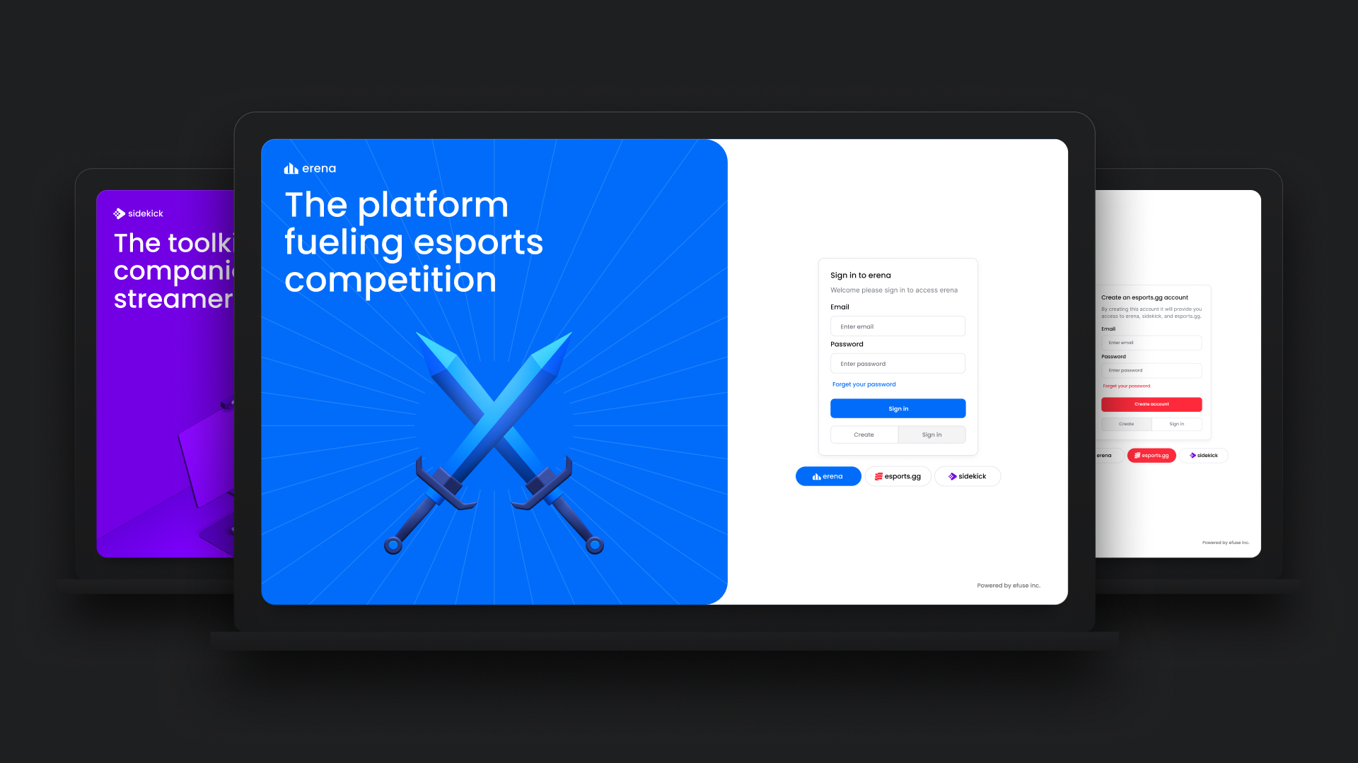
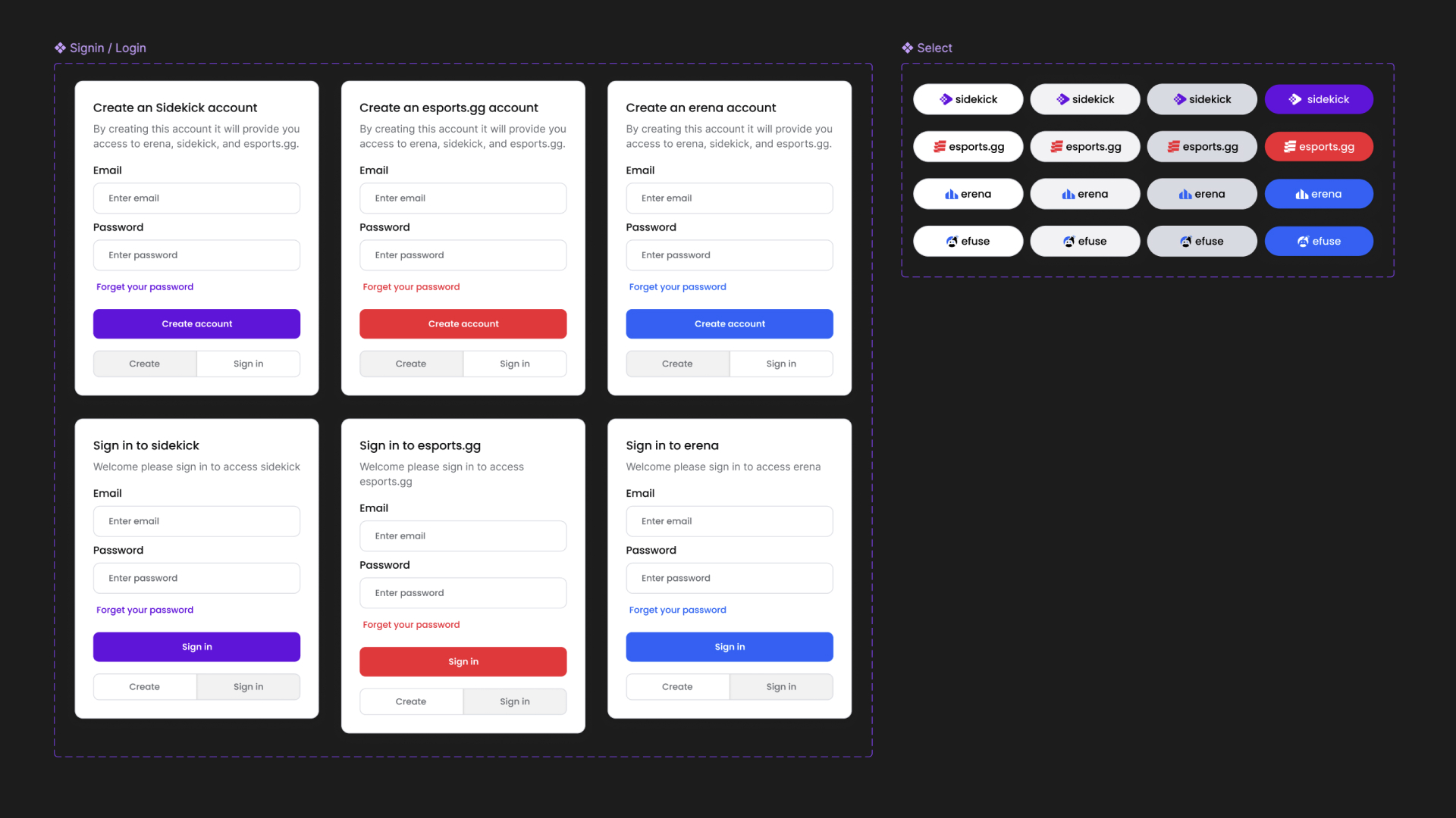
Authentication is the only screen every user is guaranteed to see. At eFuse they were seeing three of them (Fig 1.0), and each one asked for something different.
The cost of that was not obvious from inside the company. Nobody filed a ticket saying the account architecture was fragmented. What showed up instead was people staying inside whichever product they signed up for, because moving to another one meant starting over. The ecosystem existed on paper more than in practice.
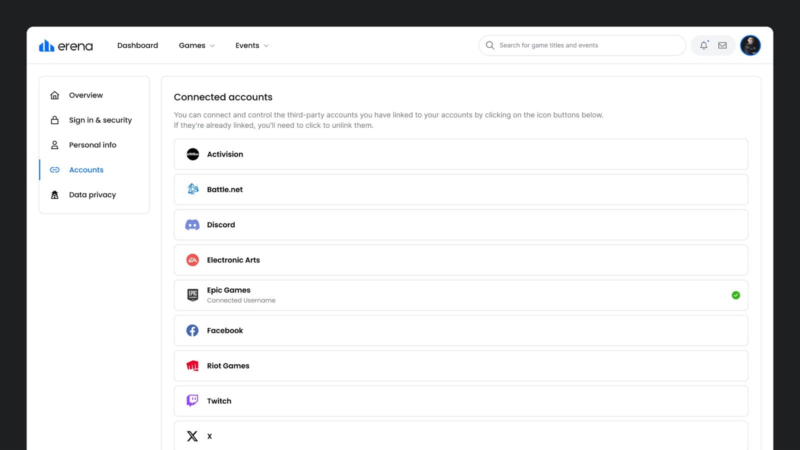
Account management had the same problem, and it was harder to see. Your name, your birthdate, your profile image, your linked gaming accounts all lived in whichever product you happened to set them in. Change something in one place and you had no reason to expect it anywhere else. Rebuilding identity (Fig 2.0) underneath three live products meant redesigning both ends of it, the way in and the place you manage what is yours.
The decision
Whose brand owns the login screen?
Here is the problem in one sentence: a person clicking sign in on esports.gg may have no idea eFuse exists.
Send that person to an eFuse-branded auth screen and you have built something that looks exactly like a phishing page. They leave. And abandonment at sign-in is worse than abandonment anywhere else, because it happens before the product gets a chance to prove anything.
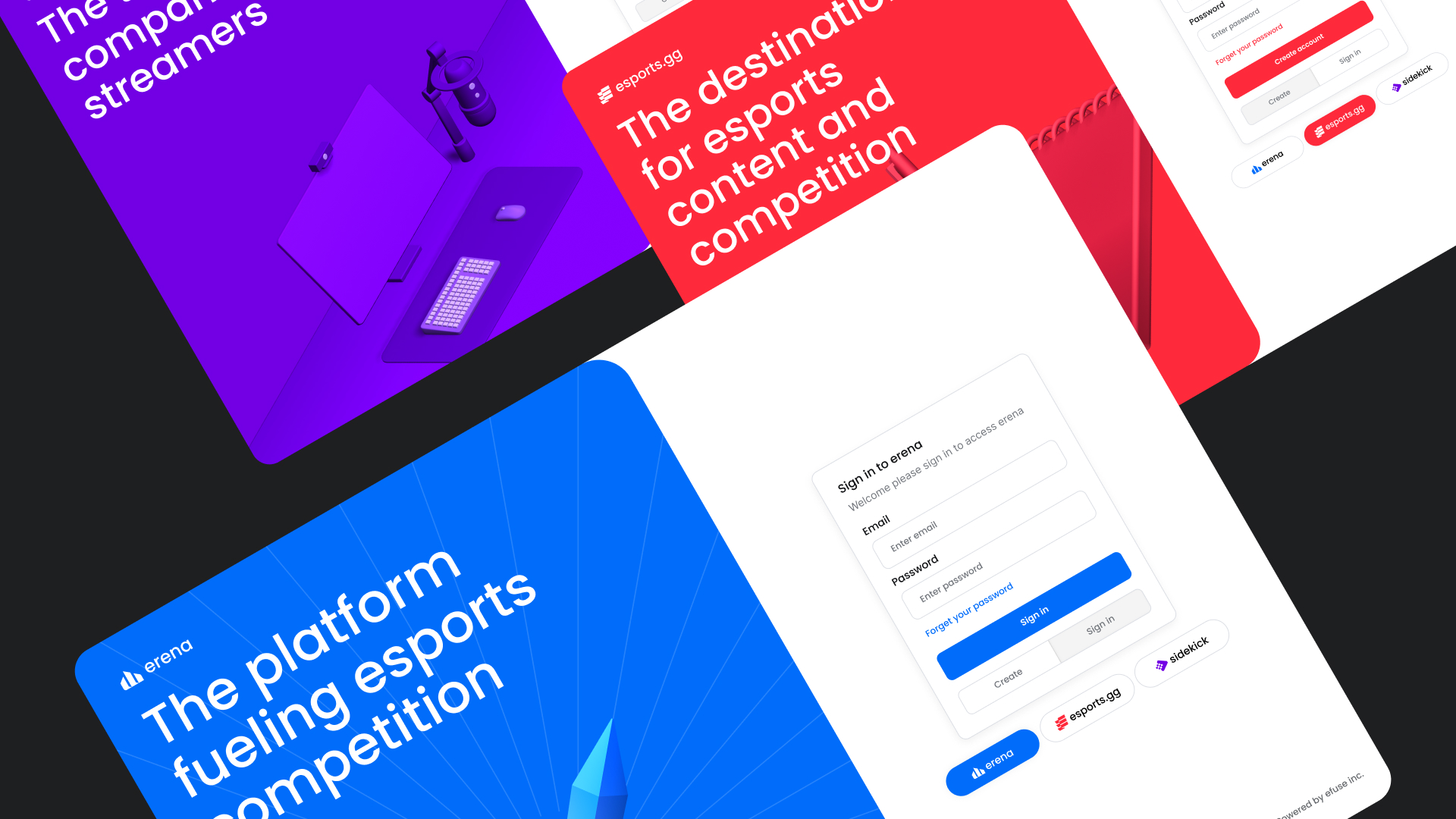
The obvious fix was to skin authentication separately for each product, but that defeats the purpose (Fig 4.0). Three login screens to maintain is what we were trying to get away from.
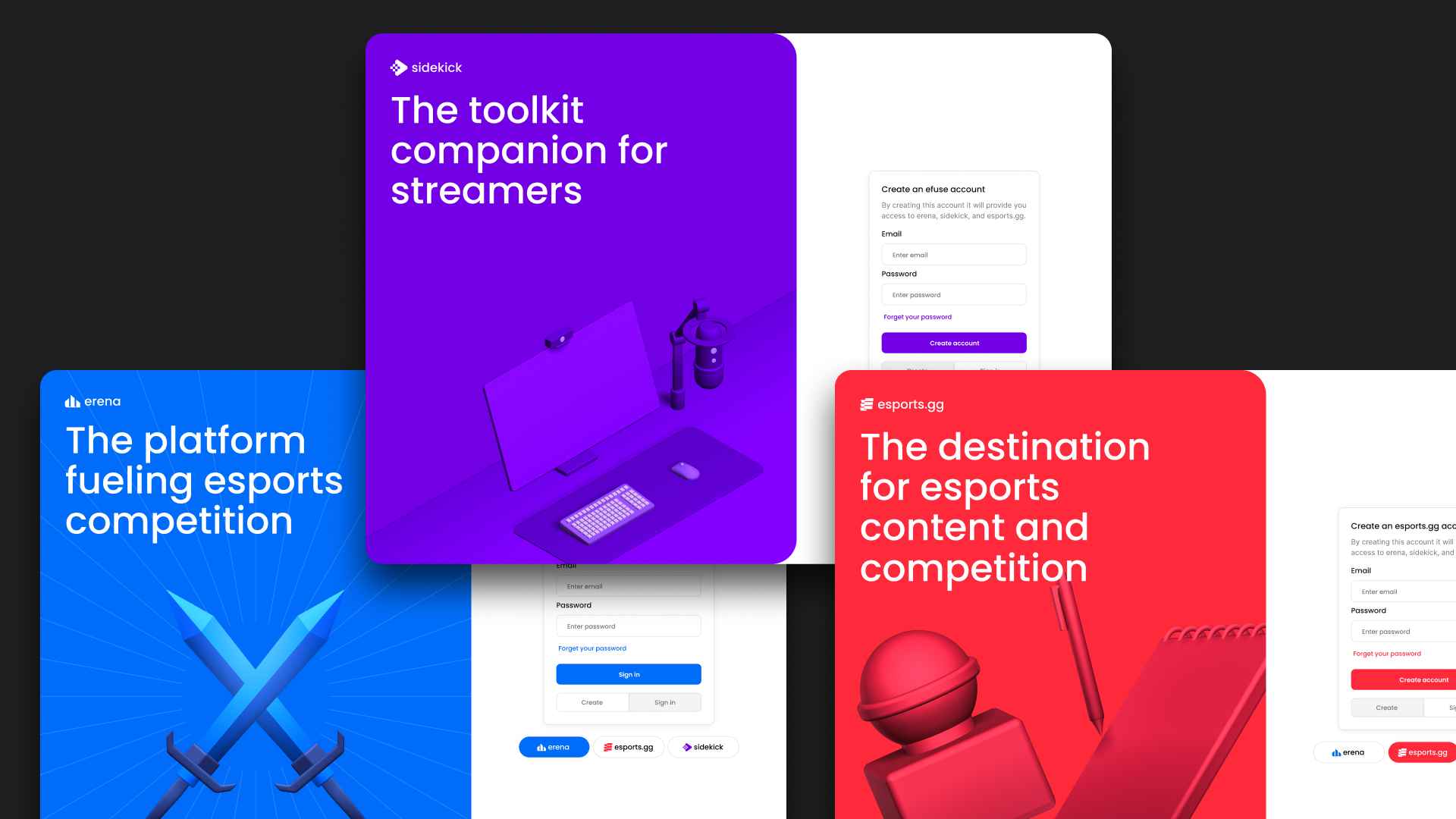
What we landed on was keeping the login in whatever brand the user arrived from (Fig 4.1). Sign in from esports.gg and you stay on an esports.gg screen. Nothing about the moment feels unfamiliar, which is the entire point.
The part I am proudest of came next. Rather than hiding the shared system, we let people click through to the other eFuse brands right from the login and watch the screen switch. Same credentials, different product. A user who had never heard of sidekick could find it while signing into something else. We kept the trust and got discovery out of it, from a screen that normally does nothing but check a password.
The account
Carrying the same logic into the account
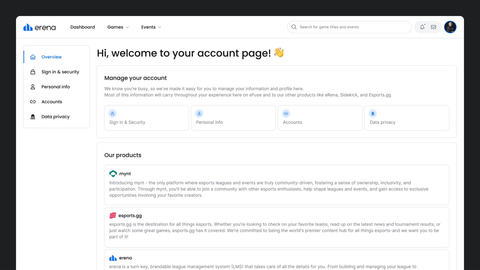
The account experience follows the identical rule. Reach it from erena and it is an erena page, sitting inside erena’s navigation, using erena’s brand. Nothing announces that you have crossed into shared infrastructure, because from the user’s point of view you have not.
I split it into five destinations rather than one long settings page: Overview, Sign in and security, Personal info, Accounts, and Data privacy. Each one answers a different question, and separating them meant a user looking to change a password never had to scroll past questions about their birthdate.
Two decisions inside that structure are worth calling out.
Telling people why we were asking
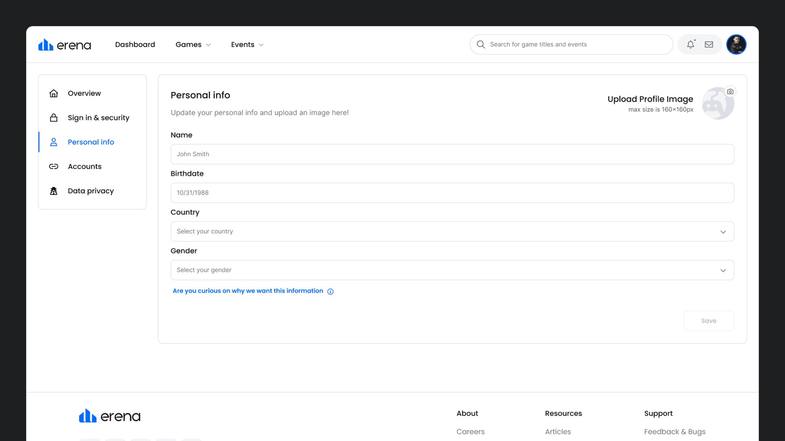
The personal info screen collects name, birthdate, country, and gender. That is more than a user expects to hand over, and in a community that is cautious about data, the ask needs a reason attached. So the form carries a link explaining exactly why each field is there (Fig 3.0). Answering the question in the moment costs one line of copy and buys a completion rate you cannot get by hoping nobody wonders.
Making linked identity a first-class surface
In esports, your Riot handle or your Epic account is closer to who you are than your email address is. The Accounts screen lets users connect and disconnect Activision, Battle.net, Discord, Electronic Arts, Epic Games, Facebook, Riot Games, Twitch, and X, with connection state visible at a glance and unlinking one click away. Linking is easy to design; unlinking usually is not, and burying it is a pattern users read as hostile. It is one tap here.
The overview page also repeats the discovery move from the login. A products section sits directly below the account controls, describing each eFuse product in plain language. Somebody managing their password can find out another product exists without ever going looking for it.
Process
From idea to reality
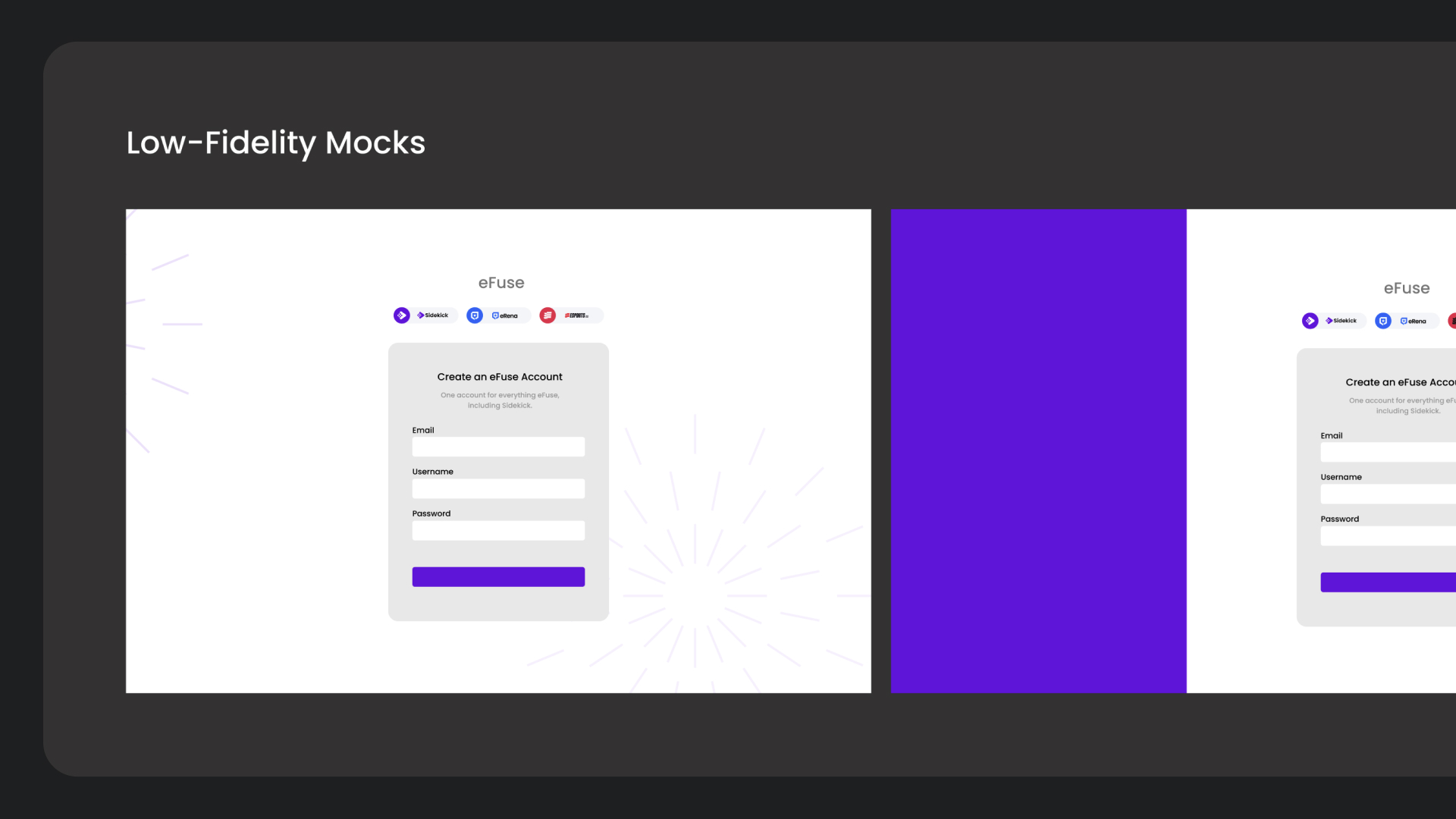
We ran this as a sprint rather than a proper design process. I wrote a light PRD, mapped flows in FigJam, and went to low fidelity only long enough to settle structure before moving to high fidelity. That order is backwards from how I would normally work, and I would defend it here: the problem was well understood, the team was small and volunteering, and a slower process would have meant no process at all because the window would have closed.
Hands-on Validation
Because we had something clickable in days, we got real reactions while there was still room to change things. Nobody was attached to the work yet, so the feedback actually landed.
Engineering the Gap
Every decision on a login screen has consequences for systems that touch every product. Third-party account linking raised that further, since each provider brings its own auth flow and its own failure states. I worked scope out with engineering as we went rather than designing something and handing it over to find out what was possible.
Stress testing paradigms
Wire-framing, Prototyping, and Validation
We tested the one thing that worried me most: whether a single account reaching three visually distinct products would feel coherent or just confusing.
People got it faster than expected. The brand switch read as a feature rather than a glitch, which was the outcome the whole approach depended on. On the account side, the thing users checked first was whether a change made in one product would actually show up in the others, which told us the promise was landing. What we got back was small: wording on error states, clarity on a few labels, and questions about what happens to accounts that already existed.
Login friction
Reduced
Three credential sets became one, without adding steps.
Cross-product recognition
Positive Signal
Users assumed changes would carry across products, and they did.
Data transparency
Positive Signal
Explaining why fields were collected removed hesitation on the personal info form.
By the numbers
Takeaways and Business Impact
One login across the ecosystem
Updates made in one product now show up in the others, so an account is something a user maintains once instead of three times.
Identity became infrastructure
Unifying authentication gave eFuse its first complete view of its users, consolidating three separate audiences into one community of 800k registered accounts.
Gaming identity, not just credentials
Nine third-party integrations let users bring the accounts they actually care about into eFuse, turning a settings page into a real profile.
The login screen earns its place
Making the umbrella clickable at sign-in turned the most purely functional screen in the product into a way to discover the rest of the platform.
A volunteer team shipped it
No headcount, no allocated time, and it still went out. That result made the argument for a real design function better than any deck would have.