Portfolio Design System

The Rules Behind Every Pixel.

The tokens and components behind zachblevins.com. Every specimen here renders from the site’s live stylesheet, and the color tokens are generated from it. If the site changes, this page changes with it.

Each component has a playground. Change its props, force a hover or an error, flip the theme, preview it at 390, 768 or 1440, then copy the markup. It all runs in a sandbox, so nothing you try here touches the site.

Layers
Primitive, Semantic, Component
Themes
Light, Dark
Breakpoints
390 mobile, 768 tablet, 1200 desktop
Source
Figma library + css/styles.css
Playgrounds
22 components, sandboxed

Color Ramps

Every ramp in the Figma library, every step a card. Click any card to copy its hex. Steps that ship carry their CSS token; the rest are in the library, ready for when the site needs them.

Brand / Primary

Figma Brand/Primary · --ds-brand-*, 11 of 11 ship

The solid neutral ramp: ink, borders and every grey surface.

Brand / Secondary

Figma Brand/Secondary · --ds-accent-*, 1 of 11 ship

The lime. Arrows, the accent button and dark mode highlights.

Ink

Figma Ink · --ds-black-*, 21 of 21 ship

Ink at every opacity in steps of 5%, for anything laid over a light ground.

Chalk

Figma Chalk · --ds-white-*, 21 of 21 ship

Chalk at every opacity in steps of 5%, for anything laid over a dark ground.

Lime

Figma Lime · Library only

The lime at every opacity in steps of 5%. The dark mode button glow reads 150 and 200.

Gray

Figma Gray · Library only

The same values as Brand / Primary under the library's generic name.

Slate

Figma Slate · Library only

A cool neutral for data and secondary surfaces.

Red

Figma Red · --ds-red-*, 3 of 11 ship

Danger. Errors, failed states and destructive actions.

Green

Figma Green · Library only

Success and positive change.

Yellow

Figma Yellow · Library only

Warnings and pending states.

Blue

Figma Blue · Library only

Information and links outside the brand.

Primitive Tokens

The 57 primitives css/styles.css ships, in the 8-digit hex Figma uses. Components never read these directly; semantic tokens do.

Ink

  • --ds-black-000#0e0f1000
  • --ds-black-050#0e0f100d
  • --ds-black-100#0e0f101a
  • --ds-black-150#0e0f1026
  • --ds-black-200#0e0f1033
  • --ds-black-250#0e0f1040
  • --ds-black-300#0e0f104d
  • --ds-black-350#0e0f1059
  • --ds-black-400#0e0f1066
  • --ds-black-450#0e0f1073
  • --ds-black-500#0e0f1080
  • --ds-black-550#0e0f108c
  • --ds-black-600#0e0f1099
  • --ds-black-650#0e0f10a6
  • --ds-black-700#0e0f10b2
  • --ds-black-750#0e0f10bf
  • --ds-black-800#0e0f10cc
  • --ds-black-850#0e0f10d9
  • --ds-black-900#0e0f10e5
  • --ds-black-950#0e0f10f2
  • --ds-black-1000#0e0f10

Chalk

  • --ds-white-000#ffffff00
  • --ds-white-050#ffffff0d
  • --ds-white-100#ffffff1a
  • --ds-white-150#ffffff26
  • --ds-white-200#ffffff33
  • --ds-white-250#ffffff40
  • --ds-white-300#ffffff4d
  • --ds-white-350#ffffff59
  • --ds-white-400#ffffff66
  • --ds-white-450#ffffff73
  • --ds-white-500#ffffff80
  • --ds-white-550#ffffff8c
  • --ds-white-600#ffffff99
  • --ds-white-650#ffffffa6
  • --ds-white-700#ffffffb2
  • --ds-white-750#ffffffbf
  • --ds-white-800#ffffffcc
  • --ds-white-850#ffffffd9
  • --ds-white-900#ffffffe5
  • --ds-white-950#fffffff2
  • --ds-white-1000#ffffff

Brand / Primary

  • --ds-brand-50#f3f3f3
  • --ds-brand-100#e7e7e7
  • --ds-brand-200#cfcfcf
  • --ds-brand-300#b7b7b7
  • --ds-brand-400#9f9f9f
  • --ds-brand-500#868787
  • --ds-brand-600#6e6f70
  • --ds-brand-700#565758
  • --ds-brand-800#3e3f40
  • --ds-brand-900#262728
  • --ds-brand-1000#0e0f10

Brand / Secondary

  • --ds-accent-50#d7ff38

Red

  • --ds-red-200#fdc1ba
  • --ds-red-500#fc655a
  • --ds-red-700#c22826

Semantic Tokens

The tokens components actually use. Each card shows the token in Light on the left and Dark on the right, the Figma variable it binds to, and what it points at. Dark mode only remaps this layer.

Core

Text, ground, lines and the accent: what nearly every component reads.

  • --c-inkBrand/Primary/1000Light #0e0f10Dark #0e0f10--ds-brand-1000 · Same in both
  • --c-white Light #ffffffDark #ffffff--ds-white-1000 · Same in both
  • --c-accentBrand/Secondary/50Light #d7ff38Dark #d7ff38--ds-accent-50 · Same in both
  • --c-bgBackground/Default/PrimaryLight #ffffffDark #0e0f10--ds-white-1000 · Changes with the theme
  • --c-bg-hoverBackground/Default/Primary Hover: Ink/050, Chalk/050 in DarkLight #0e0f100dDark #ffffff0d--op-050 · Changes with the theme
  • --c-textTypography/Default/PrimaryLight #0e0f10Dark #ffffff--ds-black-1000 · Changes with the theme
  • --c-text-2Typography/Default/SecondaryLight #0e0f10bfDark #ffffffb2--op-750 · Changes with the theme
  • --c-text-3Typography/Default/TertiaryLight #0e0f1099Dark #ffffff80--op-600 · Changes with the theme
  • --c-linkOpacity/900, both modesLight #0e0f10e5Dark #ffffffe5--op-900 · Changes with the theme
  • --c-lineBorder/Default/PrimaryLight #e7e7e7Dark #ffffff1a--ds-brand-100 · Changes with the theme
  • --c-overlayOpacity/050, Button/Background/TertiaryLight #0e0f100dDark #ffffff0d--op-050 · Changes with the theme
  • --c-navBackground/Default/Nav: Ink/100 here, Chalk/100 in DarkLight #0e0f101aDark #ffffff1a--op-100 · Changes with the theme
  • --c-overlay-hoverOpacity/150, Button/Background/Tertiary HoverLight #0e0f1026Dark #ffffff26--op-150 · Changes with the theme
  • --c-overlay-pressOpacity/100, Button/Background/Tertiary PressedLight #0e0f101aDark #ffffff1a--op-100 · Changes with the theme
  • --c-blanketBackground/Utilities/Blanket, under the nav and menu tintsLight #ffffffb2Dark #0e0f10b2--ds-white-700 · Changes with the theme

Components

Bound separately in the library because they diverge from the core set.

  • --c-btn-iconIcon/Button/Tertiary + GhostLight #0e0f10Dark #d7ff38--ds-brand-1000 · Changes with the theme
  • --c-btn-primaryButton/Background/PrimaryLight #0e0f10Dark #ffffff--ds-brand-1000 · Changes with the theme
  • --c-btn-primary-hoverButton/Background/Primary HoverLight #0e0f10Dark #e7e7e7--ds-brand-1000 · Changes with the theme

Danger

Error text and borders.

  • --c-danger-text Light #c22826Dark #fdc1ba--ds-red-700 · Changes with the theme
  • --c-danger-border Light #c22826Dark #fc655a--ds-red-700 · Changes with the theme

On dark

Text on surfaces that stay dark in both themes, the footer and primary buttons, so both halves sit on ink.

  • --c-on-darkButton/Typography/PrimaryLight #ffffffccDark #ffffffcc--ds-white-800 · Same in both
  • --c-on-dark-3Chalk/200, footer legal lineLight #ffffff33Dark #ffffff33--ds-white-200 · Same in both

Opacity scale

--op-* is ink in Light and white in Dark, so a percentage of the text color works in both.

  • --op-000 Light #0e0f1000Dark #ffffff00--ds-black-000 · Changes with the theme
  • --op-050 Light #0e0f100dDark #ffffff0d--ds-black-050 · Changes with the theme
  • --op-100 Light #0e0f101aDark #ffffff1a--ds-black-100 · Changes with the theme
  • --op-150 Light #0e0f1026Dark #ffffff26--ds-black-150 · Changes with the theme
  • --op-200 Light #0e0f1033Dark #ffffff33--ds-black-200 · Changes with the theme
  • --op-250 Light #0e0f1040Dark #ffffff40--ds-black-250 · Changes with the theme
  • --op-300 Light #0e0f104dDark #ffffff4d--ds-black-300 · Changes with the theme
  • --op-350 Light #0e0f1059Dark #ffffff59--ds-black-350 · Changes with the theme
  • --op-400 Light #0e0f1066Dark #ffffff66--ds-black-400 · Changes with the theme
  • --op-450 Light #0e0f1073Dark #ffffff73--ds-black-450 · Changes with the theme
  • --op-500 Light #0e0f1080Dark #ffffff80--ds-black-500 · Changes with the theme
  • --op-550 Light #0e0f108cDark #ffffff8c--ds-black-550 · Changes with the theme
  • --op-600 Light #0e0f1099Dark #ffffff99--ds-black-600 · Changes with the theme
  • --op-650 Light #0e0f10a6Dark #ffffffa6--ds-black-650 · Changes with the theme
  • --op-700 Light #0e0f10b2Dark #ffffffb2--ds-black-700 · Changes with the theme
  • --op-750 Light #0e0f10bfDark #ffffffbf--ds-black-750 · Changes with the theme
  • --op-800 Light #0e0f10ccDark #ffffffcc--ds-black-800 · Changes with the theme
  • --op-850 Light #0e0f10d9Dark #ffffffd9--ds-black-850 · Changes with the theme
  • --op-900 Light #0e0f10e5Dark #ffffffe5--ds-black-900 · Changes with the theme
  • --op-950 Light #0e0f10f2Dark #fffffff2--ds-black-950 · Changes with the theme
  • --op-1000 Light #0e0f10Dark #ffffff--ds-black-1000 · Changes with the theme

Type + Size Tokens

The Figma Typography and Size collections as the site ships them: every font, size, line height, gap and inset, read from the stylesheet at each breakpoint.

Type

44 tokens. Numbers are px at each breakpoint; anything computed shows its formula.

Token3907681200Figma / note
--f-display"Clash Display", "Inter", -apple-system, BlinkMacSystemFont, sans-serif"Clash Display", "Inter", -apple-system, BlinkMacSystemFont, sans-serif"Clash Display", "Inter", -apple-system, BlinkMacSystemFont, sans-serif
--f-sans"Inter", -apple-system, BlinkMacSystemFont, "Segoe UI", sans-serif"Inter", -apple-system, BlinkMacSystemFont, "Segoe UI", sans-serif"Inter", -apple-system, BlinkMacSystemFont, "Segoe UI", sans-serif
--f-mono"Geist Mono", ui-monospace, SFMono-Regular, Menlo, monospace"Geist Mono", ui-monospace, SFMono-Regular, Menlo, monospace"Geist Mono", ui-monospace, SFMono-Regular, Menlo, monospace
--fs-hero407272
--lh-hero488080Title Header/MD (Title Hero above 390)
--title-min404099the ramp's floor at this width
--title-rampmin(11.28vw, 7.8125rem)min(calc(80px + (100vw - 768px) * 0.037), 7.8125rem)99
--title-scale111the height rules' only lever
--fs-page-titlemax(var(--title-min), calc(var(--title-ramp) * var(--title-scale)))max(var(--title-min), calc(var(--title-ramp) * var(--title-scale)))max(var(--title-min), calc(var(--title-ramp) * var(--title-scale)))
--lh-page-title1.181.11.0808
--lead-max7687681064
--fs-lead162224
--lh-lead303840Body/MD: a step over Body/SM, the body text here
--fs-card-lg243232
--lh-card-lg364040Card Header/SM
--fs-card242424
--lh-card363636Card Header/SM
--fs-body141616
--lh-body243030Body/SM
--ps-lead121416Title Body paragraph spacing
--fs-intro323248
--lh-intro404056`headers` title, Title Header/SM
--fs-skill-title242432
--lh-skill-title363640Card Header/SM
--fs-cta243240
--lh-cta364048closing CTA, Card Header/SM
--fw-cta500600600
--fs-quote2323240
--lh-quote2404048Title Header/SM
--fs-stat2324048
--lh-stat2404856Title Header/SM
--fs-stat-label202424
--lh-stat-label303434Card Subheader/SM
--fs-strip-value324048
--lh-strip-value404856Title Header/SM
--fs-strip-label202424
--lh-strip-label303434Card Subheader/SM
--ps-quote202024Title Header/SM paragraph spacing
--fs-h3243240
--lh-h3364048
--fs-skill182032
--lh-skill243040
--fs-stat486472
--lh-stat567280

Size + Layout

57 tokens. Numbers are px at each breakpoint; anything computed shows its formula.

Token3907681200Figma / note
--page-max144014401440widest a page's content (and a bleed figure) gets
--pad183264
--scroll-edge484848
--nav-pad-y182424
--nav-hcalc(40px + 2 * var(--nav-pad-y) + var(--safe-t))calc(40px + 2 * var(--nav-pad-y) + var(--safe-t))calc(40px + 2 * var(--nav-pad-y) + var(--safe-t))
--radius444
--band-y405680block padding of a page band
--band-gap405680rhythm between items inside a band
--rule-space325680divider line → its label
--hero-foot-gapcalc(var(--band-gap) * 1.5)calc(var(--band-gap) * 1.5)calc(var(--band-gap) * 1.5)
--arcade-end6464104404 hero → footer, Figma 390 and 768
--grid-gap323248
--grid-row-gap565680
--card-text-pr18322Figma project details: 18 on phones, 32 at 768, 2 from 1200
--footer-pad-y325656
--footer-pad-b325656
--footer-gap325680
--footer-cta-gap244848
--cta-h484856medium button on phones and tablets
--cta-pad-x202020every button, Space/500
--cta-icon222224
--label-gap405648section label → its content (Figma: 40 / 56 / 48)
--step-gap243248step number → step text
--contact-btn-px183224
--split-gap243248
--aside-gap405664
--meta-gap82448phones: space-between does the spacing, so the three facts Figma sets on one row still fit
--panel-gap162832
--panel-row-gap41624icon sits above the text at 390
--panel-icon-pad8816
--panel-icon162424
--process-gap405648heading over a card row (DSW "Process")
--cards-gap405624the same, where the 1200 frame tightens to 24
--skill-gap243240
--card-pad243248
--marquee-tile95152200
--marquee-duration32s52s68s
--easecubic-bezier(0.22, 0.61, 0.36, 1)cubic-bezier(0.22, 0.61, 0.36, 1)cubic-bezier(0.22, 0.61, 0.36, 1)
--dur220ms220ms220ms
--dur-fast150ms150ms150msglyph swaps and the quickest fades
--dur-short200ms200ms200msexits, and small things arriving
--dur-slow300ms300ms300mswhat the reader opens: scrim, notice, picture
--dur-long400ms400ms400msexplanatory motion: the process map, the edge blur
--dur-light500ms500ms500msstatement words sharpening, the process map's nodes
--dur-enter550ms550ms550msthe load-in, block by block and word by word
--dur-reveal600ms600ms600msblocks rising in as they scroll into view
--dur-settle900ms900ms900msthe slowest arrivals: the About photo, the hatch
--dur-menu-in240ms240ms240ms
--dur-menu-out180ms180ms180ms
--press-dur160ms160ms160ms
--press-easeease-outease-outease-out
--arrow-rotate45deg45deg45deg
--arrow-dur260ms260ms260ms
--arrow-easecubic-bezier(0.22, 1, 0.36, 1)cubic-bezier(0.22, 1, 0.36, 1)cubic-bezier(0.22, 1, 0.36, 1)
--ease-out-expocubic-bezier(0.16, 1, 0.3, 1)cubic-bezier(0.16, 1, 0.3, 1)cubic-bezier(0.16, 1, 0.3, 1)
--ease-entercubic-bezier(0.33, 1, 0.68, 1)cubic-bezier(0.33, 1, 0.68, 1)cubic-bezier(0.33, 1, 0.68, 1)
--ease-overshootcubic-bezier(0.34, 1.56, 0.64, 1)cubic-bezier(0.34, 1.56, 0.64, 1)cubic-bezier(0.34, 1.56, 0.64, 1)the sun's rays and the menu X

Typography

Three typefaces: Clash Display for headings, Inter for reading, Geist Mono for labels and code. Every text style in the Figma library is set below in its own style, then the classes the site ships and how they step up at each breakpoint.

Title Hero

  • XLClash Display Semibold
    99 / 107

    Crafting Growth

  • LGClash Display Semibold
    72 / 80

    Crafting Growth

  • MDClash Display Semibold
    64 / 72

    Crafting Growth

  • SMClash Display Semibold
    44 / 52

    Crafting Growth

Title Header

  • LGClash Display Semibold
    48 / 56

    Designing the Feed

  • MDClash Display Semibold
    40 / 48

    Designing the Feed

  • SMClash Display Semibold
    32 / 40

    Designing the Feed

  • XSClash Display Semibold
    28 / 36

    Designing the Feed

Title Body

  • LGInter Regular
    24 / 40

    I figure out what to build, then I help ship it.

  • MDInter Regular
    22 / 38

    I figure out what to build, then I help ship it.

  • SMInter Regular
    18 / 34

    I figure out what to build, then I help ship it.

Card Header

  • LGClash Display Medium
    40 / 52

    A Fractured Web Presence

  • MDClash Display Medium
    32 / 40

    A Fractured Web Presence

  • SMClash Display Medium
    24 / 36

    A Fractured Web Presence

Card Subheader

  • LGClash Display Medium
    28 / 38

    A Team of Two, Plus Partners

  • MDClash Display Medium
    24 / 34

    A Team of Two, Plus Partners

  • SMClash Display Medium
    20 / 30

    A Team of Two, Plus Partners

  • XSClash Display Medium
    18 / 24

    A Team of Two, Plus Partners

Body

  • XLInter Regular
    20 / 34

    Seed-stage startups and a $2.8 billion retailer. Different rooms, same job.

  • MDInter Regular
    16 / 30

    Seed-stage startups and a $2.8 billion retailer. Different rooms, same job.

  • SMInter Regular
    14 / 24

    Seed-stage startups and a $2.8 billion retailer. Different rooms, same job.

  • XSInter Regular
    13 / 20

    Seed-stage startups and a $2.8 billion retailer. Different rooms, same job.

  • 2XSInter Regular
    12 / 22

    Seed-stage startups and a $2.8 billion retailer. Different rooms, same job.

Body Strong

  • XLInter Medium
    20 / 34

    Seed-stage startups and a $2.8 billion retailer.

  • LGInter Medium
    18 / 26

    Seed-stage startups and a $2.8 billion retailer.

  • MDInter Medium
    16 / 30

    Seed-stage startups and a $2.8 billion retailer.

  • SMInter Medium
    14 / 24

    Seed-stage startups and a $2.8 billion retailer.

  • XSInter Medium
    13 / 20

    Seed-stage startups and a $2.8 billion retailer.

  • 2XSInter Medium
    12 / 22

    Seed-stage startups and a $2.8 billion retailer.

Body Italic

  • XLInter Italic
    20 / 34

    Seed-stage startups and a $2.8 billion retailer.

  • MDInter Italic
    16 / 30

    Seed-stage startups and a $2.8 billion retailer.

  • SMInter Italic
    14 / 24

    Seed-stage startups and a $2.8 billion retailer.

  • 2XSInter Italic
    12 / 22

    Seed-stage startups and a $2.8 billion retailer.

Code

  • LGGeist Mono Regular
    20 / 34

    --c-text: var(--op-900);

  • MDGeist Mono Regular
    16 / 30

    --c-text: var(--op-900);

  • SMGeist Mono Regular
    14 / 24

    --c-text: var(--op-900);

  • XSGeist Mono Regular
    13 / 18

    --c-text: var(--op-900);

  • 2XSGeist Mono Regular
    12 / 22

    --c-text: var(--op-900);

  • 3XSGeist Mono Regular
    11 / 16

    --c-text: var(--op-900);

  • 4XSGeist Mono Regular
    10 / 16

    --c-text: var(--op-900);

Code Strong

  • LGGeist Mono Medium
    20 / 34

    --c-text: var(--op-900);

  • MDGeist Mono Medium
    16 / 30

    --c-text: var(--op-900);

  • SMGeist Mono Medium
    14 / 24

    --c-text: var(--op-900);

  • XSGeist Mono Medium
    13 / 18

    --c-text: var(--op-900);

  • 2XSGeist Mono Medium
    12 / 22

    --c-text: var(--op-900);

  • 3XSGeist Mono Medium
    11 / 16

    --c-text: var(--op-900);

  • 4XSGeist Mono Medium
    10 / 16

    --c-text: var(--op-900);

Eyebrow

  • 2XSGeist Mono Regular
    12 / 22

    02 / More Work

Button

  • LGInter Regular
    22 / 30

    View all work

  • MDInter Regular
    16 / 24

    View all work

  • XSInter Regular
    14 / 22

    View all work

Button Strong

  • LGInter Medium
    22 / 30

    View all work

  • MDInter Medium
    16 / 24

    View all work

  • SMInter Medium
    15 / 15

    View all work

  • XSInter Medium
    14 / 22

    View all work

Button Italic

  • LGInter Italic
    22 / 30

    View all work

  • MDInter Italic
    16 / 24

    View all work

  • XSInter Italic
    14 / 22

    View all work

Type ramp

Size / line height in px at each breakpoint, measured from the rendered classes. Clash Display sets display and headings, Inter sets body and lead, Geist Mono sets .t-mono. .t-display stays one step under the page title, so the title always leads.

RoleClass3907681200
Display.t-display40 / 4872 / 8072 / 80
Heading 3.t-h324 / 3632 / 4040 / 48
Card title.work-card__title24 / 3624 / 3624 / 36
Skill / step title.skill-row__title24 / 3624 / 3632 / 40
Lead.t-lead16 / 3022 / 3824 / 40
Body.t-body14 / 2416 / 3016 / 30
Stat value.stat-card__value48 / 5664 / 7272 / 80
Eyebrow.t-eyebrow12 / 2212 / 2212 / 22
Section title.intro__title32 / 4032 / 4048 / 56
Closing CTA.cta-close__title24 / 3632 / 4040 / 48
Footer title.footer__title24 / 3632 / 4032 / 40
Case quote.cs-quote__body32 / 4032 / 4040 / 48
Case stat value.cs-stat__value32 / 4040 / 4848 / 56
Case stat label.cs-stat__label20 / 3024 / 3424 / 34
Skill number.skill__num24 / 3624 / 3632 / 40
Mono.t-mono10 / 1610 / 1610 / 16

Site classes, live

The classes above, set at your current width. Resize the window to watch them step between breakpoints.

01 / Eyebrow

Crafting Growth

A Heading Three, for Section Statements

The lead sits under a display heading and carries the one-sentence summary.

Body copy runs at a tighter line height than the lead and is capped by its container rather than a max-width.

© Zach Blevins. All Rights Reserved 2026

Page title

The largest type on every page, and the same size on every page at a given width. It scales with the width on phones and tablets, and a short tablet window can step it down so the next section still peeks in. From 1200 it holds at Figma's Title Hero/XL, 99/107. Longer titles wrap to more lines instead of shrinking. tools/check_titles.py sweeps 320 to 1920px and fails any title that ends on a short last line.

Token3907681200+
--fs-page-title448099
--lh-page-title1.181.11.0808

Spacing

Every size in the Figma library drawn at true size, then the rhythm tokens the site is laid out with.

Space

49 steps from the Figma Size collection, drawn at true size. 2px apart up to 88, then 96, 104 and 160. Negative steps for overlaps: -1, -2, -4, -8, -12, -16, -24, -32, -40, -48.

  1. 00
  2. 1025
  3. 2050
  4. 4100
  5. 6150
  6. 8200
  7. 10250
  8. 12300
  9. 14350
  10. 16400
  11. 18450
  12. 20500
  13. 22550
  14. 24600
  15. 26650
  16. 28700
  17. 30750
  18. 32800
  19. 34850
  20. 36900
  21. 38950
  22. 401000
  23. 421050
  24. 441100
  25. 461150
  26. 481200
  27. 501250
  28. 521300
  29. 541350
  30. 561400
  31. 581450
  32. 601500
  33. 621550
  34. 641600
  35. 661650
  36. 681700
  37. 701750
  38. 721800
  39. 741850
  40. 761900
  41. 781950
  42. 802000
  43. 822050
  44. 842100
  45. 862150
  46. 882200
  47. 962400
  48. 1042600
  49. 1604000

Radius

  • Radius/0000px
  • Radius/0502px
  • Radius/1004px · site --radius
  • Radius/2008px
  • Radius/40016px
  • Radius/FullFull

Stroke

  • Stroke/Border1px
  • Stroke/Focus Ring2px

Icon

  • Icon/Small24px
  • Icon/Medium32px
  • Icon/Large40px

Rhythm

The spacing tokens the site is built on, at 390, 768 and 1200. Rhythm lives here, not in component margins: change a token and every page retunes.

  • --padPage gutter183264
  • --grid-gapWork grid column323248
  • --grid-row-gapWork grid row565680
  • --skill-gapSkill and step rows243240
  • --card-padCard and panel inset243248
  • --meta-gapProject meta columns82448
  • --nav-pad-yNav vertical pad182424
  • --marquee-tileMarquee logo tile95152200

Breakpoints + Motion

The three frames the site is designed at, and every duration and easing curve it moves with.

Breakpoints

Two media queries for three designed frames, drawn to scale against the 1200 frame.

  • 390BaseMobile first: no query.
  • 768Tabletmin-width: 768px
  • 1200Desktopmin-width: 1200px. Content caps at --page-max, 1440px.

Duration

Nine durations, drawn against 400ms. Nothing in the interface takes longer to answer a click.

  • --dur-fastGlyph swaps, quick fades150ms
  • --press-durPress160ms
  • --dur-menu-outPhone menu out180ms
  • --dur-shortExits, small arrivals200ms
  • --durHover, color, fades220ms
  • --dur-menu-inPhone menu in240ms
  • --arrow-durArrows turning260ms
  • --dur-slowOpening a scrim, notice or picture300ms
  • --dur-longProcess map, edge blur400ms
  • --dur-lightStatement words, process map nodes500ms
  • --dur-enterPage load-in550ms
  • --dur-revealScroll reveals600ms
  • --dur-settleAbout photo, hatch900ms

Easing

Every curve the site uses, plotted. Hover or focus a card to watch a dot travel on it, slowed to 900ms so the shape reads.

  • --easeEvery hover and color changecubic-bezier(0.22, 0.61, 0.36, 1)
  • --arrow-easeArrows, links, and everything that opens or closescubic-bezier(0.22, 1, 0.36, 1)
  • --ease-out-expoScroll reveals, and the theme and menu icons settlingcubic-bezier(0.16, 1, 0.3, 1)
  • --ease-overshootThe overshoot on the sun and the menu Xcubic-bezier(0.34, 1.56, 0.64, 1)

Elevation

Two shadows, both from the library’s effect styles. Hover lifts a button; press sets it back down.

Elevation / Hover

Figma effect style

0 2px 3px at 6%, 0 8px 12px at 12%.

Elevation / Pressed

Figma effect style

0 1px 1px at 4%.

Actions

Every way to act: buttons, icon buttons, links, and the previous / next pair that closes a case study.

Button

Figma button · 2006:9915

.btn .btn--accent / --primary / --tertiary / --secondary

Accent for the main action, primary beside it, tertiary for quiet choices. Secondary is in the library but on no page right now. Hover lifts with Elevation / Hover; press settles to Elevation / Pressed and the arrow steps away.

<a class="btn btn--accent btn--cta" href="/contact">
  <span>Get in touch</span>
  <span class="icon" aria-hidden="true"><svg width="24" height="24" viewBox="0 0 24 24"><use href="#i-arrow-ur"></use></svg></span>
</a>
<button class="btn btn--primary" type="button" data-copy="zachblevins.design@gmail.com">
  <span data-copy-label>Copy email</span>
  <span class="icon icon--copy" aria-hidden="true"><svg width="24" height="24" viewBox="0 0 24 24"><use href="#i-copy"></use></svg></span>
  <span class="visually-hidden" aria-live="polite" data-copy-status></span>
</button>
<a class="btn btn--tertiary btn--cta" href="/work">
  <span>View all work</span>
  <span class="icon" aria-hidden="true"><svg width="24" height="24" viewBox="0 0 24 24"><use href="#i-arrow-ur"></use></svg></span>
</a>
<button class="btn btn--tertiary cookie-notice__btn" type="button" data-cookie-choice="declined">Decline</button>

Icon Button

Figma button-icon · 2006:10024

.tool-btn .tool-btn--tint

Icon-only, 40px square, 4px corner. The theme toggle takes the tinted ground; the menu and close buttons sit bare.

<button class="tool-btn tool-btn--tint" type="button" data-theme-toggle aria-pressed="false" aria-label="Switch to dark theme">
  <span class="icon icon--20 icon--ink theme-icon" aria-hidden="true"><svg width="24" height="24" viewBox="0 0 24 24"><mask id="theme-bite"><rect width="24" height="24" fill="#fff"/><circle class="theme-icon__bite" cx="17" cy="7" r="6" fill="#000"/></mask><clipPath id="theme-inside"><circle class="theme-icon__core" cx="12" cy="12" r="9"/></clipPath><g class="theme-icon__body"><g mask="url(#theme-bite)"><circle class="theme-icon__core theme-icon__rim" cx="12" cy="12" r="9"/></g><g clip-path="url(#theme-inside)"><circle class="theme-icon__bite" cx="17" cy="7" r="6"/></g></g><path class="theme-icon__moon" d="M20.985 12.486a9 9 0 1 1-9.473-9.472c.405-.022.617.46.402.803a6 6 0 0 0 8.268 8.268c.344-.215.825-.004.803.401"/><g class="theme-icon__star"><path d="M20 3v4"/><path d="M22 5h-4"/></g><g class="theme-icon__rays"><path d="M12 2v2"/><path d="M12 20v2"/><path d="m4.93 4.93 1.41 1.41"/><path d="m17.66 17.66 1.41 1.41"/><path d="M2 12h2"/><path d="M20 12h2"/><path d="m6.34 17.66-1.41 1.41"/><path d="m19.07 4.93-1.41 1.41"/></g></svg></span>
</button>
<button class="tool-btn nav__menu-btn" type="button" aria-expanded="false" aria-controls="mobile-menu" aria-label="Open menu">
  <span class="icon icon--20 icon--ink menu-icon" aria-hidden="true"><svg width="24" height="24" viewBox="0 0 24 24"><path class="menu-icon__bar menu-icon__bar--a" d="M4 9h16"/><path class="menu-icon__bar menu-icon__bar--b" d="M4 15h16"/></svg></span>
</button>
<button class="tool-btn" type="button" data-menu-close aria-label="Close menu">
  <span class="icon icon--20 icon--ink menu-icon" aria-hidden="true"><svg width="24" height="24" viewBox="0 0 24 24"><path class="menu-icon__bar menu-icon__bar--a" d="M4 9h16"/><path class="menu-icon__bar menu-icon__bar--b" d="M4 15h16"/></svg></span>
</button>

Link

Figma link · 2132:489

.btn-text .social-link

A text link with a trailing arrow. The hero uses it for the next page; the menu and footer use it for socials.

<a class="btn-text" href="/approach">
  <span>Find out how</span>
  <span class="icon" aria-hidden="true"><svg width="24" height="24" viewBox="0 0 24 24"><use href="#i-arrow-ur"></use></svg></span>
</a>
<a class="social-link" href="https://www.linkedin.com/in/zachblevins" target="_blank" rel="noopener noreferrer"><span>LinkedIn</span><span class="icon" aria-hidden="true"><svg width="24" height="24" viewBox="0 0 24 24"><use href="#i-arrow-ur"></use></svg></span></a>

Nav Button

Figma nav-button · 2598:306

.nav-btn

A labelled link on the nav pill's frosted ground, with a glyph on either side or both. A trailing arrow turns on hover; a leading one steps back. Contact me in the phone nav, and the way back to zachblevins.com in this page's top bar, arrow alone at 768.

<a class="nav-btn nav__cta" href="/contact"><span>Contact me</span><span class="icon icon--20" aria-hidden="true"><svg width="24" height="24" viewBox="0 0 24 24"><use href="#i-arrow-ur"></use></svg></span></a>

Project Actions

Figma actions · 2194:2125

.cs-actions

Previous and next at the end of a case study. Stacked full width below 768.

<nav class="cs-actions" aria-label="Case studies">
  <a class="btn btn--tertiary btn--cta" href="/work-prizepicks"><span class="icon icon--flip" aria-hidden="true"><svg width="24" height="24" viewBox="0 0 24 24"><use href="#i-arrow-ur"></use></svg></span><span>Previous project</span></a>
  <a class="btn btn--primary btn--cta" href="/work-efuse"><span>Next project</span><span class="icon" aria-hidden="true"><svg width="24" height="24" viewBox="0 0 24 24"><use href="#i-arrow-ur"></use></svg></span></a>
</nav>

Headers + Dividers

How a section starts: the title header, the section header, and the rules and labels between them.

Title Header

Figma headers / type=title · 2065:1718

.intro .intro__title

An eyebrow, a section title and a lead. Opens every band on the main pages.

The Short Version

I Figure Out What to Build, Then I Help Ship It.

Seed-stage startups and a $2.8 billion retailer. Different rooms, same job. Find what’s actually broken, talk to the people living with it, and leave the team something they can keep building on. Here’s what that looked like.

<div class="intro">
  <p class="t-eyebrow">The Short Version</p>
  <h2 class="intro__title">I Figure Out What to Build, Then I Help <span class="nb">Ship It.</span></h2>
  <p class="t-lead">Seed-stage startups and a $2.8 billion retailer. Different rooms, same job. Find what&rsquo;s actually broken, talk to the people living with it, and leave the team something they can keep building on. Here&rsquo;s what that looked like.</p>
</div>

Section Header

Figma headers / type=section · 2065:1718

.cs-sub .skill__title

The case study version: smaller title, body copy in place of a lead.

The Hurdles

<div class="cs-sub">
  <p class="t-eyebrow">The Hurdles</p>
</div>

Divider Row

Figma divider-row · 2182:276

.section-label

A rule with a numbered eyebrow on the left and a value on the right.

<div class="section-label">
  <h2 class="t-eyebrow" id="more-work-label">02 / More Work</h2>
  <p class="t-eyebrow">2015 / 2023</p>
</div>

Project Notes

Figma divider-items / type=project-notes · 2182:277

.cs-meta

The hero meta row: Company, Role, Duration, Industry, Website. It wraps, so a fifth item never squeezes the rest.

Company
DSW Inc.
Role
UX Designer
Duration
2015–2017
Industry
Retail & Ecommerce
Website
DSW.com
<dl class="cs-meta">
  <div class="cs-meta__item"><dt class="t-eyebrow">Company</dt><dd class="cs-meta__value">DSW Inc.</dd></div>
  <div class="cs-meta__item"><dt class="t-eyebrow">Role</dt><dd class="cs-meta__value">UX Designer</dd></div>
  <div class="cs-meta__item"><dt class="t-eyebrow">Duration</dt><dd class="cs-meta__value">2015–2017</dd></div>
  <div class="cs-meta__item"><dt class="t-eyebrow">Industry</dt><dd class="cs-meta__value">Retail &amp; Ecommerce</dd></div>
  <div class="cs-meta__item"><dt class="t-eyebrow">Website</dt><dd><a class="btn-text cs-meta__value" href="https://www.dsw.com/" target="_blank" rel="noopener noreferrer"><span>DSW.com</span><span class="icon" aria-hidden="true"><svg width="24" height="24" viewBox="0 0 24 24"><use href="#i-arrow-ur"></use></svg></span></a></dd></div>
</dl>

Cards

Everything that repeats. Each collection wraps on a minimum width, so the column count comes from the space, not a breakpoint.

Work Card

Figma card-work · 2077:692

.work-card in .work-grid

Image, title and company. The whole card is the link.

<div class="work-grid"><a class="work-card" href="/work-prizepicks">
  <div class="work-card__media">
    <img src="assets/img/prizepicks-feature.jpg" srcset="assets/img/prizepicks-feature-640.webp 640w, assets/img/prizepicks-feature-768.webp 768w, assets/img/prizepicks-feature-960.webp 960w, assets/img/prizepicks-feature-1280.webp 1280w, assets/img/prizepicks-feature-1920.webp 1920w" sizes="(min-width: 1568px) 704px, (min-width: 768px) 50vw, 100vw" alt="PrizePicks wordmark on a deep purple wave pattern" width="1920" height="1080">
  </div>
  <div class="work-card__foot">
    <div class="work-card__text">
      <h3 class="work-card__title">Designing the Feed, Profiles, and Tail Flow</h3>
      <p class="work-card__result">+56% tailed lineups, +15% WoW retention</p>
      <p class="work-card__company">PrizePicks</p>
    </div>
    <span class="icon" aria-hidden="true"><svg width="24" height="24" viewBox="0 0 24 24"><use href="#i-arrow-ur"></use></svg></span>
  </div>
</a></div>

Info Card

Figma card-info · 2076:680

.cs-cards .cs-card .cs-card--dark

Bordered text cards. The goal card turns to ink with an accent title.

A Fractured Web Presence:

Desktop and m-dot ran as separate properties, splitting SEO equity and letting the two experiences drift. Every feature had to be built and maintained twice.

An App That Could Not Sell:

Shopping was not possible in it, and most reviewers never got past the launch screen. Anyone who did hit friction the moment they moved between the app and the site.

A Five-Month Scope Shift:

A native iOS app was requested five months from launch. Two products now had to ship on a timeline built for one, forcing tight MLP scoping alongside the Angular rebuild.

Goal:

One unified platform, replacing a split that cost twice to maintain.

<div class="cs-cards">
  <div class="cs-card">
    <h3 class="skill__title">A Fractured Web Presence:</h3>
    <p class="skill__detail">Desktop and m-dot ran as separate properties, splitting SEO equity and letting the two experiences drift. Every feature had to be built and maintained twice.</p>
  </div>
  <div class="cs-card">
    <h3 class="skill__title">An App That Could Not Sell:</h3>
    <p class="skill__detail">Shopping was not possible in it, and most reviewers never got past the launch screen. Anyone who did hit friction the moment they moved between the app and the site.</p>
  </div>
  <div class="cs-card">
    <h3 class="skill__title">A Five-Month Scope Shift:</h3>
    <p class="skill__detail">A native iOS app was requested five months from launch. Two products now had to ship on a timeline built for one, forcing tight MLP scoping alongside the Angular rebuild.</p>
  </div>
  <div class="cs-card cs-card--dark">
    <h3 class="skill__title">Goal:</h3>
    <p class="skill__detail">One unified platform, replacing a split that cost twice to maintain.</p>
  </div>
</div>

Stat Card

Figma card-stat · 2060:908

.cs-stats .cs-stat

A value, a label and a line of context, in bordered cards.

$2.8B

Total Company Revenue

A new company high, closing the year on record digital performance.

1.5m

App Downloads in Year One

A product with nothing to inherit, reaching scale from a standing start.

+26%

Digital Demand Growth

The strongest growth in digital demand DSW had seen in nine years.

4.8

iOS App Rating

Ranked #88 in Shopping, across 63.4K reviews.

<div class="cs-stats">
  <div class="cs-stat"><p class="cs-stat__value">$2.8B</p><div class="cs-stat__text"><p class="cs-stat__label">Total Company Revenue</p><p class="skill__detail">A new company high, closing the year on record digital performance.</p></div></div>
  <div class="cs-stat"><p class="cs-stat__value">1.5m</p><div class="cs-stat__text"><p class="cs-stat__label">App Downloads in Year One</p><p class="skill__detail">A product with nothing to inherit, reaching scale from a standing start.</p></div></div>
  <div class="cs-stat"><p class="cs-stat__value">+26%</p><div class="cs-stat__text"><p class="cs-stat__label">Digital Demand Growth</p><p class="skill__detail">The strongest growth in digital demand DSW had seen in nine years.</p></div></div>
  <div class="cs-stat"><p class="cs-stat__value">4.8</p><div class="cs-stat__text"><p class="cs-stat__label">iOS App Rating</p><p class="skill__detail">Ranked #88 in Shopping, across 63.4K reviews.</p></div></div>
</div>

At a Glance

Figma stat-strip · 2379:12

.cs-glance .cs-statline .cs-rows

At a Glance: a ruled stat strip over ruled title and detail rows, no boxes. On a locked case study it hides once the full story is open.

2

Person Design Team

70%

Site Pages I Designed

100%

App Designed In-House

  • The Website

    IBM iX joined for the early concept work and designed about 30% of the pages. I carried that system through the rest.

  • The Testing

    Lextant ran most of the website’s usability testing, and I was in the room for it. The app’s testing I ran myself.

  • The App

    Ours. I designed it in-house and led its user research, from the first studies to the sessions that shaped what shipped.

<div class="cs-glance">
  <div class="cs-statline">
    <div class="cs-statline__item"><p class="cs-stat__value">2</p><p class="cs-stat__label">Person Design Team</p></div>
    <div class="cs-statline__item"><p class="cs-stat__value">70%</p><p class="cs-stat__label">Site Pages I Designed</p></div>
    <div class="cs-statline__item"><p class="cs-stat__value">100%</p><p class="cs-stat__label">App Designed In-House</p></div>
  </div>
  <ul class="skills cs-rows">
    <li class="skill-row">
      <h3 class="skill-row__title">The Website</h3>
      <p class="skill-row__detail">IBM iX joined for the early concept work and designed about 30% of the pages. I carried that system through the rest.</p>
    </li>
    <li class="skill-row">
      <h3 class="skill-row__title">The Testing</h3>
      <p class="skill-row__detail">Lextant ran most of the website&rsquo;s usability testing, and I was in the room for it. The app&rsquo;s testing I ran myself.</p>
    </li>
    <li class="skill-row">
      <h3 class="skill-row__title">The App</h3>
      <p class="skill-row__detail">Ours. I designed it in-house and led its user research, from the first studies to the sessions that shaped what shipped.</p>
    </li>
  </ul>
</div>

Panel

Figma card-panel · panel-row · 2060:937 · 2066:1849

.cs-panel .cs-panel__row

A bordered panel of ruled rows for testing results and mechanics.

Cognitive Load

Neutral / Unchanged

Rewards and store features sat alongside the shopping flow without slowing it down.

Loyalty Visibility

Positive Signal

Testers expected points and offers surfaced during browsing, not after checkout.

<div class="cs-panel">
  <div class="cs-panel__cell">
    <p class="t-eyebrow">Cognitive Load</p>
    <div class="cs-panel__row">
      <div class="cs-panel__text">
        <h4 class="skill__title">Neutral / Unchanged</h4>
        <p class="skill__detail">Rewards and store features sat alongside the shopping flow without slowing it down.</p>
      </div>
    </div>
  </div>
  <hr class="cs-rule" aria-hidden="true">
  <div class="cs-panel__cell">
    <p class="t-eyebrow">Loyalty Visibility</p>
    <div class="cs-panel__row">
      <div class="cs-panel__text">
        <h4 class="skill__title">Positive Signal</h4>
        <p class="skill__detail">Testers expected points and offers surfaced during browsing, not after checkout.</p>
      </div>
    </div>
  </div>
</div>

Result Cards

Figma stat-cards · stat-card · 2323:906 · 2323:758

.stat-cards .stat-card

The joined result cards on About. A card that links somewhere is clickable all over and hatches on hover.

PrizePicks

+56%

Tailed Lineups

The first social feed, for 20 million accounts. I led the design. Gross handle up 1.9%.

Read the case study

HubiFi · 2025 to Now

3x

ARR, $1M to $3M

I was the only designer, from the first screen to the sales deck.

HubiFi

$9.5M

Series A

Then I built the decks and demos for the raise.

READY Robotics

$24M

Series B

At READY Robotics, the interface work I led was critical to closing it.

<div class="stat-cards stat-cards--joined">
  <div class="stat-card hatch">
    <p class="t-eyebrow">PrizePicks</p>
    <p class="stat-card__value">+56%</p>
    <p class="stat-card__label">Tailed Lineups</p>
    <p class="stat-card__text">The first social feed, for 20 million accounts. I led the design. Gross handle up 1.9%.</p>
    <a class="btn btn--primary stat-card__link" href="/work-prizepicks">
      <span>Read the case study</span>
      <span class="icon" aria-hidden="true"><svg width="24" height="24" viewBox="0 0 24 24"><use href="#i-arrow-ur"></use></svg></span>
    </a>
  </div>
  <div class="stat-card hatch">
    <p class="t-eyebrow">HubiFi &middot; 2025 to Now</p>
    <p class="stat-card__value">3x</p>
    <p class="stat-card__label">ARR, $1M to $3M</p>
    <p class="stat-card__text">I was the only designer, from the first screen to the sales deck.</p>
  </div>
  <div class="stat-card hatch">
    <p class="t-eyebrow">HubiFi</p>
    <p class="stat-card__value">$9.5M</p>
    <p class="stat-card__label">Series A</p>
    <p class="stat-card__text">Then I built the decks and demos for the raise.</p>
  </div>
  <div class="stat-card hatch">
    <p class="t-eyebrow">READY Robotics</p>
    <p class="stat-card__value">$24M</p>
    <p class="stat-card__label">Series B</p>
    <p class="stat-card__text">At READY Robotics, the interface work I led was critical to closing it.</p>
  </div>
</div>

Image + Quote

Pictures and the words around them.

Image

Figma image · 2057:76

.cs-figure

A 16:9 image with a right-aligned mono caption. Click to open it full screen.

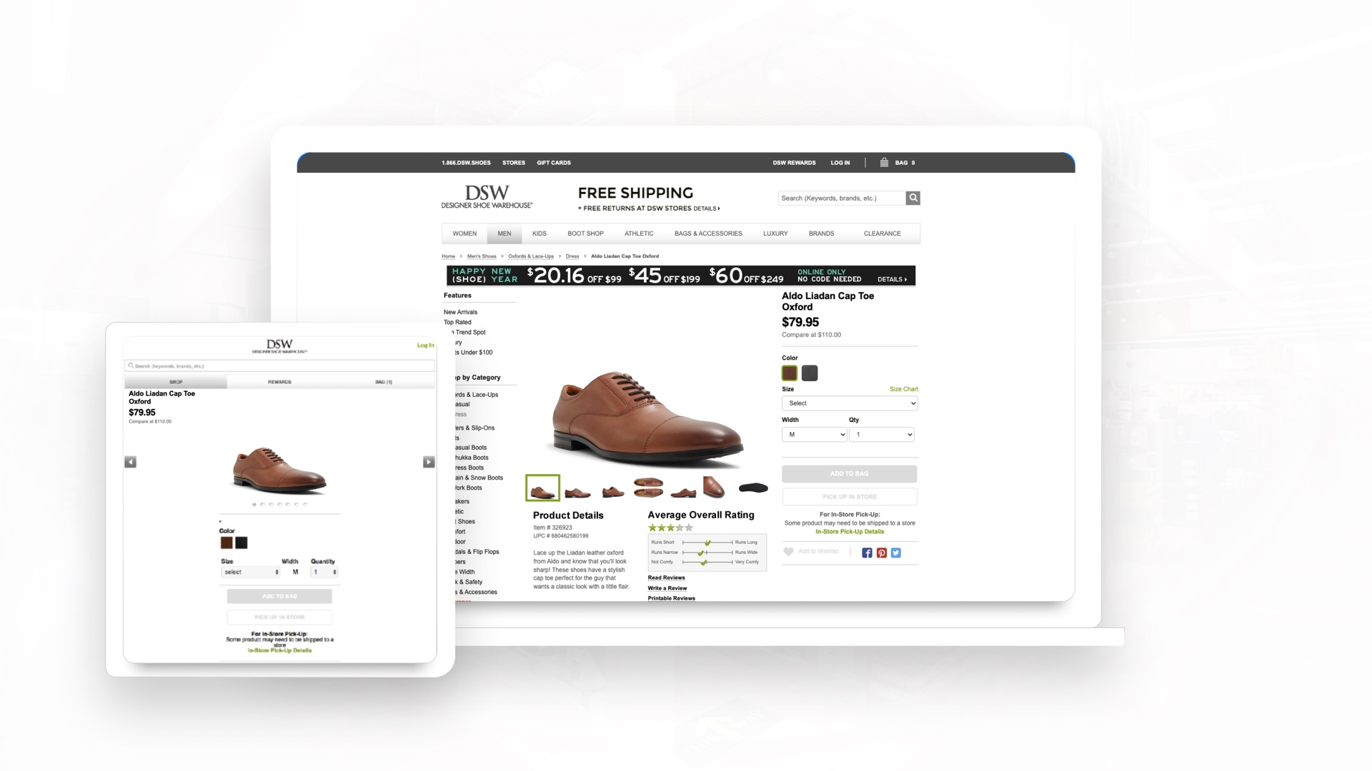
The same DSW product page on desktop and on the m-dot site
Fig 1.0. The same product page on desktop and m-dot. Two codebases, two content updates, and SEO equity split between them.
<figure class="cs-figure">
  <img src="assets/img/work/dsw/fig1-0.jpg" srcset="assets/img/work/dsw/fig1-0-640.webp 640w, assets/img/work/dsw/fig1-0-768.webp 768w, assets/img/work/dsw/fig1-0-1024.webp 1024w, assets/img/work/dsw/fig1-0-1440.webp 1440w, assets/img/work/dsw/fig1-0-1920.webp 1920w" sizes="(min-width: 1568px) 1440px, 100vw" alt="The same DSW product page on desktop and on the m-dot site" width="1920" height="1080" loading="lazy" decoding="async">
  <figcaption>Fig 1.0. The same product page on desktop and m-dot. Two codebases, two content updates, and SEO equity split between them.</figcaption>
</figure>

Image Split

Figma image-split · 2213:655

.cs-split .cs-split--image-first

Text and image side by side from 1200, stacked below. The image side can lead.

My Part

A Team of Two, Plus Partners

Design was my manager and me. I did the visual lifting on both products, with partners where the website needed scale.

The same DSW product page on desktop and on the m-dot site
Fig 1.0. The same product page on desktop and m-dot. Two codebases, two content updates, and SEO equity split between them.
<div class="cs-split">
  <div class="cs-sub">
    <p class="t-eyebrow">My Part</p>
    <h3 class="skill__title">A Team of Two, Plus Partners</h3>
    <div class="cs-sub__body">
      <p class="skill__detail">Design was my manager and me. I did the visual lifting on both products, with partners where the website needed scale.</p>
    </div>
  </div>
  <figure class="cs-figure">
    <img src="assets/img/work/dsw/fig1-0.jpg" srcset="assets/img/work/dsw/fig1-0-640.webp 640w, assets/img/work/dsw/fig1-0-768.webp 768w, assets/img/work/dsw/fig1-0-1024.webp 1024w, assets/img/work/dsw/fig1-0-1440.webp 1440w, assets/img/work/dsw/fig1-0-1920.webp 1920w" sizes="(min-width: 1568px) 704px, (min-width: 1200px) 50vw, 100vw" alt="The same DSW product page on desktop and on the m-dot site" width="1920" height="1080" loading="lazy" decoding="async">
    <figcaption>Fig 1.0. The same product page on desktop and m-dot. Two codebases, two content updates, and SEO equity split between them.</figcaption>
  </figure>
</div>

Quote

Figma quote · 2066:2098

.cs-quote

A pull quote with an optional attribution.

“Our total company revenues set a new high of $2.8 billion. We had positive footwear comp at Designer Shoe Warehouse for the third quarter in a row. We delivered our strongest growth in digital demand in the last 9 years.”

Roger Rawlins, CEO
<figure class="cs-quote">
  <blockquote class="cs-quote__body">
    <p>&ldquo;Our total company revenues set a new high of $2.8 billion. We had positive footwear comp at Designer Shoe Warehouse for the third quarter in a row. We delivered our strongest growth in digital demand in the last 9 years.&rdquo;</p>
  </blockquote>
  <figcaption class="cs-quote__attr">Roger Rawlins, CEO</figcaption>
</figure>

Skill + Step

Rows that read top to bottom.

Skill

Figma skill · 2182:291

.skills .skill-row

Title and detail side by side from 768, ruled between. On Home and About the titles light up word by word as they scroll in.

  • Finding the Real Problem

    Usability testing / Research that never stops / Journey mapping / Information architecture / Knowing what to fix first

  • Designing the System

    Wireframes / Figma component libraries / Design tokens / Interaction and visual design / Prototyping fast

  • Building It Live

    Design engineer by default / Directing coding agents / Pixel-accurate live prototypes / Figma to front end / Web, iOS, whatever ships

  • Deciding What Gets Built

    Working with founders / Roadmaps / Tying design to the business / Cutting the backlog down

  • Leading the Work

    Creative direction / Managing contractors / Fixing the process / Getting teams pointed the same way

  • Building the Brand

    Identity / Marketing sites / Collateral / Brand guidelines

  • Keeping Things Moving

    Mentoring / Helping dev ship faster / The parts of agile that actually help / Working across teams

<ul class="skills skills--lit" aria-labelledby="what-i-do-label">
  <li class="skill-row">
    <h3 class="skill-row__title">Finding the Real Problem</h3>
    <p class="skill-row__detail">Usability testing / Research that never stops / Journey mapping / Information architecture / Knowing what to fix first</p>
  </li>
  <li class="skill-row">
    <h3 class="skill-row__title">Designing the System</h3>
    <p class="skill-row__detail">Wireframes / Figma component libraries / Design tokens / Interaction and visual design / Prototyping fast</p>
  </li>
  <li class="skill-row">
    <h3 class="skill-row__title">Building It Live</h3>
    <p class="skill-row__detail">Design engineer by default / Directing coding agents / Pixel-accurate live prototypes / Figma to front end / Web, iOS, whatever ships</p>
  </li>
  <li class="skill-row">
    <h3 class="skill-row__title">Deciding What Gets Built</h3>
    <p class="skill-row__detail">Working with founders / Roadmaps / Tying design to the business / Cutting the backlog down</p>
  </li>
  <li class="skill-row">
    <h3 class="skill-row__title">Leading the Work</h3>
    <p class="skill-row__detail">Creative direction / Managing contractors / Fixing the process / Getting teams pointed the same way</p>
  </li>
  <li class="skill-row">
    <h3 class="skill-row__title">Building the Brand</h3>
    <p class="skill-row__detail">Identity / Marketing sites / Collateral / Brand guidelines</p>
  </li>
  <li class="skill-row">
    <h3 class="skill-row__title">Keeping Things Moving</h3>
    <p class="skill-row__detail">Mentoring / Helping dev ship faster / The parts of agile that actually help / Working across teams</p>
  </li>
</ul>

Step

Figma step · 2081:800

.skill-list .skill--step

Numbered process rows on My Approach, ruled between. The number column sizes to its digits.

  1. Step 1: Charting the Course

    Before designing anything, I get clear on the objective. What’s the actual problem, who is it for, and what does success look like for the business. This is the product designer in me. I make sure the tickets that come out of it are the ones that move the business and make the experience better for users, so the team starts aligned instead of finding out in week three that we weren’t.

  2. Step 2: Deep Dive

    Real insight comes from talking to people. I run continuous research, interviews, and competitive analysis, then use LLMs to work through qualitative feedback at volume and surface patterns I would otherwise miss. The goal is strategy rooted in genuine frustration rather than assumption.

  3. Step 3: Creative Exploration

    This is where I push past the obvious answer. Tools like Claude Design, Figma Make, and Midjourney let me generate and compare a lot of directions fast. Agents can make a pile of options. Picking the right one is taste, and that part is mine.

  4. Step 4: From Concept to Reality

    The strongest direction gets finalized in Figma. That’s where I decide what good looks like. Then I point agents at it and build it for real, pixel for pixel, with real data. Variations take minutes instead of days, so I find the best path instead of defending the first one.

  5. Step 5: Hands-On Validation

    Design is a conversation, not a handoff. I get the live prototype in front of users early, a site in a real browser or an app on TestFlight, to see what people actually do rather than what they say they’d do. The risky assumptions get tested before anyone commits engineering time to them.

  6. Step 6: Engineering the Gap

    I work closely with development to make sure what I design can be built. Pairing design system knowledge with Claude Code, I generate front-end prototypes to test implementation ideas early. Agents do the typing, I hold the result to the design, and engineering gets something they can run instead of a spec to interpret. Speaking the same language as engineers removes an enormous amount of friction, and on one team it cut dev cycles by 25%.

  7. Step 7: Launch & Beyond

    Launch is the start. I track live data, optimize conversion, and keep the design infrastructure scaling as the product grows. Agents help me ship the next iteration fast. Whether it should ship is still my call.

<ol class="skill-list" aria-labelledby="method-label">
<li class="skill skill--step" id="step-01">
  <p class="skill__num" aria-hidden="true">01</p>
  <div class="skill__body">
    <h3 class="skill__title"><span class="visually-hidden">Step 1: </span>Charting the Course</h3>
    <p class="skill__detail">Before designing anything, I get clear on the objective. What&rsquo;s the actual problem, who is it for, and what does success look like for the business. This is the product designer in me. I make sure the tickets that come out of it are the ones that move the business and make the experience better for users, so the team starts aligned instead of finding out in week three that we weren&rsquo;t.</p>
  </div>
</li>
<li aria-hidden="true"><hr class="skill-list__rule"></li>
<li class="skill skill--step" id="step-02">
  <p class="skill__num" aria-hidden="true">02</p>
  <div class="skill__body">
    <h3 class="skill__title"><span class="visually-hidden">Step 2: </span>Deep Dive</h3>
    <p class="skill__detail">Real insight comes from talking to people. I run continuous research, interviews, and competitive analysis, then use LLMs to work through qualitative feedback at volume and surface patterns I would otherwise miss. The goal is strategy rooted in genuine frustration rather than assumption.</p>
  </div>
</li>
<li aria-hidden="true"><hr class="skill-list__rule"></li>
<li class="skill skill--step" id="step-03">
  <p class="skill__num" aria-hidden="true">03</p>
  <div class="skill__body">
    <h3 class="skill__title"><span class="visually-hidden">Step 3: </span>Creative Exploration</h3>
    <p class="skill__detail">This is where I push past the obvious answer. Tools like Claude Design, Figma Make, and Midjourney let me generate and compare a lot of directions fast. Agents can make a pile of options. Picking the right one is taste, and that part is mine.</p>
  </div>
</li>
<li aria-hidden="true"><hr class="skill-list__rule"></li>
<li class="skill skill--step" id="step-04">
  <p class="skill__num" aria-hidden="true">04</p>
  <div class="skill__body">
    <h3 class="skill__title"><span class="visually-hidden">Step 4: </span>From Concept to Reality</h3>
    <p class="skill__detail">The strongest direction gets finalized in Figma. That&rsquo;s where I decide what good looks like. Then I point agents at it and build it for real, pixel for pixel, with real data. Variations take minutes instead of days, so I find the best path instead of defending the first one.</p>
  </div>
</li>
<li aria-hidden="true"><hr class="skill-list__rule"></li>
<li class="skill skill--step" id="step-05">
  <p class="skill__num" aria-hidden="true">05</p>
  <div class="skill__body">
    <h3 class="skill__title"><span class="visually-hidden">Step 5: </span>Hands-On Validation</h3>
    <p class="skill__detail">Design is a conversation, not a handoff. I get the live prototype in front of users early, a site in a real browser or an app on TestFlight, to see what people actually do rather than what they say they&rsquo;d do. The risky assumptions get tested before anyone commits engineering time to them.</p>
  </div>
</li>
<li aria-hidden="true"><hr class="skill-list__rule"></li>
<li class="skill skill--step" id="step-06">
  <p class="skill__num" aria-hidden="true">06</p>
  <div class="skill__body">
    <h3 class="skill__title"><span class="visually-hidden">Step 6: </span>Engineering the Gap</h3>
    <p class="skill__detail">I work closely with development to make sure what I design can be built. Pairing design system knowledge with Claude Code, I generate front-end prototypes to test implementation ideas early. Agents do the typing, I hold the result to the design, and engineering gets something they can run instead of a spec to interpret. Speaking the same language as engineers removes an enormous amount of friction, and on one team it cut dev cycles by 25%.</p>
  </div>
</li>
<li aria-hidden="true"><hr class="skill-list__rule"></li>
<li class="skill skill--step" id="step-07">
  <p class="skill__num" aria-hidden="true">07</p>
  <div class="skill__body">
    <h3 class="skill__title"><span class="visually-hidden">Step 7: </span>Launch &amp; Beyond</h3>
    <p class="skill__detail">Launch is the start. I track live data, optimize conversion, and keep the design infrastructure scaling as the product grows. Agents help me ship the next iteration fast. Whether it should ship is still my call.</p>
  </div>
</li>
  </ol>

Input

The one form on the site: the access code for a locked case study.

Input

Figma input · 2146:903

.field .field__input .field__toggle

A label, the input and a show / hide toggle, inside the access card. An error swaps the hint for a message in Danger red.

Enter Password

This project is password-protected. Please enter the access code provided to view the case study.

Don’t have the access?Request access

<form class="gate-card" data-gate-form="prizepicks" novalidate>
  <button class="tool-btn gate-card__close" type="button" aria-label="Close" data-gate-close><span class="icon icon--20 icon--ink" aria-hidden="true"><svg width="24" height="24" viewBox="0 0 24 24"><use href="#i-x"></use></svg></span></button>
  <div class="gate-card__header">
    <h2 class="gate-card__title" id="gate-title">Enter Password</h2>
    <p class="gate-card__desc" id="gate-desc">This project is password-protected. Please enter the access code provided to view the case study.</p>
  </div>
  <div class="field">
    <label class="field__label" for="gate-code">Access code</label>
    <div class="field__control">
      <input class="field__input" id="gate-code" name="code" type="password" autocomplete="current-password" autocapitalize="off" autocorrect="off" spellcheck="false" enterkeyhint="go" required aria-describedby="gate-error">
      <button class="tool-btn tool-btn--xs field__toggle" type="button" aria-label="Show access code" aria-pressed="false" data-gate-reveal><span class="icon icon--16 icon--ink" aria-hidden="true"><svg width="24" height="24" viewBox="0 0 24 24"><use href="#i-eye-off"></use></svg></span></button>
    </div>
    <p class="field__error" id="gate-error" role="alert"></p>
  </div>
  <button class="btn btn--primary btn--cta gate-card__submit" type="submit"><span>Submit</span><span class="icon" aria-hidden="true"><svg width="24" height="24" viewBox="0 0 24 24"><use href="#i-arrow-ur"></use></svg></span></button>
  <p class="gate-card__request"><span>Don&rsquo;t have the access?</span><a class="gate-card__link" href="/contact">Request access</a></p>
</form>

Marquee

The only component that moves on its own.

Marquee

Figma marquee · marquee__item · 2066:2090 · 2179:517

.marquee .marquee__item

Two identical sets slide in a loop with no JavaScript, edges fading out. Hover or tap a logo to light it: full color, lifted, name underneath. Stops for reduced motion.

<div class="marquee hatch">
  <div class="marquee__view" tabindex="0">
    <ul class="marquee__track" role="list" aria-label="Programs I use">
      <li class="marquee__item"><span class="marquee__logo" role="img" aria-label="Slack" style="mask-image:url(assets/img/tools/slack.svg?v=3)"></span><img class="marquee__color" src="assets/img/tools/color/slack.svg?v=3" alt="" loading="lazy" decoding="async"><span class="marquee__name" aria-hidden="true">Slack</span></li>
      <li class="marquee__item"><span class="marquee__logo" role="img" aria-label="Linear" style="mask-image:url(assets/img/tools/linear.svg?v=3)"></span><span class="marquee__color marquee__color--mono" aria-hidden="true" style="mask-image:url(assets/img/tools/color/linear.svg?v=3)"></span><span class="marquee__name" aria-hidden="true">Linear</span></li>
      <li class="marquee__item"><span class="marquee__logo" role="img" aria-label="ClickUp" style="mask-image:url(assets/img/tools/clickup.svg?v=3)"></span><img class="marquee__color" src="assets/img/tools/color/clickup.svg?v=3" alt="" loading="lazy" decoding="async"><span class="marquee__name" aria-hidden="true">ClickUp</span></li>
      <li class="marquee__item"><span class="marquee__logo" role="img" aria-label="Jira" style="mask-image:url(assets/img/tools/jira.svg?v=3)"></span><img class="marquee__color" src="assets/img/tools/color/jira.svg?v=3" alt="" loading="lazy" decoding="async"><span class="marquee__name" aria-hidden="true">Jira</span></li>
      <li class="marquee__item"><span class="marquee__logo" role="img" aria-label="Notion" style="mask-image:url(assets/img/tools/notion.svg?v=3)"></span><span class="marquee__color marquee__color--mono" aria-hidden="true" style="mask-image:url(assets/img/tools/color/notion.svg?v=3)"></span><span class="marquee__name" aria-hidden="true">Notion</span></li>
      <li class="marquee__item"><span class="marquee__logo" role="img" aria-label="Coda" style="mask-image:url(assets/img/tools/coda.svg?v=3)"></span><img class="marquee__color" src="assets/img/tools/color/coda.svg?v=3" alt="" loading="lazy" decoding="async"><span class="marquee__name" aria-hidden="true">Coda</span></li>
      <li class="marquee__item"><span class="marquee__logo" role="img" aria-label="Figma" style="mask-image:url(assets/img/tools/figma.svg?v=3)"></span><img class="marquee__color" src="assets/img/tools/color/figma.svg?v=3" alt="" loading="lazy" decoding="async"><span class="marquee__name" aria-hidden="true">Figma</span></li>
      <li class="marquee__item"><span class="marquee__logo" role="img" aria-label="Claude" style="mask-image:url(assets/img/tools/claude.svg?v=3)"></span><img class="marquee__color" src="assets/img/tools/color/claude.svg?v=3" alt="" loading="lazy" decoding="async"><span class="marquee__name" aria-hidden="true">Claude</span></li>
      <li class="marquee__item"><span class="marquee__logo" role="img" aria-label="Gemini" style="mask-image:url(assets/img/tools/gemini.svg?v=3)"></span><img class="marquee__color" src="assets/img/tools/color/gemini.svg?v=3" alt="" loading="lazy" decoding="async"><span class="marquee__name" aria-hidden="true">Gemini</span></li>
      <li class="marquee__item"><span class="marquee__logo" role="img" aria-label="Cursor" style="mask-image:url(assets/img/tools/cursor.svg?v=3)"></span><span class="marquee__color marquee__color--mono" aria-hidden="true" style="mask-image:url(assets/img/tools/color/cursor.svg?v=3)"></span><span class="marquee__name" aria-hidden="true">Cursor</span></li>
      <li class="marquee__item"><span class="marquee__logo" role="img" aria-label="Midjourney" style="mask-image:url(assets/img/tools/midjourney.svg?v=3)"></span><span class="marquee__color marquee__color--mono" aria-hidden="true" style="mask-image:url(assets/img/tools/color/midjourney.svg?v=3)"></span><span class="marquee__name" aria-hidden="true">Midjourney</span></li>
      <li class="marquee__item"><span class="marquee__logo" role="img" aria-label="Adobe Photoshop" style="mask-image:url(assets/img/tools/photoshop.svg?v=3)"></span><img class="marquee__color" src="assets/img/tools/color/photoshop.svg?v=3" alt="" loading="lazy" decoding="async"><span class="marquee__name" aria-hidden="true">Adobe Photoshop</span></li>
      <li class="marquee__item"><span class="marquee__logo" role="img" aria-label="Adobe Illustrator" style="mask-image:url(assets/img/tools/illustrator.svg?v=3)"></span><img class="marquee__color" src="assets/img/tools/color/illustrator.svg?v=3" alt="" loading="lazy" decoding="async"><span class="marquee__name" aria-hidden="true">Adobe Illustrator</span></li>
      <li class="marquee__item"><span class="marquee__logo" role="img" aria-label="Adobe InDesign" style="mask-image:url(assets/img/tools/indesign.svg?v=3)"></span><img class="marquee__color" src="assets/img/tools/color/indesign.svg?v=3" alt="" loading="lazy" decoding="async"><span class="marquee__name" aria-hidden="true">Adobe InDesign</span></li>
      <li class="marquee__item"><span class="marquee__logo" role="img" aria-label="Jitter" style="mask-image:url(assets/img/tools/jitter.svg?v=3)"></span><span class="marquee__color marquee__color--mono" aria-hidden="true" style="mask-image:url(assets/img/tools/color/jitter.svg?v=3)"></span><span class="marquee__name" aria-hidden="true">Jitter</span></li>
      <li class="marquee__item"><span class="marquee__logo" role="img" aria-label="Hotjar" style="mask-image:url(assets/img/tools/hotjar.svg?v=3)"></span><img class="marquee__color" src="assets/img/tools/color/hotjar.svg?v=3" alt="" loading="lazy" decoding="async"><span class="marquee__name" aria-hidden="true">Hotjar</span></li>
      <li class="marquee__item"><span class="marquee__logo" role="img" aria-label="Optimal Workshop" style="mask-image:url(assets/img/tools/optimal-workshop.svg?v=3)"></span><span class="marquee__color marquee__color--mono" aria-hidden="true" style="mask-image:url(assets/img/tools/color/optimal-workshop.svg?v=3)"></span><span class="marquee__name" aria-hidden="true">Optimal Workshop</span></li>
      <li class="marquee__item"><span class="marquee__logo" role="img" aria-label="UserTesting" style="mask-image:url(assets/img/tools/usertesting.svg?v=3)"></span><img class="marquee__color" src="assets/img/tools/color/usertesting.svg?v=3" alt="" loading="lazy" decoding="async"><span class="marquee__name" aria-hidden="true">UserTesting</span></li>
      <li class="marquee__item"><span class="marquee__logo" role="img" aria-label="User Interviews" style="mask-image:url(assets/img/tools/userinterviews.svg?v=3)"></span><img class="marquee__color" src="assets/img/tools/color/userinterviews.svg?v=3" alt="" loading="lazy" decoding="async"><span class="marquee__name" aria-hidden="true">User Interviews</span></li>
      <li class="marquee__item"><span class="marquee__logo" role="img" aria-label="Framer" style="mask-image:url(assets/img/tools/framer.svg?v=3)"></span><span class="marquee__color marquee__color--mono" aria-hidden="true" style="mask-image:url(assets/img/tools/color/framer.svg?v=3)"></span><span class="marquee__name" aria-hidden="true">Framer</span></li>
      <li class="marquee__item"><span class="marquee__logo" role="img" aria-label="Webflow" style="mask-image:url(assets/img/tools/webflow.svg?v=3)"></span><img class="marquee__color" src="assets/img/tools/color/webflow.svg?v=3" alt="" loading="lazy" decoding="async"><span class="marquee__name" aria-hidden="true">Webflow</span></li>
      <li class="marquee__item" aria-hidden="true"><span class="marquee__logo" style="mask-image:url(assets/img/tools/slack.svg?v=3)"></span><img class="marquee__color" src="assets/img/tools/color/slack.svg?v=3" alt="" loading="lazy" decoding="async"><span class="marquee__name" aria-hidden="true">Slack</span></li>
      <li class="marquee__item" aria-hidden="true"><span class="marquee__logo" style="mask-image:url(assets/img/tools/linear.svg?v=3)"></span><span class="marquee__color marquee__color--mono" aria-hidden="true" style="mask-image:url(assets/img/tools/color/linear.svg?v=3)"></span><span class="marquee__name" aria-hidden="true">Linear</span></li>
      <li class="marquee__item" aria-hidden="true"><span class="marquee__logo" style="mask-image:url(assets/img/tools/clickup.svg?v=3)"></span><img class="marquee__color" src="assets/img/tools/color/clickup.svg?v=3" alt="" loading="lazy" decoding="async"><span class="marquee__name" aria-hidden="true">ClickUp</span></li>
      <li class="marquee__item" aria-hidden="true"><span class="marquee__logo" style="mask-image:url(assets/img/tools/jira.svg?v=3)"></span><img class="marquee__color" src="assets/img/tools/color/jira.svg?v=3" alt="" loading="lazy" decoding="async"><span class="marquee__name" aria-hidden="true">Jira</span></li>
      <li class="marquee__item" aria-hidden="true"><span class="marquee__logo" style="mask-image:url(assets/img/tools/notion.svg?v=3)"></span><span class="marquee__color marquee__color--mono" aria-hidden="true" style="mask-image:url(assets/img/tools/color/notion.svg?v=3)"></span><span class="marquee__name" aria-hidden="true">Notion</span></li>
      <li class="marquee__item" aria-hidden="true"><span class="marquee__logo" style="mask-image:url(assets/img/tools/coda.svg?v=3)"></span><img class="marquee__color" src="assets/img/tools/color/coda.svg?v=3" alt="" loading="lazy" decoding="async"><span class="marquee__name" aria-hidden="true">Coda</span></li>
      <li class="marquee__item" aria-hidden="true"><span class="marquee__logo" style="mask-image:url(assets/img/tools/figma.svg?v=3)"></span><img class="marquee__color" src="assets/img/tools/color/figma.svg?v=3" alt="" loading="lazy" decoding="async"><span class="marquee__name" aria-hidden="true">Figma</span></li>
      <li class="marquee__item" aria-hidden="true"><span class="marquee__logo" style="mask-image:url(assets/img/tools/claude.svg?v=3)"></span><img class="marquee__color" src="assets/img/tools/color/claude.svg?v=3" alt="" loading="lazy" decoding="async"><span class="marquee__name" aria-hidden="true">Claude</span></li>
      <li class="marquee__item" aria-hidden="true"><span class="marquee__logo" style="mask-image:url(assets/img/tools/gemini.svg?v=3)"></span><img class="marquee__color" src="assets/img/tools/color/gemini.svg?v=3" alt="" loading="lazy" decoding="async"><span class="marquee__name" aria-hidden="true">Gemini</span></li>
      <li class="marquee__item" aria-hidden="true"><span class="marquee__logo" style="mask-image:url(assets/img/tools/cursor.svg?v=3)"></span><span class="marquee__color marquee__color--mono" aria-hidden="true" style="mask-image:url(assets/img/tools/color/cursor.svg?v=3)"></span><span class="marquee__name" aria-hidden="true">Cursor</span></li>
      <li class="marquee__item" aria-hidden="true"><span class="marquee__logo" style="mask-image:url(assets/img/tools/midjourney.svg?v=3)"></span><span class="marquee__color marquee__color--mono" aria-hidden="true" style="mask-image:url(assets/img/tools/color/midjourney.svg?v=3)"></span><span class="marquee__name" aria-hidden="true">Midjourney</span></li>
      <li class="marquee__item" aria-hidden="true"><span class="marquee__logo" style="mask-image:url(assets/img/tools/photoshop.svg?v=3)"></span><img class="marquee__color" src="assets/img/tools/color/photoshop.svg?v=3" alt="" loading="lazy" decoding="async"><span class="marquee__name" aria-hidden="true">Adobe Photoshop</span></li>
      <li class="marquee__item" aria-hidden="true"><span class="marquee__logo" style="mask-image:url(assets/img/tools/illustrator.svg?v=3)"></span><img class="marquee__color" src="assets/img/tools/color/illustrator.svg?v=3" alt="" loading="lazy" decoding="async"><span class="marquee__name" aria-hidden="true">Adobe Illustrator</span></li>
      <li class="marquee__item" aria-hidden="true"><span class="marquee__logo" style="mask-image:url(assets/img/tools/indesign.svg?v=3)"></span><img class="marquee__color" src="assets/img/tools/color/indesign.svg?v=3" alt="" loading="lazy" decoding="async"><span class="marquee__name" aria-hidden="true">Adobe InDesign</span></li>
      <li class="marquee__item" aria-hidden="true"><span class="marquee__logo" style="mask-image:url(assets/img/tools/jitter.svg?v=3)"></span><span class="marquee__color marquee__color--mono" aria-hidden="true" style="mask-image:url(assets/img/tools/color/jitter.svg?v=3)"></span><span class="marquee__name" aria-hidden="true">Jitter</span></li>
      <li class="marquee__item" aria-hidden="true"><span class="marquee__logo" style="mask-image:url(assets/img/tools/hotjar.svg?v=3)"></span><img class="marquee__color" src="assets/img/tools/color/hotjar.svg?v=3" alt="" loading="lazy" decoding="async"><span class="marquee__name" aria-hidden="true">Hotjar</span></li>
      <li class="marquee__item" aria-hidden="true"><span class="marquee__logo" style="mask-image:url(assets/img/tools/optimal-workshop.svg?v=3)"></span><span class="marquee__color marquee__color--mono" aria-hidden="true" style="mask-image:url(assets/img/tools/color/optimal-workshop.svg?v=3)"></span><span class="marquee__name" aria-hidden="true">Optimal Workshop</span></li>
      <li class="marquee__item" aria-hidden="true"><span class="marquee__logo" style="mask-image:url(assets/img/tools/usertesting.svg?v=3)"></span><img class="marquee__color" src="assets/img/tools/color/usertesting.svg?v=3" alt="" loading="lazy" decoding="async"><span class="marquee__name" aria-hidden="true">UserTesting</span></li>
      <li class="marquee__item" aria-hidden="true"><span class="marquee__logo" style="mask-image:url(assets/img/tools/userinterviews.svg?v=3)"></span><img class="marquee__color" src="assets/img/tools/color/userinterviews.svg?v=3" alt="" loading="lazy" decoding="async"><span class="marquee__name" aria-hidden="true">User Interviews</span></li>
      <li class="marquee__item" aria-hidden="true"><span class="marquee__logo" style="mask-image:url(assets/img/tools/framer.svg?v=3)"></span><span class="marquee__color marquee__color--mono" aria-hidden="true" style="mask-image:url(assets/img/tools/color/framer.svg?v=3)"></span><span class="marquee__name" aria-hidden="true">Framer</span></li>
      <li class="marquee__item" aria-hidden="true"><span class="marquee__logo" style="mask-image:url(assets/img/tools/webflow.svg?v=3)"></span><img class="marquee__color" src="assets/img/tools/color/webflow.svg?v=3" alt="" loading="lazy" decoding="async"><span class="marquee__name" aria-hidden="true">Webflow</span></li>
    </ul>
  </div>
  <div class="marquee__view marquee__view--blur" aria-hidden="true">
    <ul class="marquee__track" aria-hidden="true">
      <li class="marquee__item" aria-hidden="true"><span class="marquee__logo" style="mask-image:url(assets/img/tools/slack.svg?v=3)"></span></li>
      <li class="marquee__item" aria-hidden="true"><span class="marquee__logo" style="mask-image:url(assets/img/tools/linear.svg?v=3)"></span></li>
      <li class="marquee__item" aria-hidden="true"><span class="marquee__logo" style="mask-image:url(assets/img/tools/clickup.svg?v=3)"></span></li>
      <li class="marquee__item" aria-hidden="true"><span class="marquee__logo" style="mask-image:url(assets/img/tools/jira.svg?v=3)"></span></li>
      <li class="marquee__item" aria-hidden="true"><span class="marquee__logo" style="mask-image:url(assets/img/tools/notion.svg?v=3)"></span></li>
      <li class="marquee__item" aria-hidden="true"><span class="marquee__logo" style="mask-image:url(assets/img/tools/coda.svg?v=3)"></span></li>
      <li class="marquee__item" aria-hidden="true"><span class="marquee__logo" style="mask-image:url(assets/img/tools/figma.svg?v=3)"></span></li>
      <li class="marquee__item" aria-hidden="true"><span class="marquee__logo" style="mask-image:url(assets/img/tools/claude.svg?v=3)"></span></li>
      <li class="marquee__item" aria-hidden="true"><span class="marquee__logo" style="mask-image:url(assets/img/tools/gemini.svg?v=3)"></span></li>
      <li class="marquee__item" aria-hidden="true"><span class="marquee__logo" style="mask-image:url(assets/img/tools/cursor.svg?v=3)"></span></li>
      <li class="marquee__item" aria-hidden="true"><span class="marquee__logo" style="mask-image:url(assets/img/tools/midjourney.svg?v=3)"></span></li>
      <li class="marquee__item" aria-hidden="true"><span class="marquee__logo" style="mask-image:url(assets/img/tools/photoshop.svg?v=3)"></span></li>
      <li class="marquee__item" aria-hidden="true"><span class="marquee__logo" style="mask-image:url(assets/img/tools/illustrator.svg?v=3)"></span></li>
      <li class="marquee__item" aria-hidden="true"><span class="marquee__logo" style="mask-image:url(assets/img/tools/indesign.svg?v=3)"></span></li>
      <li class="marquee__item" aria-hidden="true"><span class="marquee__logo" style="mask-image:url(assets/img/tools/jitter.svg?v=3)"></span></li>
      <li class="marquee__item" aria-hidden="true"><span class="marquee__logo" style="mask-image:url(assets/img/tools/hotjar.svg?v=3)"></span></li>
      <li class="marquee__item" aria-hidden="true"><span class="marquee__logo" style="mask-image:url(assets/img/tools/optimal-workshop.svg?v=3)"></span></li>
      <li class="marquee__item" aria-hidden="true"><span class="marquee__logo" style="mask-image:url(assets/img/tools/usertesting.svg?v=3)"></span></li>
      <li class="marquee__item" aria-hidden="true"><span class="marquee__logo" style="mask-image:url(assets/img/tools/userinterviews.svg?v=3)"></span></li>
      <li class="marquee__item" aria-hidden="true"><span class="marquee__logo" style="mask-image:url(assets/img/tools/framer.svg?v=3)"></span></li>
      <li class="marquee__item" aria-hidden="true"><span class="marquee__logo" style="mask-image:url(assets/img/tools/webflow.svg?v=3)"></span></li>
      <li class="marquee__item" aria-hidden="true"><span class="marquee__logo" style="mask-image:url(assets/img/tools/slack.svg?v=3)"></span></li>
      <li class="marquee__item" aria-hidden="true"><span class="marquee__logo" style="mask-image:url(assets/img/tools/linear.svg?v=3)"></span></li>
      <li class="marquee__item" aria-hidden="true"><span class="marquee__logo" style="mask-image:url(assets/img/tools/clickup.svg?v=3)"></span></li>
      <li class="marquee__item" aria-hidden="true"><span class="marquee__logo" style="mask-image:url(assets/img/tools/jira.svg?v=3)"></span></li>
      <li class="marquee__item" aria-hidden="true"><span class="marquee__logo" style="mask-image:url(assets/img/tools/notion.svg?v=3)"></span></li>
      <li class="marquee__item" aria-hidden="true"><span class="marquee__logo" style="mask-image:url(assets/img/tools/coda.svg?v=3)"></span></li>
      <li class="marquee__item" aria-hidden="true"><span class="marquee__logo" style="mask-image:url(assets/img/tools/figma.svg?v=3)"></span></li>
      <li class="marquee__item" aria-hidden="true"><span class="marquee__logo" style="mask-image:url(assets/img/tools/claude.svg?v=3)"></span></li>
      <li class="marquee__item" aria-hidden="true"><span class="marquee__logo" style="mask-image:url(assets/img/tools/gemini.svg?v=3)"></span></li>
      <li class="marquee__item" aria-hidden="true"><span class="marquee__logo" style="mask-image:url(assets/img/tools/cursor.svg?v=3)"></span></li>
      <li class="marquee__item" aria-hidden="true"><span class="marquee__logo" style="mask-image:url(assets/img/tools/midjourney.svg?v=3)"></span></li>
      <li class="marquee__item" aria-hidden="true"><span class="marquee__logo" style="mask-image:url(assets/img/tools/photoshop.svg?v=3)"></span></li>
      <li class="marquee__item" aria-hidden="true"><span class="marquee__logo" style="mask-image:url(assets/img/tools/illustrator.svg?v=3)"></span></li>
      <li class="marquee__item" aria-hidden="true"><span class="marquee__logo" style="mask-image:url(assets/img/tools/indesign.svg?v=3)"></span></li>
      <li class="marquee__item" aria-hidden="true"><span class="marquee__logo" style="mask-image:url(assets/img/tools/jitter.svg?v=3)"></span></li>
      <li class="marquee__item" aria-hidden="true"><span class="marquee__logo" style="mask-image:url(assets/img/tools/hotjar.svg?v=3)"></span></li>
      <li class="marquee__item" aria-hidden="true"><span class="marquee__logo" style="mask-image:url(assets/img/tools/optimal-workshop.svg?v=3)"></span></li>
      <li class="marquee__item" aria-hidden="true"><span class="marquee__logo" style="mask-image:url(assets/img/tools/usertesting.svg?v=3)"></span></li>
      <li class="marquee__item" aria-hidden="true"><span class="marquee__logo" style="mask-image:url(assets/img/tools/userinterviews.svg?v=3)"></span></li>
      <li class="marquee__item" aria-hidden="true"><span class="marquee__logo" style="mask-image:url(assets/img/tools/framer.svg?v=3)"></span></li>
      <li class="marquee__item" aria-hidden="true"><span class="marquee__logo" style="mask-image:url(assets/img/tools/webflow.svg?v=3)"></span></li>
    </ul>
  </div>
</div>

Media Player

Custom controls over a native video.

Media Player

Figma player · 2066:2270

.player

Lime controls and scrubber over a dark frame. Without JavaScript the browser's controls stay, so it always plays. This demo shows the poster only; the footage is behind the PrizePicks access code.

<div class="player">
  <video class="player__video" controls preload="metadata" playsinline
         poster="assets/img/commercial-poster.jpg" width="1280" height="720">
    <source src="assets/video/clip.mp4" type="video/mp4">
    <p class="t-body">Your browser can&rsquo;t play this video. <a href="assets/video/clip.mp4">Download the video</a> instead.</p>
  </video>
</div>

Icons + Texture

Lucide icons inlined as symbols, 24px grid, 2px strokes, round caps and joins. Color follows the text.

Icon

Figma icon · 2116:644

.icon

All 50 glyphs in Figma's set. The ones the site's sprite does not carry are listed with where they went.

arrow-left

arrow-right

arrow-ul

arrow-ur

check

chevron-down

chevron-right

chevrons-left-right

controls

copy

cycle

eye

eye-off

feed

gamepad

grip

hand-point

hand-wave

heart

joystick

key

knight

link

mail-pen

maximize

menu

minimize

moon

ninja

ohio

pause

play

repeat-2

rotate-ccw

ruler

send

send-horizontal

send-mail

spline

sun

terminal

ticket

toolbox

trophy

volume

volume-1

volume-2

volume-x

wand

x

  • arrow-ul: drawn as arrow-ur flipped (.icon--flip)
  • chevrons-left-right: not used on the site
  • controls: not used on the site
  • cycle: drawn inline as an eyebrow icon (.ico-cycle)
  • feed: drawn inline as an eyebrow icon (.ico-feed)
  • gamepad: drawn inline as an eyebrow icon (.ico-gamepad)
  • grip: not used on the site
  • hand-point: not used on the site
  • hand-wave: not used on the site
  • heart: the footer credit draws its own heart
  • joystick: drawn inline as an eyebrow icon (.ico-joystick)
  • key: drawn inline as an eyebrow icon (.ico-key)
  • knight: drawn inline as an eyebrow icon (.ico-knight)
  • moon: the theme toggle draws its own sun and moon
  • ninja: drawn inline as an eyebrow icon (.ico-ninja)
  • ohio: not used on the site
  • rotate-ccw: not used on the site
  • ruler: not used on the site
  • send: not used on the site
  • send-horizontal: not used on the site
  • send-mail: drawn inline as an eyebrow icon (.ico-send)
  • spline: drawn inline as an eyebrow icon (.ico-spline)
  • sun: the theme toggle draws its own sun and moon
  • terminal: drawn into the Agent Guide overview card
  • toolbox: drawn inline as an eyebrow icon (.ico-toolbox)
  • trophy: drawn inline as an eyebrow icon (.ico-trophy)
  • volume: the player uses volume-2 and volume-x
  • volume-1: the player uses volume-2 and volume-x
  • wand: drawn inline as an eyebrow icon (.ico-wand)
<span class="icon" aria-hidden="true"><svg width="24" height="24" viewBox="0 0 24 24"><use href="#i-arrow-ur"></use></svg></span>

Texture

Figma hatch · 2402:2

.hatch

The diagonal hatch behind page titles and the marquee, and on a linked result card when you hover it.

<div class="hatch" style="height:160px"></div>

Figma Parity

Every component in the Figma library, the CSS that ships it, and where it lives on this page. Figma owns anatomy and states; the stylesheet owns what ships.

Components

33 library components, all shipping. Node IDs from u7Woeg2PGHsjKAyaGKuKf2.

FigmaNodeVariantsCSSOn this page
button2006:9915primary, secondary, tertiary, ghost × large, medium × static, hover, active.btn .btn--accent / --primary / --tertiary / --secondaryActions
button-icon2006:10024primary, secondary, tertiary, ghost × large, medium, small, x-small, xx-small × static, hover, active.tool-btn .tool-btn--tintActions
link2132:489primary, secondary × static, hover, pressed.btn-text .social-linkActions
nav-button2598:306Show label, Left icon, Right icon × static, hover, active.nav-btnActions
actions2194:21251440, 768, 390.cs-actionsActions
main-nav · nav · nav-link · logo2095:1620 · 2203:583 · 2159:1740 · 2203:14431200, 768, mobile · 768 above, 767 below · primary, secondary, tertiary × static, hover, active · static, hover, pressed.nav .nav__pill .nav__link .nav__logoNavigation
menu2165:1836default, open, dropdown, dropdown-wide × 767 below, 768+.menu .dropdownNavigation
menu2165:1836open, 767 below.menu .mobile-menuNavigation
headers / type=title2065:1718title, section × 1440, 768, 390.intro .intro__titleHeaders + Dividers
headers / type=section2065:1718title, section × 1440, 768, 390.cs-sub .skill__titleHeaders + Dividers
divider-row2182:276divider, break, header × all, 1440, 768, 390.section-labelHeaders + Dividers
divider-items / type=project-notes2182:277divider, text labels, project-notes.cs-metaHeaders + Dividers
card-work2077:692767 below, 768 above × default, hover, active.work-card in .work-gridCards
card-info2076:680info, goal × 1440, 768, 390.cs-cards .cs-card .cs-card--darkCards
card-stat2060:9081440, 768, 390.cs-stats .cs-statCards
stat-strip2379:12row, stacked · text properties Value 1 to 3, Label 1 to 3.cs-glance .cs-statline .cs-rowsCards
card-panel · panel-row2060:937 · 2066:18491440, 768, 390 · 1200, 768, 390.cs-panel .cs-panel__rowCards
stat-cards · stat-card2323:906 · 2323:7581440, 768, 390 · 1440, 768, 390 × default, hover.stat-cards .stat-cardCards
image2057:76.cs-figureImage + Quote
image-split2213:655right, left, bottom × 1440, 768, 390.cs-split .cs-split--image-firstImage + Quote
quote2066:20981440, 768, 390.cs-quoteImage + Quote
skill2182:2911440, 768, 390 × lit, unlit.skills .skill-rowSkill + Step
step2081:8001440, 768, 390.skill-list .skill--stepSkill + Step
input2146:903default, hover, active, input, error-default, error-hover.field .field__input .field__toggleInput
marquee · marquee__item2066:2090 · 2179:5171440, 768, 390 × default, hover × gray, full.marquee .marquee__itemMarquee
player2066:2270idle, playing.playerMedia Player
footer2182:1621200.footerFooter
footer2182:162768.footerFooter
footer2182:162390.footerFooter
icon2116:64450 glyphs.iconIcons + Texture
hatch2402:2.hatchIcons + Texture

Design System Site

41 more library components that build this page: the chrome, the playground and the specimens.

FigmaNodeVariantsCSSOn this page
ds-topbar2323:2576390, 768, 1440.ds-topbarEvery page
ds-nav2324:329closed, foundations, components, references open; dropdowns.ds-navEvery page
ds-pager2332:711440, 390 × middle, first.ds-pagerEvery page
ds-section-head2325:3020 .ds-section__title .ds-section__noteEvery page
ds-hero2325:30191440, 390.ds-heroOverview
ds-overview-card2326:4002small, wide, xl × lime, blue, green, yellow, red, slate × default, hover.ds-illOverview
ds-head-facts2348:51 .ds-head__factsOverview
ds-map-head2348:67 .ds-map__headOverview
ds-group-head2325:3023 .ds-ramp-group__headColor Ramps
ds-ramp-filter2331:26all, swatch, swatch-white × default, hover, selected.ds-ramp-filterColor Ramps
ds-color2331:126shipped, library × default, hover, copied.ds-colorColor Ramps
ds-prim2332:2 .ds-primPrimitive Tokens
ds-sem2332:16 .ds-semSemantic Tokens
ds-table-row2348:45head, body.ds-table trType + Size Tokens, Figma Parity
ds-ts2372:7row, stacked.ds-tsTypography
ds-item2348:46 .ds-itemSpacing, Elevation
ds-space-step2345:8 .ds-space__stepSpacing
ds-shape2345:26radius, stroke, icon.ds-radius .ds-strokeSpacing
ds-rhythm2345:50row, head × inline, stacked.ds-rhythmSpacing
ds-frame-row2348:13 .ds-frame-rowBreakpoints + Motion
ds-dur2345:51 .ds-durBreakpoints + Motion
ds-ease2355:35ease, arrow-ease, ease-out-expo, spring.ds-easeBreakpoints + Motion
ds-elev2348:22flat, hover, pressed.ds-elevElevation
ds-story2330:212playground, code, stacked.ds-storyEvery component page
ds-controls2419:4953side, inline.ds-controlsEvery component page
ds-ctl2329:22segmented, text, switch, select, range × stacked, inline.ds-ctlEvery component page
ds-tab2328:36default, selected.ds-tabEvery component page
ds-tools2420:1298 .ds-toolsEvery component page
ds-tool2328:30text, icon × default, selected.ds-toolEvery component page
ds-ui-icon2327:31sun, outline, measure, code, reset, copy, check, chevron, chevron-up.ds-tool svgEvery component page
ds-seg-option2328:17text, icon × default, hover, selected.ds-seg__optEvery component page
ds-input2328:41default, focus, hover × desktop, touch.ds-inputEvery component page
ds-input-paragraph2420:1238default, focus, hover × desktop, touch.ds-input--areaEvery component page
ds-select2344:31default, hover, focus, selected, active × desktop, touch.ds-selectEvery component page
ds-list2614:5362desktop, touch.ds-listEvery component page
.selection-link2458:7388default, hover, selected × desktop, touch.ds-optionEvery component page
ds-switch2344:18false, true.ds-switchEvery component page
ds-range2344:32 .ds-rangeEvery component page
ds-mini-button2328:56default, hover, selected.ds-reset .ds-copyEvery component page
ds-fig2328:57 .ds-figEvery component page
ds-iconview2348:70 .ds-iconviewIcons + Texture

Variables + Styles

Every collection and style set in the library, and where it shows here.

FigmaCountModesCSSOn this page
Color Primitives151Value--ds-*Color Ramps, Primitive Tokens
Colors192Light, Dark--c-*, --op-*Semantic Tokens
Typography + Typography Primitives135 + 62Mode 1--f-*, --fs-*, --lh-*Type + Size Tokens, Typography
Size134Mode 1--pad, --*-gap, --card-pad …Type + Size Tokens, Spacing
Responsive3Desktop, Tablet, Mobile@media 768, 1200Breakpoints + Motion
Text styles58 .t-*, component typeTypography
Effect styles: Elevation / Hover, Elevation / Pressed2 .btn:hover, .btn:activeElevation

Agent Guide

How a coding agent should build with this system. The same rules ship as plain files an agent can read, written from the stylesheet and the component catalog on every build, so they never describe a version that is gone.

Files

Served from the site root. Point an agent at the first one before it writes anything.

FileWhat it holds
design-system.mdThe guide. Rules, 31 semantic tokens in both themes, type and spacing at every frame, and all 31 components with their Figma nodes, classes and real markup.
design-tokens.jsonThe same tokens as data in the W3C design tokens shape: color with Dark under $extensions, and 108 type, layout and motion tokens with their 768 and 1200 steps.
llms.txtThe site for language models. Points here, so an agent that finds the site finds the system.

Prompt

Paste it at the top of a task.

Prompt
You are building with Zach Blevins' design system. Before you write markup or CSS, read https://zachblevins.com/design-system.md, and take values from https://zachblevins.com/design-tokens.json. Load the site's stylesheet and reuse its classes and CSS custom properties instead of writing new ones. Use the semantic color tokens (--c-*) and never hard-code a hex value. Use the type and spacing tokens, which already step at 768 and 1200, and do not add breakpoints. Copy a component's markup from the guide rather than rebuilding it, and do not invent variants the library does not have. Check every change in Light and Dark, keep text at WCAG AA, and keep em dashes out of the copy.

Rules

What an agent gets wrong without being told.

  1. Reuse before you write. Every component in the system ships on the site. Copy its markup and classes as they are. If what you need is not here, say so rather than inventing a variant the Figma library does not have.
  2. Color comes from semantic tokens. Use the --c-* tokens, and --op-* when you want a share of the foreground. Never type a hex value, and never reach for a --ds-* primitive inside a component: primitives do not flip with the theme, semantic tokens do.
  3. Every screen has two themes. Dark mode is <html data-theme="dark">. Anything you add has to read in both, and a dark value goes in the :root[data-theme="dark"] block, not beside the rule that uses it.
  4. Type and spacing are tokens too. Font families come from --f-display, --f-sans and --f-mono. Sizes and line heights come from --fs-* and --lh-*, spacing from --pad, --band-y, --band-gap and the gap tokens. They already step at 768 and 1200.
  5. Two breakpoints, mobile first. The base styles are the 390 frame. @media (min-width: 768px) and (min-width: 1200px) are the only queries. Do not add one; retune a token in the :root block for that width instead.
  6. Icons are Lucide symbols. Reference the sprite with <svg><use href="#i-name"></use></svg> inside .icon. Strokes are 2px on a 24px grid and the color follows the text.
  7. Motion uses the motion tokens. --dur and --ease for state changes, --press-dur and --press-ease for presses, --arrow-* for arrows. Every other duration is a step of the scale (--dur-fast, --dur-short, --dur-slow, --dur-long), or for entrances --dur-light, --dur-enter, --dur-reveal and --dur-settle, never typed by hand. Anything the reader opens or closes moves on --arrow-ease; --ease-out-expo is for scroll reveals and icons settling. Everything stops under prefers-reduced-motion.
  8. Accessible in both themes. Text clears WCAG AA on its real background in Light and in Dark. Keep visible focus, real heading order, aria-current on the current page and alt text on every image.
  9. Safe areas go through tokens. Anything pinned to an edge pads with --safe-t, --safe-r, --safe-b or --safe-l, never env() directly.
  10. Write like Zach. First person, plain words, varied sentence length. No em dashes anywhere in copy.